Connie Reinhart
June 2020 - Tulip Sunflower
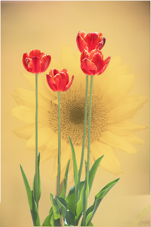
Original 1
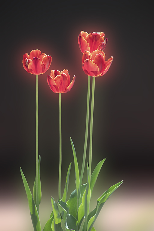
Original 2
About the Image(s)
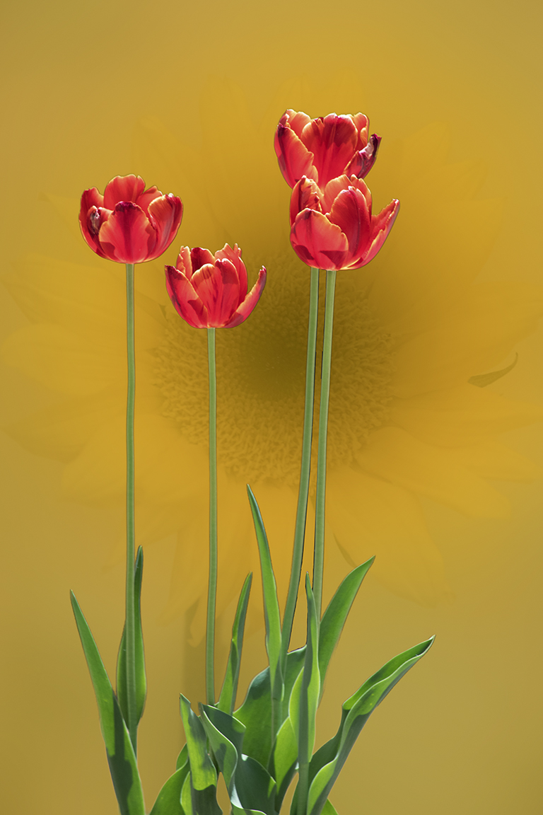
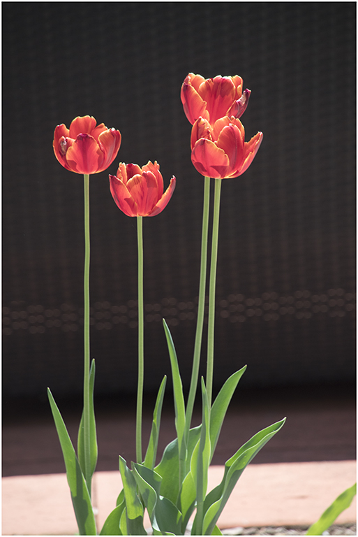
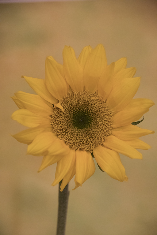
We were wandering around the hotel during a photo conference when I spied these red tulips in the courtyard. The sun made the blossoms glow, especially against the black wicker settee. While the flowers are lovely, the background leaves a bit to be desired. Taken at f/7.1, 1/250 sec ISO 1000. Later, at a macro workshop we found a very nice sunflower. Taken at f/6.3, 1/80 sec ISO 6400. Never thought of putting them together at the time. To make this composite, I started with the sunflower. Made a duplicate layer and blurred it. Then used Topaz Remask to separate the tulips from the background. The tulips were added to the sunflower on their own layer. I’m not completely satisfied with the color combination here, but the sunflower was all I could find.
This round’s discussion is now closed!
8 comments posted
(Group 43)
The sunflower might make for a different image altogether, perhaps with a background that makes it pop or a very tight crop. Posted: 06/02/2020 09:32:57
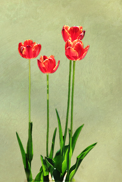
I love to combine photos, so I photograph textures all the time and have a library of over 2000 photos. (And, it's easy to change the color of a texture in PS as desired with a Hue and Saturation adjustment layer clipped to the texture).
But there's another good option. As it turns out, PS has a wonderful free add-on for textures. It's called Adobe Paper Texture Pro, and it probably is still a free download that you can search for. I've had it for a long time. Once downloaded, it lives under Window / Extensions in PS. Aside from providing some very nice textures (which you can replace with your own), it also does much of the work (resizing, blend mode adjustment, and adding a mask) of applying one or more textures to a photo. This image was created using the pistachio texture.
Posted: 06/02/2020 20:51:13
I couldn't resist playing with your image. My changes involved the following:
After cutting out the flowers quickly with adjusted Select > Subject, I duplicated the underlying sunflower image, and blurred the lowest level one. The upper level sunflower layer is at 64% opacity in Hard Light blending mode. I then applied a Selective Color adjustment layer to the images below the top sunflower layer. In that, I maximized the yellow slider and lowered the black slider to -72%. I also lowered the black slider to -20% on the Neutral scale. I then applied a Selective Color adjustment layer to the tulip layer, and clipped it to that layer (alt click on line between adjustment layer and underlying layer). In that adjustment layer, I lowered the Cyan slider to -65%, to bring out the reds. I also upped the Black slider to +14. Posted: 06/04/2020 20:26:39
The sunflower is very soft and does not stand out from the background. It might be worth trying to increase the contrast in the flower to provide some separation from the background. Also, a tighter, perhaps square crop would be flattering. Posted: 06/12/2020 18:30:10
One thing I often do is take the edited image, overlay it on itself, play with placement, size, toning and blend modes. Using the tulips, or part of them as a texture overlay could yield some interesting results. Posted: 06/19/2020 00:30:04