David Henderson
September 2020 - Stables
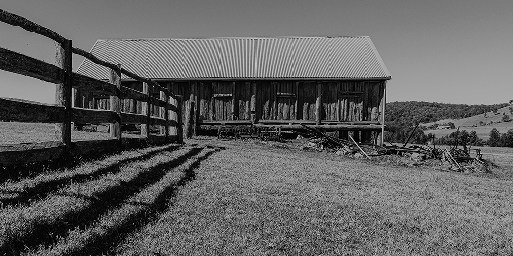
Original
About the Image(s)
I used my Canon 5D iv with a 24-105mm lens
I took this image at a rural area north of Newcastle NSW
ISO 200
Speed 1/200s
F13 at 25mm
Used photoshop to edit and crop the image and then turned it to a Mono image using Nik Silver Pro.
This round’s discussion is now closed!
10 comments posted
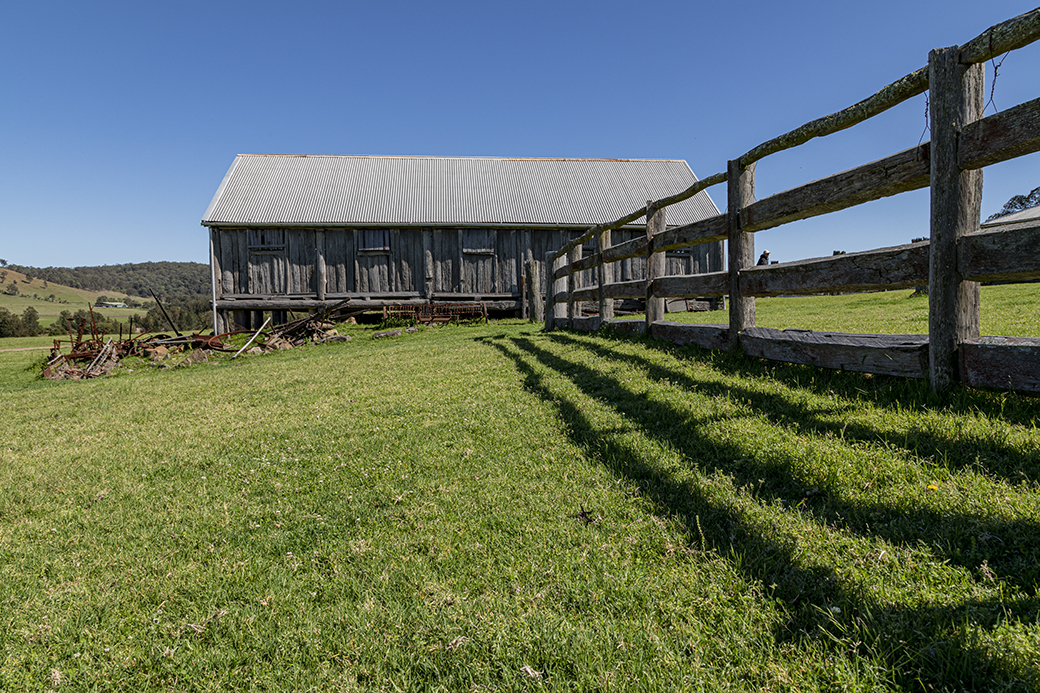
Coronavirus has tainted city life and millions are already fleeing metropolitan areas for a quiter and safer life.
With your photo, I find myself jealous of self-isolating countryside life. Meanwhile, I saw some rusted farm machineries which are so interesting for me. You could enhance the contrast a bit and I will appreciate if you could kindly advise us about your camera settings e.g. aperture. Thanks for sharing David.
Posted: 09/01/2020 11:34:00
Hi David,
Thank you for sharing. A peaceful image.
I like your choice to flip horizontally to create leading line from left bottom to upper right. It helps my eyes to arrive at the back ground subject.
I agree with Ata on the contrast, you have a lot of mid tones dominated in the image, so my eye cannot stay long in the area with same tones.
I was curious what make you take this shot. Posted: 09/01/2020 20:55:27
Thanks for the input, I have made some adjustments to add some contrast to the image, Posted: 09/01/2020 22:47:07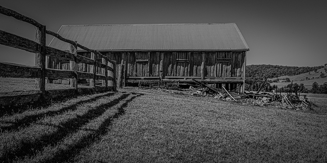
A good work full of story and pastoral scenery.
Too much mid-gray and lack of bright white make the work dull. I prefer color originals. Posted: 09/03/2020 20:12:29
Too much mid-gray and lack of bright white make the work dull. I prefer color originals. Posted: 09/03/2020 20:12:29
(Group 36)
I like your composition an the mirroring of the subject. However, as commented by the others, the contrast is too low, even with the last issue. My suggestion is to use dodge and burn in Photoshop and particularly increase the highlights in the stable wall and the area in front of the stable. The roof could be either darker or lighter to give contrast to the sky. I would try with darker first and see if that works. That will attract the attention to the main subject. Posted: 09/03/2020 23:38:17
I, too, like your composition and flip of the image. I like the adjustments you made to the second image. I think they give the image a moody, lonely feel. Posted: 09/14/2020 11:45:42
(Group 32)
The fence line and barn are a very strong composition.
I am not very good at color adjustments into monochrome, but I thought the sky needed to be darkened a bit, so I tried to apply a red filter in post-processing. Then I brightened the image overall, lightened the shadows a bit, darkened the highlights a bit. Maybe I overdid these last two steps. How does this look? Posted: 09/14/2020 17:27:07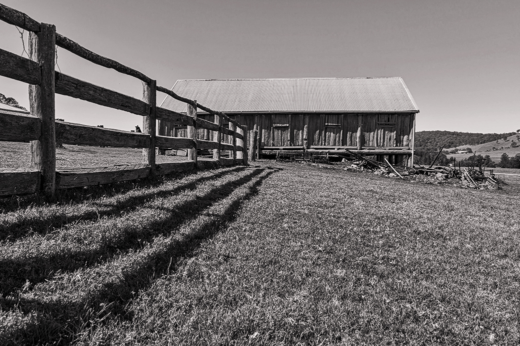
I am not very good at color adjustments into monochrome, but I thought the sky needed to be darkened a bit, so I tried to apply a red filter in post-processing. Then I brightened the image overall, lightened the shadows a bit, darkened the highlights a bit. Maybe I overdid these last two steps. How does this look? Posted: 09/14/2020 17:27:07
Thanks Stephen, the overall effect of your changes is differently and improvement on my last attempt. Posted: 09/14/2020 20:31:29
Nice country scenery .
May I ask a question ? What is your main subject ?
The fence, the house or the lawn ?
I would name the colored version: Peaceful lawn in front of the farmhouse.
To me, the BW version is all about the fence because this is what catches my eyes.
Overall, I feel that the farmhouse need something more to make it the center of attention. May be if the roof is darker ( or if the sky is darker), or if the farmhouse has more texture it will stand out a bit more.
This is only my humble opinion and I know that I am kind of different . LOL ! ! ! Posted: 09/24/2020 09:23:20
Thanks Angela
I was trying to frame the image as the fence was to be a leading line to the stable, but I failed to make the stable stand out.
Posted: 09/24/2020 22:47:23
I was trying to frame the image as the fence was to be a leading line to the stable, but I failed to make the stable stand out.
Posted: 09/24/2020 22:47:23