Arne Skinlo
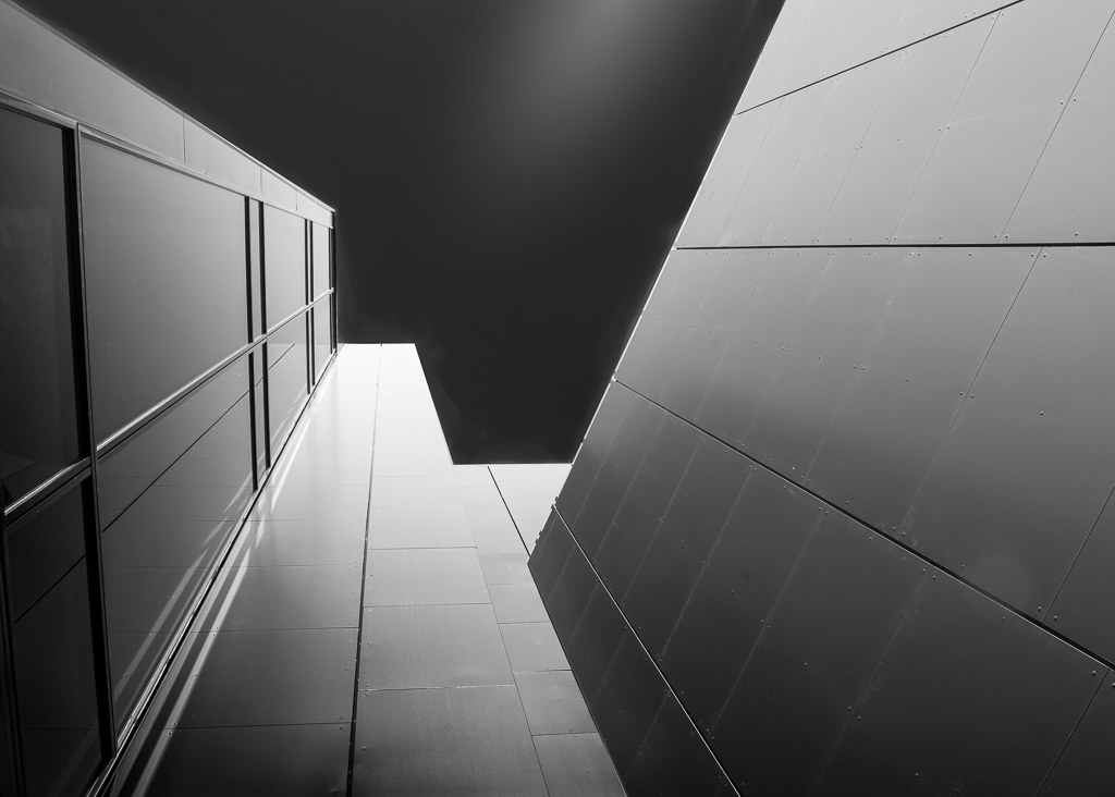
May 2019 - Contrast and gradients
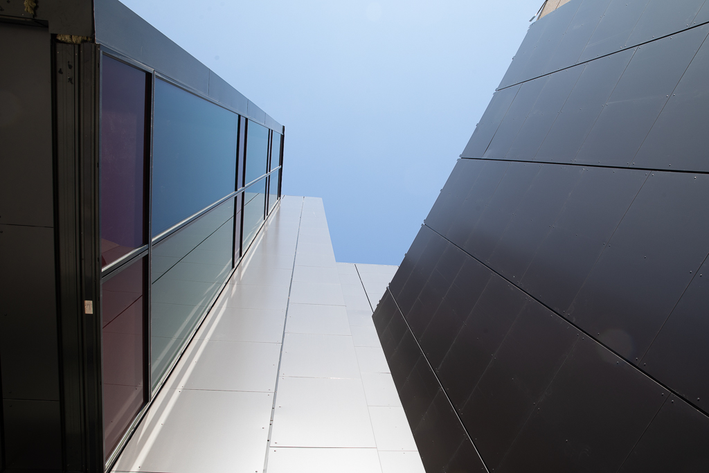
Original
About the Image(s)
I just read a book about Black and White Architectural Fine Art and tried to make something similar. The picture is taken at a shopping centre in my neighbourhood. The point here is to make contrasts and gradients that work together.
Camera: Canon 5D mark 4 with 24-70 mm lens at 24 mm.
Settings: ISO 160, Shutter: 1/100 sec, Aperture: f. 11
This round’s discussion is now closed!
3 comments posted
(Groups 51 & 52)
I think you achieved your goal. The architectural lines lead the eye up and the conversion to black and white enhanced the image. For me I would like the sky all dark by taking out the splash of light. Posted: 05/09/2019 17:29:48
I think you've done well Arne. I don't have an understanding of the gradients function in PP, but I like your results. Wondering about Pamela's suggestion of removing the bit of light from the sky - thinking the total blackness would have the ability to confuse the viewer - am I looking up, or down? Posted: 05/12/2019 11:34:40
I like the detail on the buildings. When I look at the original, I see a lot more glass than the monotone. To me, in the second image, the building looks more like metal than glass. I like how you cut out the small part on the right side of the image. In my monitor, it appears that there is a small area in the middle of the image that was not masked and darkened. Posted: 05/13/2019 14:59:45