Theresa Rice
April 2021 - Into the Rain
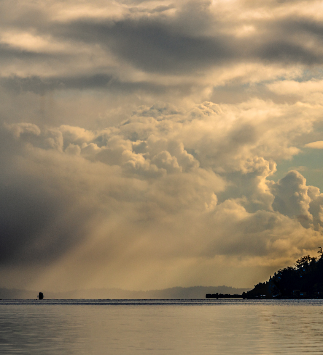
About the Image(s)
The small square shape on the horizon is a container ship, headed from out sunny clouds into what looked like rain clouds over on the east side. Sony A7riii, Tamron 70-300 at 196 mm, f-9, ISO 100, 1/2000 second.
This round’s discussion is now closed!
10 comments posted
You have a great subject here and did you best to capture it. Unfortunately, in my opinion, it lacks sufficient contrast, colors or even black and white contrast to capture my attention. In theory, the sunrays could have worked but they didn't illuminate the image enough to make a significant difference. The land on the right and the ship on the horizon are placed nicely but due to the unfortunate lighting just appear like dark smudges. I also wish there had been more contrast to the clouds to make them really pop. You had a perfect composition but due to the lighting that was out of your control the image, in my view, fell flat. Posted: 04/02/2021 08:11:27
It's a very powerful presentation, the sky and the comparison of sky v.s. landmarks. I like the portion of sky with land/ocean and that makes the focus on the sky. I can't identify the ship till read your comment. I agree with Mike on the sky contrast but that can be adjusted with PS. Good job. Posted: 04/16/2021 19:20:49
Based on your comments, I went back to the original and started again. Part of the redo was moving the whole image to the right, which also dropped off the unidentifiable ship. Posted: 04/21/2021 22:51:37
I think your revisions nailed it. Good work. We're heading up to the San Juan Islands in early June, with plans to stay on Orcas Island about a week. Hope to emulate some of your nice captures. Posted: 04/22/2021 10:46:46
Thanks! Hope you have a great visit. Posted: 04/22/2021 10:53:17
I like this one much better. Is the blue color too much? Try reduce the blue a bit? Posted: 04/27/2021 17:07:15
Try B&W? Maybe a good candidate. Posted: 04/27/2021 17:08:01
I can try B&W - thanks for the suggestions. Posted: 04/30/2021 01:22:22
I like the image. I don't find that lack of clarity in the ship takes away from it. It is very much how I feel that ships in the distance look. I do agree with Mike about the pop. I think that the revised image supplies that. I love images of the ocean in all its moods and of ships. The subject matter by itself grabbed my attention. Posted: 04/30/2021 08:39:08
Thank you, Paul. Improving images is what this group is all about, isn't it? Posted: 04/30/2021 10:08:52