Lynne Hollingsworth
November 2020 - Dome Light
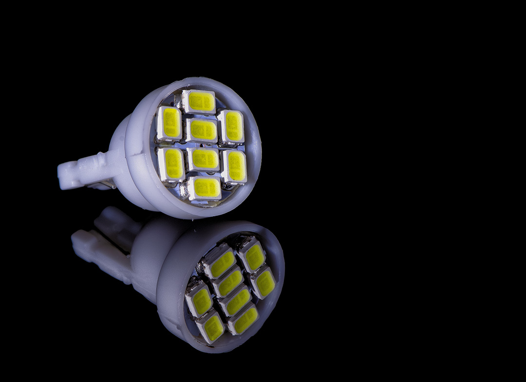
About the Image(s)
I found the little dome lightbulb in the back of the kitchen drawer. It attracted me because it had interesting elements such as the eight LEDs. It's small - if you hold up a penny it obscures the bulb.
The image has been cropped and sharpened in NIK software as part of my normal workflow. I flipped the bulb horizontally because it seemed awkward in the original orientation. Does the composition work? The black reflective surface is actually my cell phone. The sides of the LEDs are white, but do you think they appear blown out? The histogram didn't reveal any blowouts, but perhaps the light is too strong?
Looking forward to your opinions.
This round’s discussion is now closed!
7 comments posted
(Group 63)
I really am enjoying this image. I think that the composition and exposure work and have no issues which what you have presented. I like the sharpness of the main subject and appreciate the falloff in sharpness toward the back of the subject. To my mind, this aids in adding a sense of depth to the image. The image as a whole has a sort of technological appeal, and I love the style of the presentation (similar to many of my images so it must be great, RIGHT? :) ).
I think that this image does highlight on of the unique aspects of macro-photography, that being to show us everyday items in a new and perhaps unseen manner. Nice Job
Posted: 11/12/2020 13:14:38
I think that this image does highlight on of the unique aspects of macro-photography, that being to show us everyday items in a new and perhaps unseen manner. Nice Job
Posted: 11/12/2020 13:14:38
Thank you Charlie for the good words. This was an exercise that reminded me to slow things down, enjoy what I was photographing and pay attention to the lighting. Posted: 11/14/2020 06:47:52
(Groups 20 & 79)
Lynne, I love it. The angular placement of the flashlight, against its reflection creates a dynamic tension.
Only one suggestion. The negative space in the image is black and merges with viewing screen. If you placed a one or two pixel white border around the image, we could easily see the boundaries of the image. Posted: 11/13/2020 16:58:15
Only one suggestion. The negative space in the image is black and merges with viewing screen. If you placed a one or two pixel white border around the image, we could easily see the boundaries of the image. Posted: 11/13/2020 16:58:15
Yes Peter I completely agree about adding a border. Posted: 11/14/2020 06:40:28
Great orientation and lighting.
The reflection is darker than the original which is exactly what it should be.
The decrease of sharpness from front to back is great too.
Usually I lower the white point until I can see texture if I am working on organic subject such as an orchid...I would lower the white until I can see shimmer on the petal because if texture is not seen than people will think that the area is over exposed.
However, in this image the white is just fine because I do not always expect to see texture in those areas.
Thank you very much for sharing. Posted: 11/16/2020 14:10:20
Hi Lynne,
I like this image a lot. The "bulb" is well placed and the details are both clear and interesting to look at. I don't feel that anything is blown out. The reflection is terrific...just the right level of brightness and clarity. The lime green adds to the interest/attraction factor.
Nancy Posted: 11/17/2020 13:10:26
I really like the composition and how the bulb slowly goes out of focus as you into the scene, especially in the reflected image. I agree with Nancy about the green color of the LED's....they really are interesting to look at. To my eye, the white sides are a little blown-out. They do look distracting to me. If they are a polished surface there may not be much that you can do about that either when collecting the image or in post processing. Posted: 11/26/2020 12:15:59