John Roach

March 2023 - Daffodil
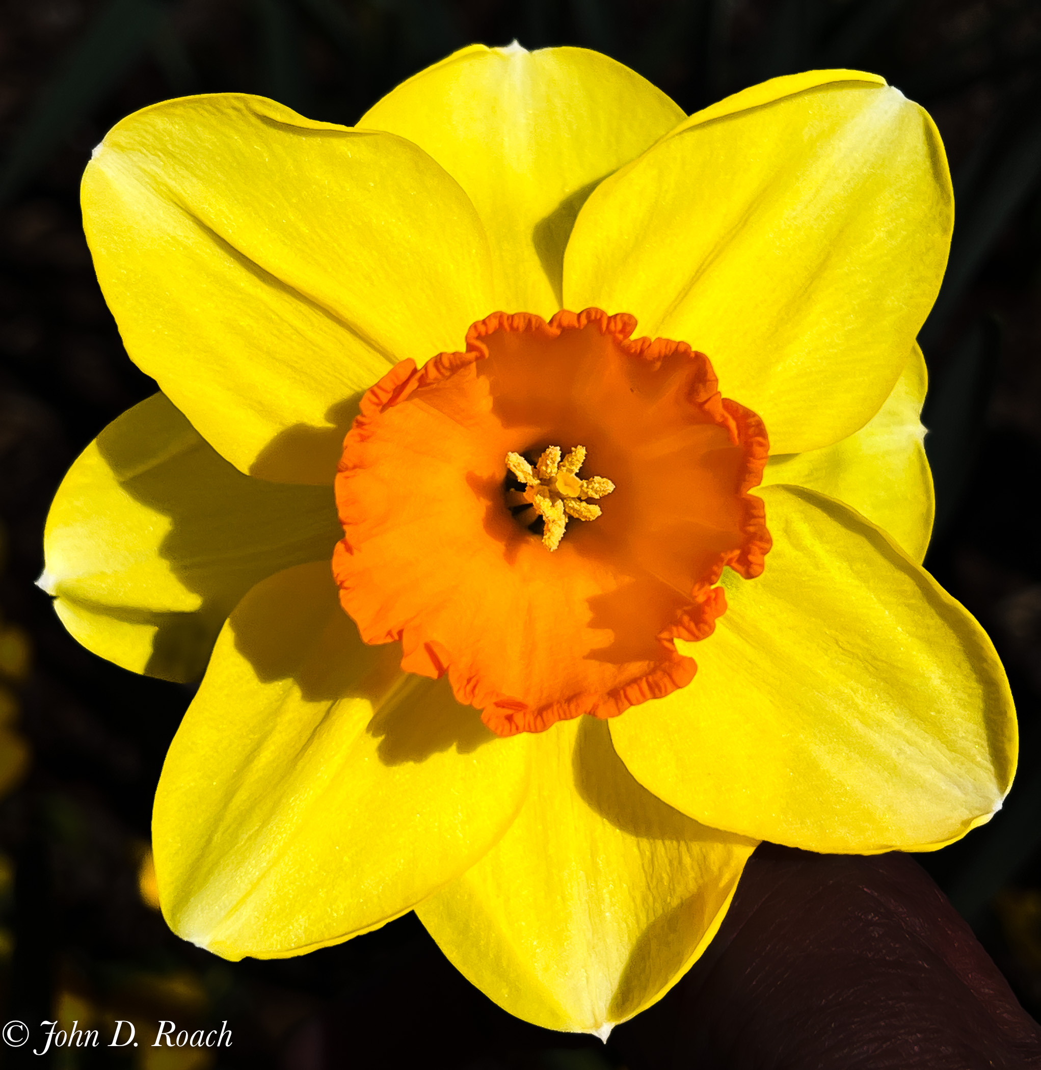
Original
About the Image(s)
I photographed this daffodil at Lewis Ginter Botanical Garden this past Sunday. I bent over and used my right hand to left up the blossom so that I could use my iPhone 13 Pro to photograph it.
I used Lightroom new selective background feature and turned it black with exposure and black adjustments so that I could get rid of the busy background and my lower part of my forearm that was holding the stem. I think use DxO Nik Silver Efex to create the monochrome. I used the High Dynamic Range Soft Monochrome filter and adjusted slightly it Lightroom after importing back into Lightroom.
This round’s discussion is now closed!
5 comments posted
Much to my surprise, I've got to say that I really like this result.
Why surprise? Because my normal "rule" says "if colour is important, use colour". But here is an exception. The resulting limited number of grey tones (predominantly 4 or so I reckon) gives the shape and form that we love in mono, and the less dominant greys give lovely texture in the petals. The detail in the edge of the cup are so much clearer in the mono, a beautiful texture. I'd have loved to see more photos taken at different angles - I like the bird's eye view, but I want more!
Daffodils are starting to come out here, I know what I'm going to do!!
Super, great vision, John.
Posted: 03/08/2023 01:57:25
Wow, I would never have thought to turn a flower image into monochrome, since the color of the flower is what usually attracts you to the flower. In this case, you have achieved a great image and given me something more to think about in photoshoots! Posted: 03/10/2023 10:30:01
The best features are the strong side light bringing out the textures and the tonal contrast between the center petals and the outer petals in my opinion. Very nice detail, especially for a handheld i-phone image. I might have saturated the orange before monochrome conversion to increase the contrast even more.
Posted: 03/11/2023 12:48:14
Posted: 03/11/2023 12:48:14
The side lighting works well to bring out the textures and provides definition especially around the edge of the petals which accentuates the shape as opposed to it appearing flat and one dimensional. I like the detail in the centre. What about a tiny bit more detail in the bottom three petals as there are a few spots there that may benefit with a little dodging. Square format works well. Posted: 03/11/2023 22:20:57
It's all been said. I agree that, surprisingly, the mono version is more interesting than the original. The delicacy of the outer petals and the fringe of the center as well as the three dimensionality created by the shadows make this outstanding. Posted: 03/26/2023 20:45:14