Don York
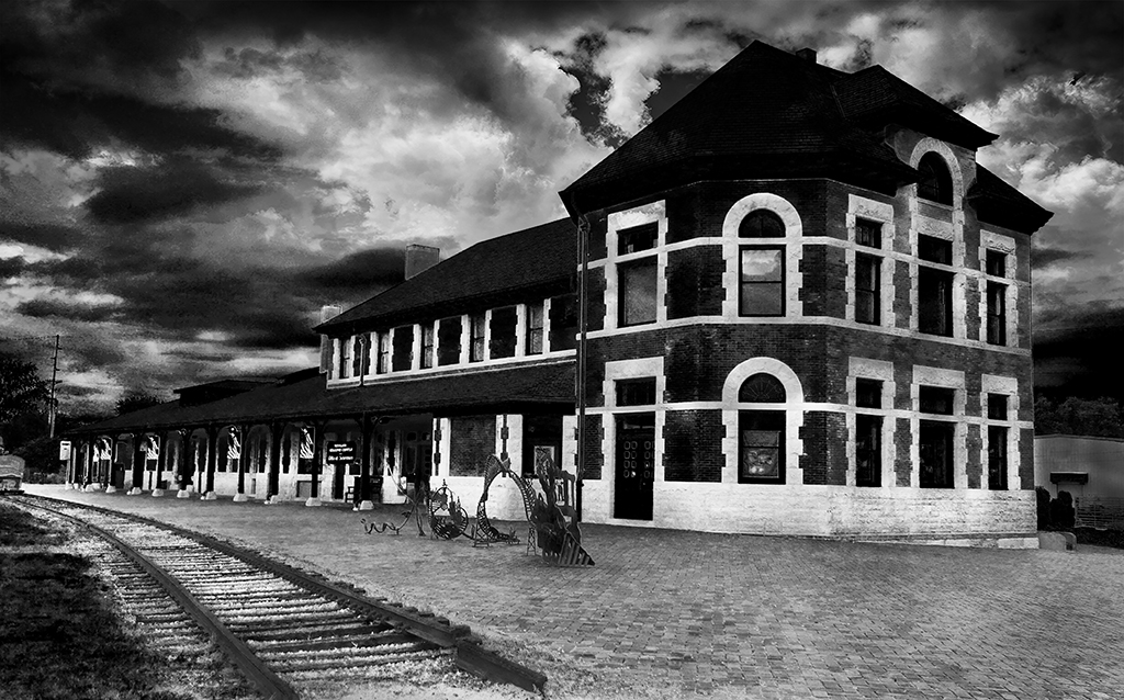
July 2017 - Old Train Station, Sedalia, Missouri
About the Image(s)
It is the old train station, at Sedalia, Missouri. It was taken with a SONY DSC-RX100 at f2.5, 1/80, ISO 125. The sky was added from a different image in Photoshop.
This round’s discussion is now closed!
7 comments posted
I like the rails and the textures of the cobblestone surface. The different heights of the areas of the building provide a lot of interest and you highlighted the most interesting highest part of the building with the rest providing depth. When you replace a sky you have the option of enlarging, shrinking, or positioning it where you want it. you have picked a position to highlight and give good separation of the building from the sky. There seems to be a bit of perspective shift with the building growing a bit wider at the top. I think I would play with this a bit, but it is a very nice shot. Posted: 07/10/2017 06:59:19
An interesting image, I like it too. The sky adds lots of drama. There seems to me to be good sharpness and overall, a nice range of tones. The leading lines bring my eye towards the focus of attention which to me is the front part of the building, so it gives me a nice punchline and stereoscopic effect. I agree with Stan, the building does seem to grow a little to the top - have you corrected converging verticals to get them bang parallel? Although personally I like the result, it pushes my eye to the dramatic sky.
I find the rolling stock on the left edge rather distracting, I'd definitely crop it out. The modern sculptures seem out of place to me, I'd have had a bash at cloning them out. I can't figure why I can't see more detail in the roof, it should be well lit by the sky and showing some detail. Can you recover any detail there? Posted: 07/11/2017 14:56:45
I find the rolling stock on the left edge rather distracting, I'd definitely crop it out. The modern sculptures seem out of place to me, I'd have had a bash at cloning them out. I can't figure why I can't see more detail in the roof, it should be well lit by the sky and showing some detail. Can you recover any detail there? Posted: 07/11/2017 14:56:45
I like the image compositionally and find nothing distracting about the image and rather like the subject. From a purest monochrome conversation perspective, I think the blacks are a bit overwhelming in the sky and thus even makes the front main roof seem even more dark. You might consider lightening the that portion of the roof to be more in balance the rest of the roof as well as toning down the black in the clouds. Posted: 07/13/2017 21:09:38
Somber is the word that comes to mind when I view this image. The dark tones on the building emphasize the white outlines of the windows, which I see as the main subject of the image. I would like to see some more detail in the stone work. The sculpture and track provide important environmental information about the station. I suggest a lighter treatment of the clouds on the left side of the image. Posted: 07/16/2017 12:37:12
I think Jerry's comments are right on. The image is a bit too "somber" I think. Pure black is fine in things like a sky where often if there is "detail", it is really just noise to me, but getting some detail in the stone work and the roof would improve this image. I still really like the composition and it is a building of interest.
Another interesting point is when does a dramatic sky contribute interest to an image, and when does it distract? I am not sure of the answer to that question on many images, but it seems like judges really like them. Posted: 07/16/2017 15:21:34
Another interesting point is when does a dramatic sky contribute interest to an image, and when does it distract? I am not sure of the answer to that question on many images, but it seems like judges really like them. Posted: 07/16/2017 15:21:34
I like the mood you have created. The darkness creates an ominous feeling almost creepy. I do also like the angle withe railway lines running in parallel with the building. It makes for an interesting image. Posted: 07/27/2017 20:36:36
Beautiful image with good tonal quality and depth. I liked the drama in the sky. However, I find the metal pieces in front of the building distracting. Also if you can bring out some details from the roof of the building at the front end of the image. Posted: 07/31/2017 00:22:32