Mary Hinsen, BPSA
October 2020 - Untitled
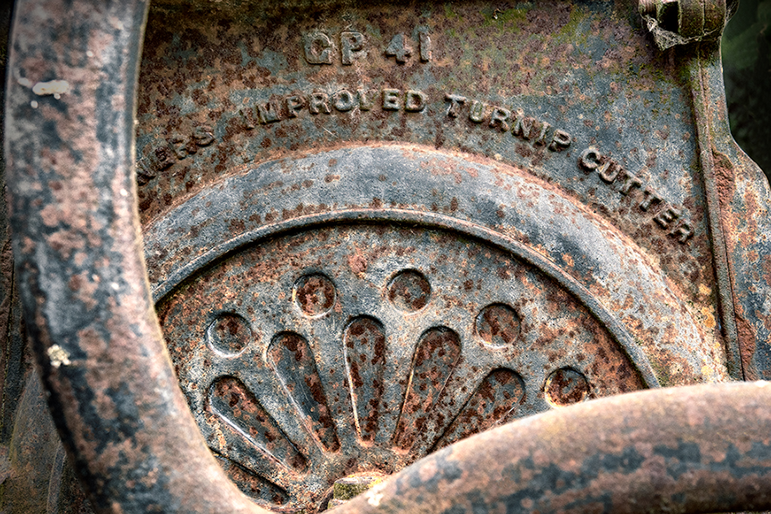
About the Image(s)
I took this image on the same trip out to a historical cottage that my previous image came from. There was a lot of interesting old equipment, and this is one that I liked.
I cropped in slightly, and then just used a series of adjustment layers. I increased contrast and selectively lightened and darkened using levels. I then darkened the background with two gradient layers to bring out the turnip cutter. I colour graded using a LUT to bring out the rust colours.
I tried this in black and white, but prefer the colour version. I look forward to your thoughts.
Kia pai te rā
Mary
This round’s discussion is now closed!
7 comments posted
Love the textures and rust. You did a wonderful job with your post processing. The focal point is nice and sharp. However, the foreground is out of focus and, for me, detracts from the great processing and details. Maybe a closer crop, eliminating the left and bottom would work. I also added a little saturation and contrast to make it pop. Posted: 10/12/2020 10:18:18
I don't think black and white would work either. I think the dappled colors of the rust help make the image interesting. I see Cindy's point with the crop because those foreground images are blurry, however I kind of like them there. They frame out the image for me. Posted: 10/12/2020 10:32:38
I love old rusty stuff to photograph; rust gives such great texture. I'm glad you were able to get the text in focus, really helps tell the story. Not sure what f-stop you used, seems like there is fairly shallow DOF. I understand what what Cindy is saying about those out of focus elements in the foreground but I agree also with Jessica that they help frame the image and maybe their curved nature was one of the things that attracted your attention. Since they are fairly bright also, maybe making them darker would keep the viewers eye moving toward the middle. Their shape almost makes be think that maybe when this machine operated, these things rotated. So if you wanted to get really wild, if your software can do it, add a motion blur just to those elements. Would expand your storyline if people thought the machine was operational. Just sayin........ Posted: 10/13/2020 16:46:15
I agree with Cindy's suggestion, although when I first looked at your image, my eyes went to the middle and the letters above it. The colors are beautiful. Posted: 10/13/2020 18:02:11
(Groups 22 & 80)
I agree with Cindy's version. The foreground is too prominent and out of focus. It's really not needed for the impact of the image. This is more of what I expected from a "close-up" image. Nice job. Posted: 10/24/2020 21:08:16
Built to last. Great subject with identification. May I suggest taking several shots at different focal points and focus stacking so everything is in focus. It's really very easy.
The patina give the subject character. There's beauty in everything. Great job. Posted: 10/25/2020 11:53:51
The patina give the subject character. There's beauty in everything. Great job. Posted: 10/25/2020 11:53:51
Very nice sharp image. I liked the focus on this, it draws your eyes to the top of the image where the text is. It kinda frames it. Posted: 10/26/2020 09:19:56