Marcela Stegemueller
March 2019 - Untitled
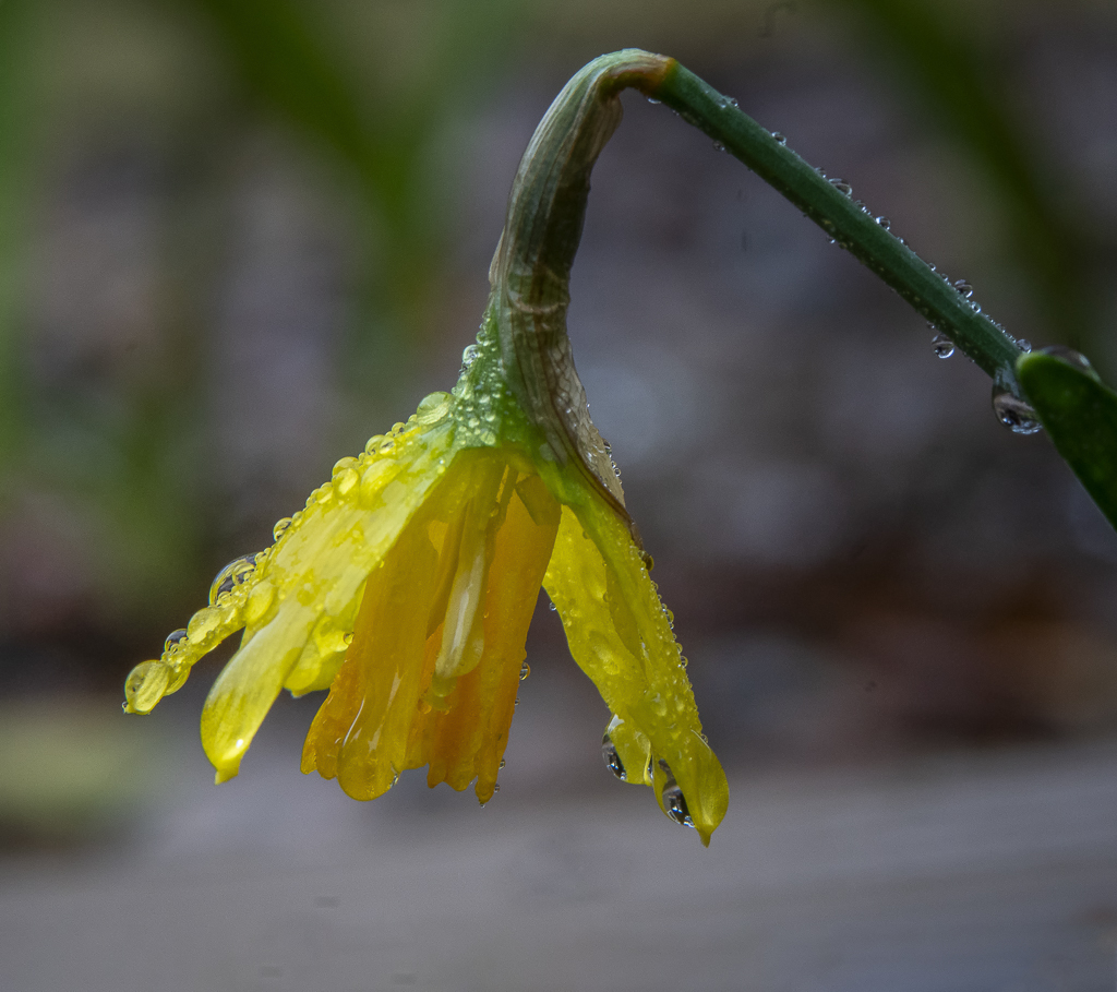
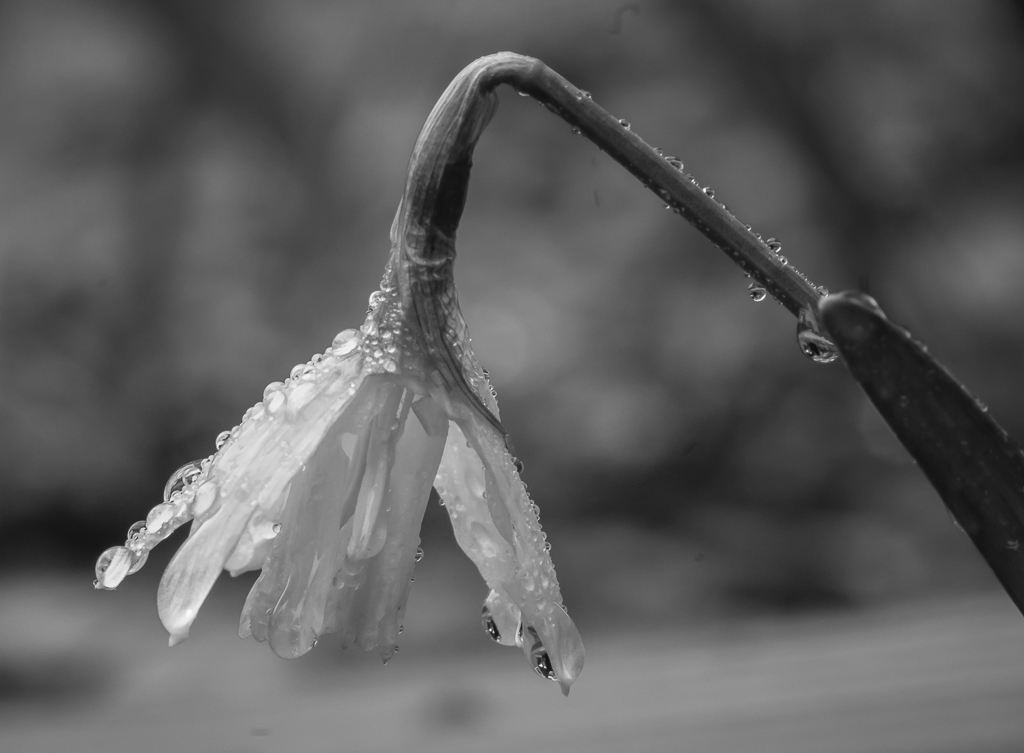
Original
About the Image(s)
HOW I DID IT
On a gorilla pod, shutter speed 1/25 sec at f/11 and ISO 1600. I think this is an early daffodil bearing heavy due, early overcast morning. I photographed first in color, cropped it, did basic adjustments, used Dfine in NIK. I made a virtual copy of the raw image and converted it to black and white, and cropped it differently. I think the image has possibilities. Which one is better and what can I do to improve it?
This round’s discussion is now closed!
5 comments posted
I like the monochrome version the best. For me, the water droplets show up much better and they make the image. The flower seems a little soft, I wish there was a little more detail. I would suggest darkening the background to make the flower "pop". Posted: 03/07/2019 20:51:19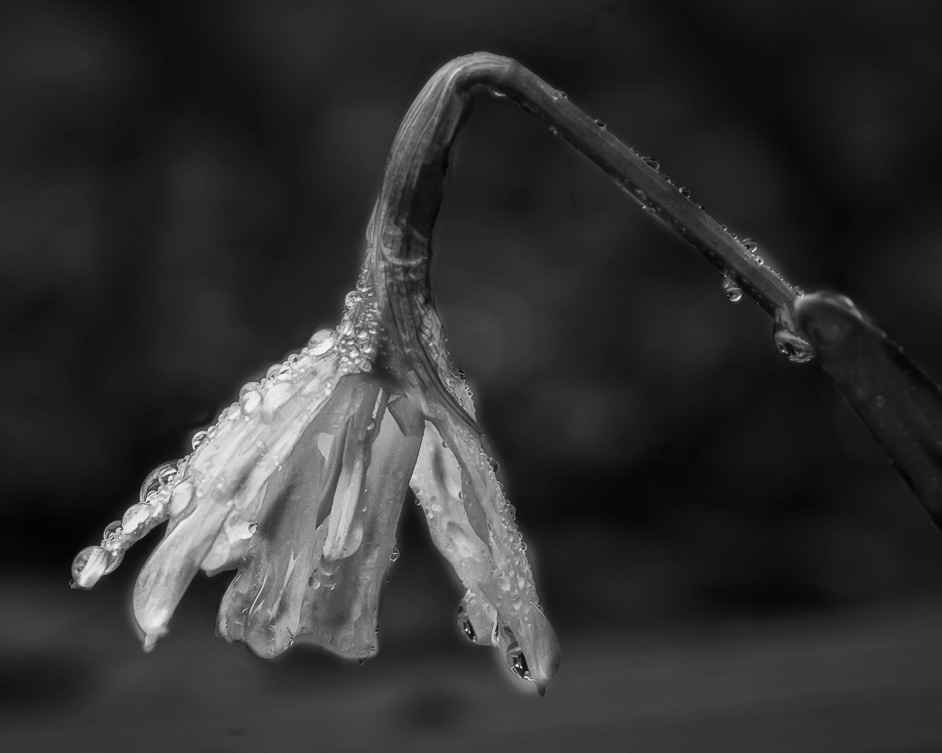
I love the colors in the original version - they almost look frozen. If you could desaturate the background greens a little bit then the color version would be my favorite. Very moody & interesting shot! Posted: 03/09/2019 12:15:16
Hi Marcela - I like your monochrome version, it's different and shows off the water droplets as Cindy says.
I would like to see the flower a little whiter and the background a little darker, it would stand out better. Lovely image :) Posted: 03/09/2019 17:00:19
I would like to see the flower a little whiter and the background a little darker, it would stand out better. Lovely image :) Posted: 03/09/2019 17:00:19
I think either version works, but with the monochrome version I think you need to get better contrast. I agree with Cindy that the flower starts to blend in with the background a little too much, so you either need more definition on the flower or darken the background. Posted: 03/21/2019 14:25:45
I would try and add a little clarity, sharpness, and contrast.
Also, darken the background. Posted: 03/25/2019 09:25:24
Also, darken the background. Posted: 03/25/2019 09:25:24