Gerhard Geldenhuys
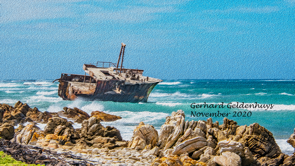
November 2020 - Shipwrecked
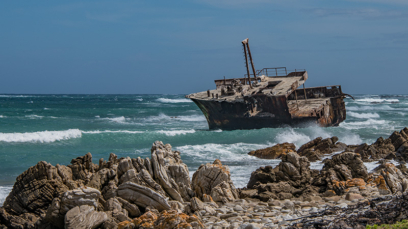
Original
About the Image(s)
The image was all done in PScc and I worked in layers and applied the oil paint filter.
This round’s discussion is now closed!
6 comments posted
The oil paint filter can sometimes be "too much," with large, distracting, flowing strokes that won't fit the image. That is not the case here; I love the small delicate strokes, especially in the water and sky. "Flipping" the composition was also a great choice. The only thing I might change is to clone out the green grass on the lower left. Then, it might look like the shipwreck occurred on a rocky outcrop well at sea, rather than right offshore. This is a well executed painting - great job. Posted: 11/12/2020 13:38:06
Thanks Cindy Posted: 11/18/2020 06:11:06
Nice composition with the turning and moving of the ship. It gives important space for the ship to travel in if it could. I agree with Cindy's thoughts on the bright green grass. The color tends to draw attention to it, but when I took it into Photoshop and applied a B & W filter the green was in the right tones so the eye still does go to the white and leads in nicely into your subject. Posted: 11/18/2020 15:59:27
I like the fact that you flipped it over to give the shipwreck some space to head from left to right. (Well, that is, if a shipwreck could move.) I like the gritty-ness of the rocks with this filter, but for me, it does not enhance the sky. (appears a bit like sandpaper) One thing I DO like about the sky is the lighter cloud-like streaks not apparent in the darker original.
Where did you find this shipwreck? It sure has just the right amount of parts left to look right inside while maintaining the outlines of a ship. Interesting. Posted: 11/19/2020 20:50:00
Where did you find this shipwreck? It sure has just the right amount of parts left to look right inside while maintaining the outlines of a ship. Interesting. Posted: 11/19/2020 20:50:00
I agree with all that's been said. The flip gives the leading line emphasis for the western eye. The oil paint filter you used was appropriate because everything in the image is "rough": the rocks, the water, the wreck. I also like the change in coloration of the sea and sky. To my eye, I would darken the rock pile at bottom right so it isn't fighting with the wreck for attention. I really like this image! Posted: 11/21/2020 11:14:11
So sad to see a fine vessel dying on a rocky shore. But the "savage" quality of the those foreground rocks conveys the danger the ocean holds for those you sail upon its waters.
Thank you for sharing this, nicely done. Posted: 11/21/2020 13:29:34
Thank you for sharing this, nicely done. Posted: 11/21/2020 13:29:34