Jeanine Leech
About the Image(s)
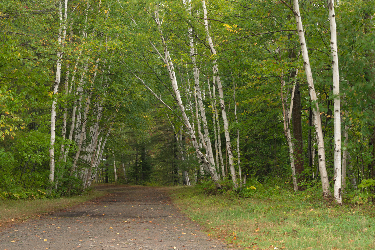
The fall foliage was still pretty green on my recent trip to the Adirondack Mountains so I decided to change that for my painting. I adjusted the color using Color Efex Pro 4 with the Indian Summer filter. This made the greens look more yellow/orange. I saved the image and brought it into Topaz Impression and used the Cave Dweller IV filter at 55% opacity to make the image look like a pencil/charcoal drawing. Lastly, I used Photoshop to darken the edges and saturate the colors a little bit.
This round’s discussion is now closed!
9 comments posted
Although I understand your good rationale for changing to a fall color pattern as I look at this image I see the dominant component being the branches and not the foliage.
Perhaps the foliage need to be brighter to make an impact. Posted: 10/08/2018 18:36:37
Perhaps the foliage need to be brighter to make an impact. Posted: 10/08/2018 18:36:37
Posted: 10/08/2018 18:36:40
I agree with Cyril's comments.
One of the things I like about your original is the pathway being a leading line to take us into the forest. When you made the tree trunks more prominent, you diminished the path (and also by making the path a muted color instead of the original contrasting color) and gave us many lines all competing for attention.
Perhaps if you decide on where you'd like our eyes to focus and then work out from there with your "fall" concept, it would be a more cohesive picture.
Posted: 10/11/2018 13:11:00
I love the warm color rendition, but I agree with Cyril and Kathy's suggestions. Posted: 10/11/2018 16:42:19
You took on a mammoth task when you changed the colors of the original which I believe you have done exceptionally well. There are some very good comments made by the group and maybe a challenge to have a relook at changing it ? Posted: 10/14/2018 01:29:24
Thanks everyone for your comments. I think sometimes we are too close to our own work and can't look at more objectively, so I thank you for the constructive critic. I wanted the fall color so much that I missed the fact that the path disappeared. I attached the image without the color alternation and the same Cave Dweller IV filter. Posted: 10/15/2018 20:00:41
I don't blame you for wanting to make the leaves look more "October", but I agree with the others that the path got lost in the warm tones. I really enjoyed the look that pencil filter added to the scene, though! Maybe you could strike a happy medium and just change a few of the foreground trees to yellow tones and let the ones back near the path's curve remain green? Posted: 10/22/2018 12:35:57
Jeanine, I guess I am the odd person here because I like the change of tones to yellow and the path is clear to my eye. What I think is missing is a bit of a vignette to draw the eye to the center. I put one on using a PS Lasso tool and curve to darken. I then removed the vignette in the lower left to force the eye to come in on the path . I like the way the vignette darkened some of the colors to enhance the red. Posted: 10/24/2018 00:12:17
Thank you, Nancy! I like what you have done with the image and I think the vignette is the perfect solution.
Posted: 10/27/2018 18:48:13
Posted: 10/27/2018 18:48:13


