Samuel Lane
March 2020 - Welcome to Philly
About the Image(s)
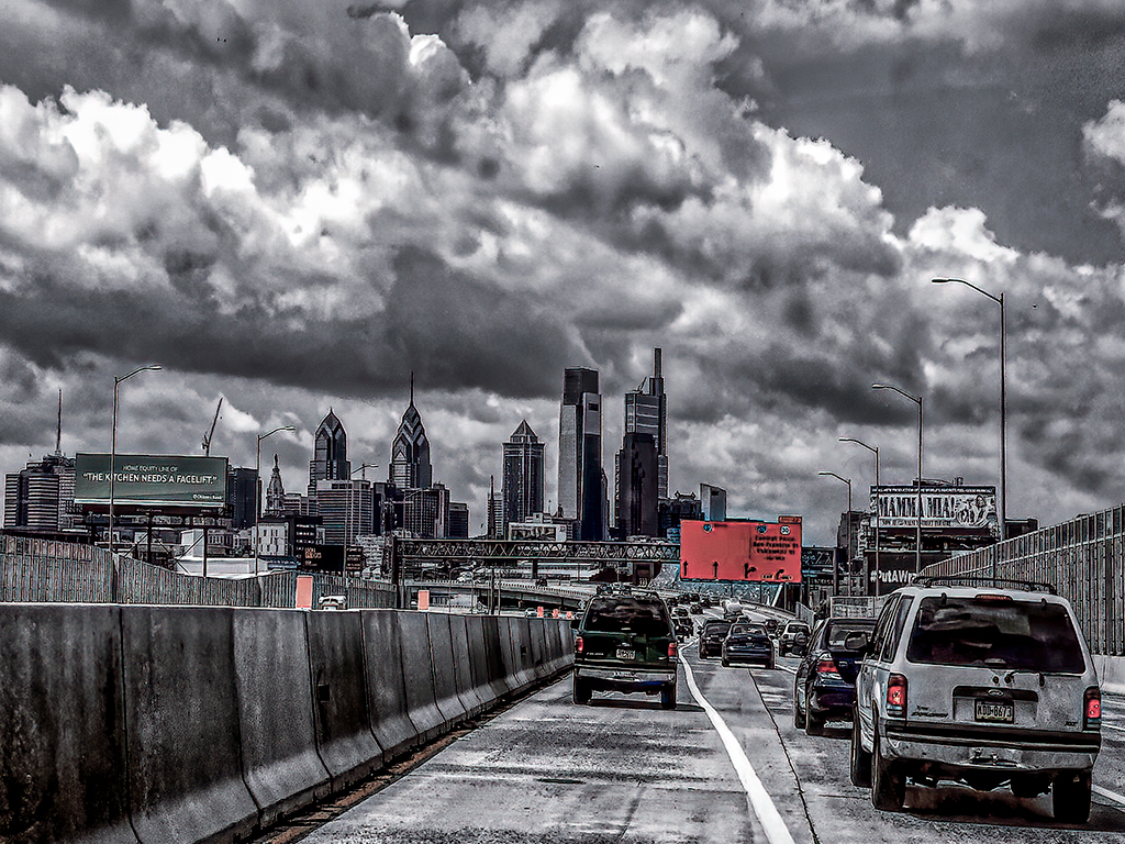
I took this photo on my phone edited using photoshop and topaz studio. I changed to black and white but muted some of the colors
This round’s discussion is now closed!
14 comments posted
(Group 38)
I'm going to break one of my own prejudices and say that this image is why I believe 80% of good photography is anchored to a good imagination. I love the selective colorization of this image. It's an over-baked HDR look that, when paired with the selective colorization, in my opinion, works great. To my eye, it is crisp in focus. I think the highway, as a leading line into the city, works wonders setting a foreboding mood. The hint of color suggests a faint hope. For me, I would like to see the "faucet" sign and some of the upper clouds cropped out. The sky, in my opinion, is too dominating. Just the opinion of another fickle photographer. Great image and imagination. Posted: 03/12/2020 13:01:06
Thanks
Posted: 03/15/2020 08:58:28
Posted: 03/15/2020 08:58:28
The spots of red add more drama to this impressive black and white HDR. Leading lines to the sharp skyline and then the full, dark clouds complete the dark mood. At first I thought about some cropping of the clouds, but they are so impressive and foreboding, I concluded that for me they help more than subtract.
Stay safe and well! Posted: 03/19/2020 13:07:57
Stay safe and well! Posted: 03/19/2020 13:07:57
Thanks Posted: 03/19/2020 20:44:36
As I look at this I feel like I'm tipping over a bit maybe redo the leveling of the photo? I'm not generally one to like spot color but I think for this treatment it works. Like has already been suggested the clouds don't help the image so I'd crop in tighter or cut them off a bit.
What was your thinking of adding the red back into the black and white? Posted: 03/21/2020 11:16:33
What was your thinking of adding the red back into the black and white? Posted: 03/21/2020 11:16:33
Initially it was just a generic photo with a road leading into the city but adding the mute colors to the signs and the markers on the jersey wall served as sort of leading lines into the photo. The orange markers on the jersey wall along with the sign in the middle of highway took you into the city and the others signs steered you around the photo. The clouds to me were menacing and gave a feeling of foreboding. But yes agree they are a little overbearing....but I like the feeling it gives when I look at it. Posted: 03/21/2020 14:03:56
The color way of Black/White bring more impression, but red sigh confusion the focus. Try to put apparent horizon in middle of image with leveling? Posted: 03/21/2020 14:13:52
Dennis not sure how to respond to the group but concerning the horizon. I adjusted the photo based on the leveling function in camera raw so when you and Matt say level do you mean bring the highway up so that it is level vice going down hill? Posted: 03/21/2020 14:45:08
(Group 38)
Samuel, it looks to me that the picture is level if adjusted for everything that should be vertical. All highways have a natural slope away from center to aid drainage. I'm pretty sure the picture would really confuse if you leveled for the highway. Some awkward visual effects naturally occur. This is one. I still think you did a great job taking an ordinary shot and making it very interesting. Posted: 03/22/2020 07:41:39
thanks
Posted: 03/22/2020 20:56:30
Posted: 03/22/2020 20:56:30
The image shows the entrance to a serious looking city, emphasized by the gritty look. I like the preservation of some muted color. I'm a fan of clouds, but some cropping, as suggested, would be helpful. Posted: 03/23/2020 14:08:36
thanks Posted: 03/23/2020 21:39:30
Interesting image, I don't have a problem with the color in the taillights, but the signs are a distraction. The contract is good and works well with the scene. The cloud are interesting, a tighter corp would help. Posted: 03/27/2020 13:43:27
Thanks
Posted: 03/27/2020 21:37:39
Posted: 03/27/2020 21:37:39