Sharon Prislipsky, APSA, EPSA  


Daybreak in the Badlands by Sharon Prislipsky, APSA, EPSA

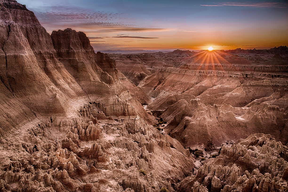
November 2020 - Daybreak in the Badlands
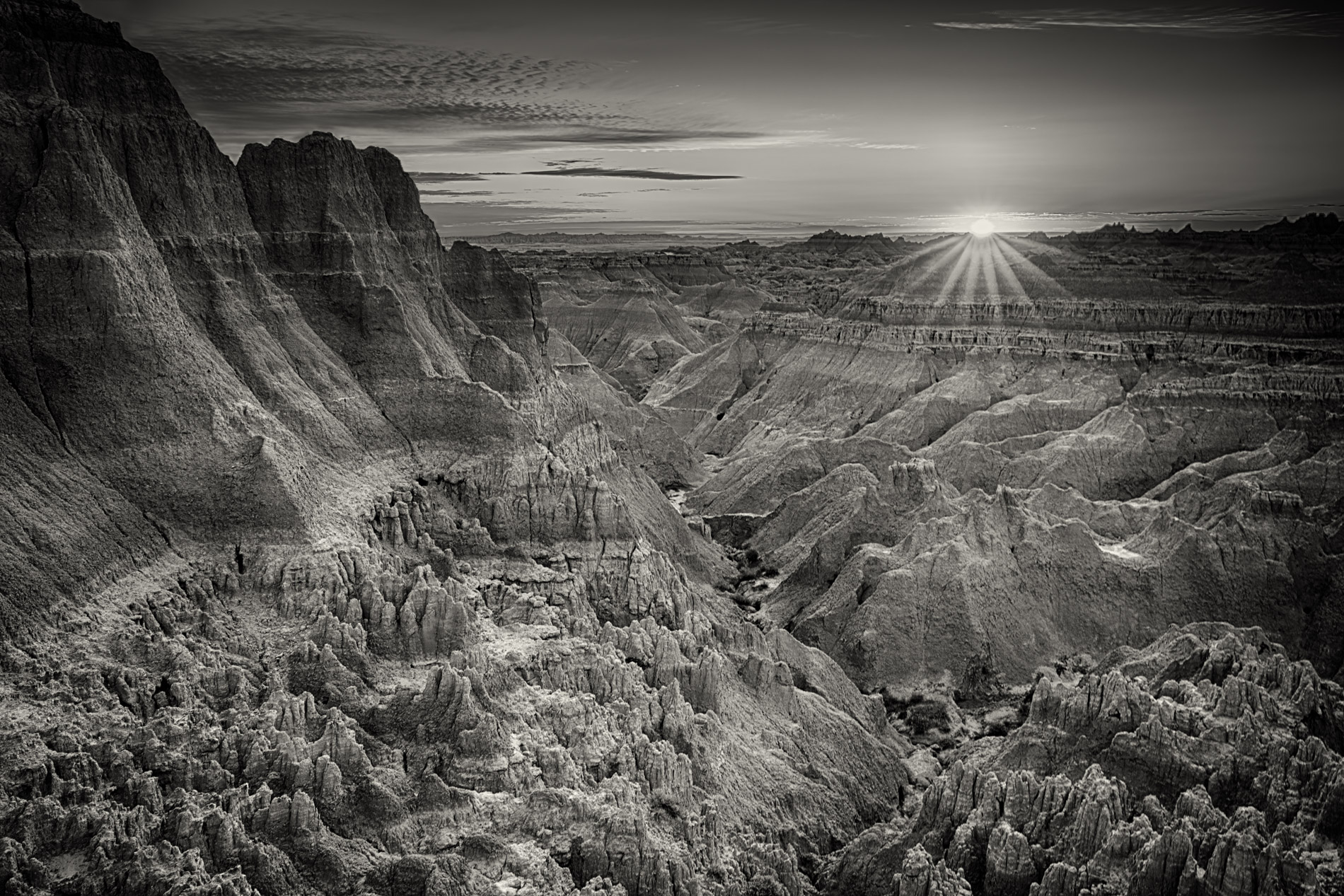
November 2020 - Sharon Prislipsky, APSA, EPSA

Original 1

November 2020 - Sharon Prislipsky, APSA, EPSA

Original 2

About the Image(s)

This image was made on a recent camping trip to Badlands National Park. It was captured with a Canon R5 camera and Canon RF 24-105 f/4 lens. I added a polarizer; the camera was tripod mounted and I made three exposures 1 and 2/3 stops apart. I compbined then in NIK HDR Efex Pro and used Topax AI to remove noise
In post processing I did quite a bit of dodge and burn, added dynamic contrast and applied a warm cool filter in OnOne.
I was concerned about the clouds in the top left - I thought at first they did not look realistic. I checked all three exposures which ranged from .1 sec to 3 sec.and they all have that same look, so I think that is just how it was.
The first origianal is the HDR without any adjustments. I also included a monochrome version and would like your feedback on that as well. I am hoping this image has competition potential.


This round’s discussion is now closed!
12 comments posted


Pamela Hoaglund   Pamela Hoaglund
What a beautiful image. I'm torn between the color and monochrome. I think they are both excellent and can stand on there own depending on how you want to use them. I would put either one on my wall. I think the monochrome does show the texture a little better; it's a matter of taste. The soft brown/gold tones and the sun star work well together. You were fortunate to have some clouds to also reflect the colors of the rising sun. I wouldn't change a thing and I would consider it competition worthy.   Posted: 11/07/2020 20:57:22
Sharon Prislipsky   Sharon Prislipsky
Thanks, Pam. I was indeed fortunate to have those clouds that morning. Otherwise, it was a mosty cloudless week. For once, Nature gave me a break.   Posted: 11/10/2020 08:08:56


Mike Cohen   Mike Cohen
This is breathtaking. What a scene! Of the three, I like the one you choose the best. One black and white looked too crunchy to me and the other too monotone. For this one, I would do a good bit of dodging and burning with the goal of adding more depth or dimension to the scene. Also, I find the darkness in the upper left, which is also on one of the black and white's, a bit distracting and would lighten it up a bit. All that said, you could do absolutely nothing and have a winner.

Your image gave me a great image to practice some luminosity techniques I've been trying to get good at. I made a mask for the shadows and one for the highlights and used them to do some selective dodging and burning.   Posted: 11/08/2020 08:35:41
Comment Image
Sharon Prislipsky   Sharon Prislipsky
Thanks, Mike. I think a luminosity mask is a good idea and I will do that. I apprefciate your thoughtful comments.   Posted: 11/10/2020 08:10:02


LC Boros   LC Boros
(Group 90)
I like the composition of the image as my eye is drawn across the entire image to take in multiple areas. I think the image, upon close inspection is over sharpened and the saturation in the foreground makes it very grainy. I like the original better as the colors in the valley allow the vegetation and surfaces to be seen: instead of warming the entire image, perhaps masking areas where the rising light is certain to hit and the allowing that to fall off and the greys of the deeper canyon sections to maintain a more natural state.

I think the monochrome version would benefit from greater contrast between the canyon floor and peaks on the left.   Posted: 11/09/2020 22:25:36
Sharon Prislipsky   Sharon Prislipsky
Thanks for your comments LC. Since reading your feedback I have gone back and taken a very close-up look, especially at the foreground. I have a 4K 27 inch monitor so I am able to look at it quite closely. I simply do not see the oversharpening and graininess that you are referring to. Is it compeletly across the foreground, or are you looking at a specific area? I am asking because I have hopes for this image and would go back to the original and try to correct this kind of a flaw. In this version what I see is very true to the actual textures in the landscape I observed. Any further clarification you can give me will be appreciate.   Posted: 11/10/2020 08:13:52
LC Boros   LC Boros
(Group 90)
I'm viewing the image on a 27" Retina 5K _BUT_ I did some testing and discovered something interesting/weird .

I'm pretty certain that the graininess I noted originally is a result as the website code wanting to fill my screen: as I download the image to pop it into my DAM tools to mess with and the lack of extreme grain was the first thing I noticed and the image was displayed at 1900  x 1267 with 240x240 RGB

If I click your image to view it in a new browser window/tab, the image is displayed at a substantially larger size/zoomed. The same is true for Judith's image for this month although that image at 3437  x  3937 is gigantic. I'm going through several other groups/images and looking for similar issues as I suspect it's a result of the website code trying to handle/display images and not getting it quite right.

Thus ignore my graininess comments! I do still wish a bit more of the vegetation registered in the valley though.

  Posted: 11/16/2020 13:05:33


Ally Green   Ally Green
What a wonderful vista....and a great place to be at sunrise. I like the Color image better than the monochrome. The golden colours of the sunrise accentuates the warmth of the rocks. They almost look as if they are in sepia. The clouds don't bother me and to me they add to the image. Definitely a competition winner.   Posted: 11/10/2020 13:23:59


Oh my, what beautiful photography and processing. Of course, this should be entered in Nature. There are many things to notice: The composition is wonderful. The sun is in a perfect position with perfect brightness. The rays take me down to the valley and ridges. I like how the layers take me around the image to investigate history of the land. The clouds are odd but not unnatural, and the blues enhance/cool the otherwise warm valley. When I view the image presented on the screen it seems smooth. When I open it to a larger view, it seems a bit over sharpened. I am curious if it is my screen or if others see this.   Posted: 11/11/2020 08:49:21
Sharon Prislipsky   Sharon Prislipsky
This question of oversharpening puzzles me, but I value your opinon. To me, it looks very realistic as there is just so much texture in those rocks. Would you be willing to let me send you a higher resolution image via email to take a look at and see what you think?   Posted: 11/11/2020 11:25:53
 
Of course. As I said, the one we see is perfect, and it looks different only when I click on it to enlarge it.   Posted: 11/11/2020 15:57:45


Judith Lesnaw   Judith Lesnaw
Sharon, this image is absolutely stunning!! The tack-sharp focus and perspective have produced a three-dimensional effect. That rising sun is dramatic and the sky is perfect. The warm color of the land blends with the sun's orange and can be seen in streaks in the sky. I much prefer the color version you chose. The original image shows two interesting streaks of sunlight on the rocks at the low left of center area. These are lost in the color and B&W versions.   Posted: 11/15/2020 12:10:36