Mike Cohen

November 2019 - Enchanted Canyon
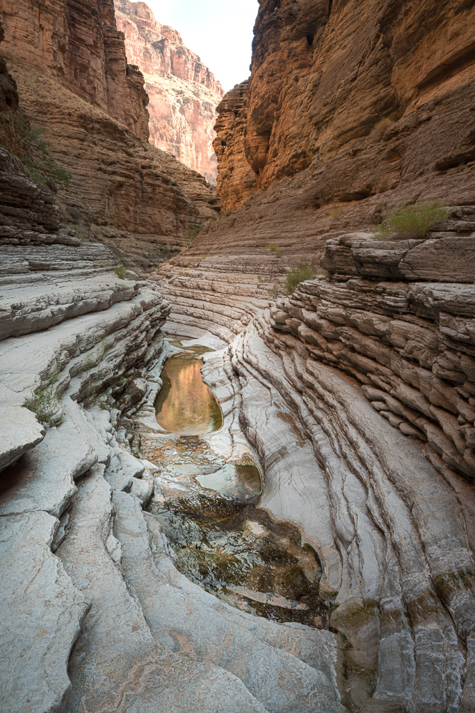
Original
About the Image(s)
I did an 18 day raft/camping trip on the Colorado River. 225 miles through
Marble and Grand Canyon. What a blast. I'm submitting this picture taken
in one of the side canyons, specifically to ask if anyone feels it is over
processed. My tendency is to process past reality to make something that
looks as beautiful as possible without being garish. What do you think of
this one? Shot with my Sony 7Riii, Sony 16-35mm at 21mm, ISO 100 for .6
second. The processing was extensive and I can't remember everything I did.
I know I ran several NIK filters, some more than once. Glamor Glow and
Tonal Contrast. I also did an unsharp layer and a bit of dodging and
burning.
This round’s discussion is now closed!
7 comments posted
(Group 95)
Beautiful and definitely competition-worthy. Having the reflection at that angle and in that spot in your composition works so well. It didn't feel overprocessed to me, and I wouldn't do anything differently with it, except, when I compare it to the original, I do find that you processed the heck out of that back right orange wall, that already had a lovely but natural glow on it. Maybe if you had backed down the processing a bit there. This is nature, after all. But I still think, as an image, it is beautiful. I know we differ quite a bit on our approach to nature and processing of our images, and this fits your vision and is a beautiful image on its own, to boot. Posted: 11/10/2019 11:24:39
(Group 64)
Well done, Mike. I think you did a nice job enhancing the scene. Everything about it leads me into what you see and keeps me grounded within it to enjoy the textures, layers and tones. I like the image a lot. Posted: 11/10/2019 12:59:07
The first comment is that I like your composition. I like your treatment of the rocks; however, what I notice is that your water is brighter than the background rock it is reflecting. I opened the original to check, and it reflects that color much more naturally. In my opinion tone down the water color a bit. It has more orange in it than the surrounding area. Otherwise this is a beautiful shot. Posted: 11/10/2019 19:22:14
For me the leading lines are the strength of this scene and they all take me right to the back of the canyon. The texture on the rocks in the foreground is so well done I can almost feel the grittiness of it. The blue and orange work well in my opinion. The only thing about this image that is problematic for me is that the area top and center is soooo much brighter than everything else in it and the sky is flat white without detail that my eye is drawn there and not to the real center of interest. My inclination would be to try to bring out some more blue in the sky and tone it down as much as possible. Posted: 11/12/2019 12:14:51
Thanks for all the good comments. I lean toward a bit of over processing. Hopefully recognizing it and expecting, in years hence, I'll look back and say, why did I do that. That said, I liked the color treatment but agreed that the distant rocks and sky were problematic. I did bracket the shot and combined an underexposed version with a little cloning in this version. Thanks for helping me out. Posted: 11/15/2019 08:47:18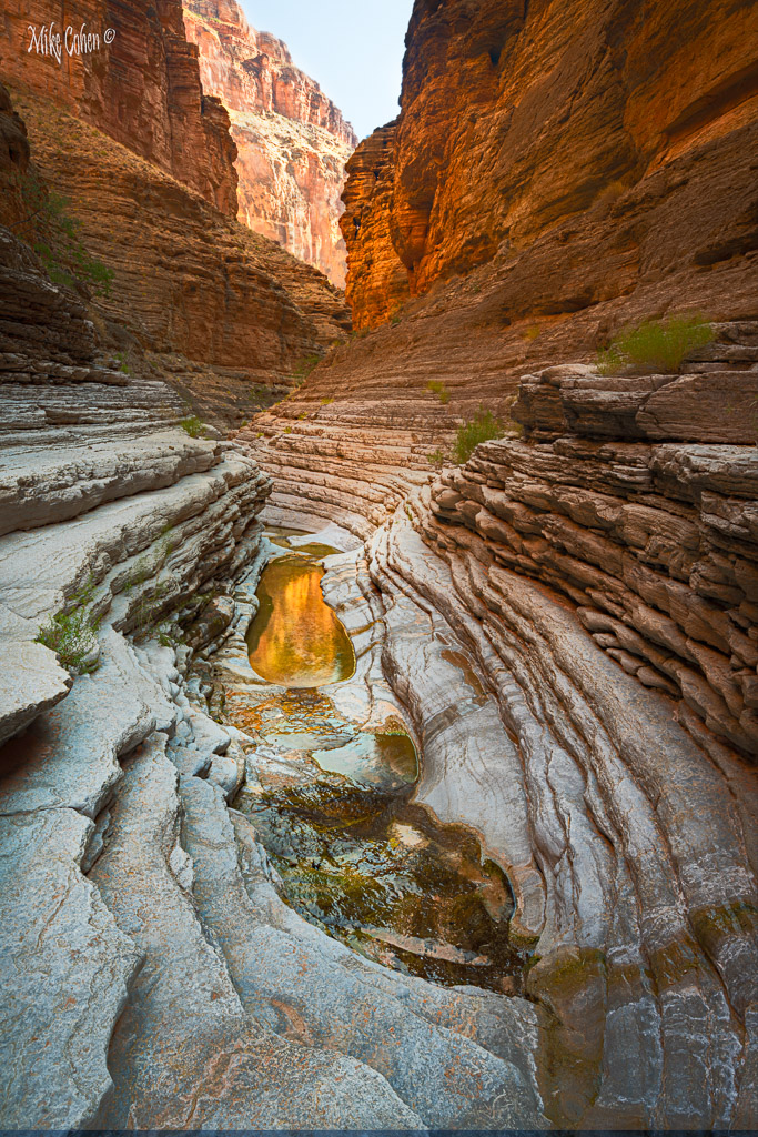
I like this image as well. My first inclinations in viewing was that the right side of the canyon was a bit over processed and / or saturated. I also feel the back canyon wall on the left is too bright for the rest of the image and needs to be toned down a bit. With your processing of the reflection pool, to my eye has become, a bit too yellow and lost some of the definition of the original image. I do like the subtle reds of the iron color running up to the reflection pool giving more definition to the grey colored rocks. Posted: 11/18/2019 15:00:25
Wonderful textures and colors. I love the golden reflection in the center, and the red rocks upper right. The rock layers form lines that lead to the central gold and up to the vanishing point. Great composition. For my eyes the sky is a bit too bright and it pulls my attention away from the interesting patterns below. I believe that your processing worked well for this image. Posted: 11/22/2019 20:53:06