Michael Hrankowski  


Rusty Gears by Michael Hrankowski

February 2021 - Rusty Gears

February 2021 - Michael Hrankowski

Original

February 2021 - Michael Hrankowski

Original 2

About the Image(s)

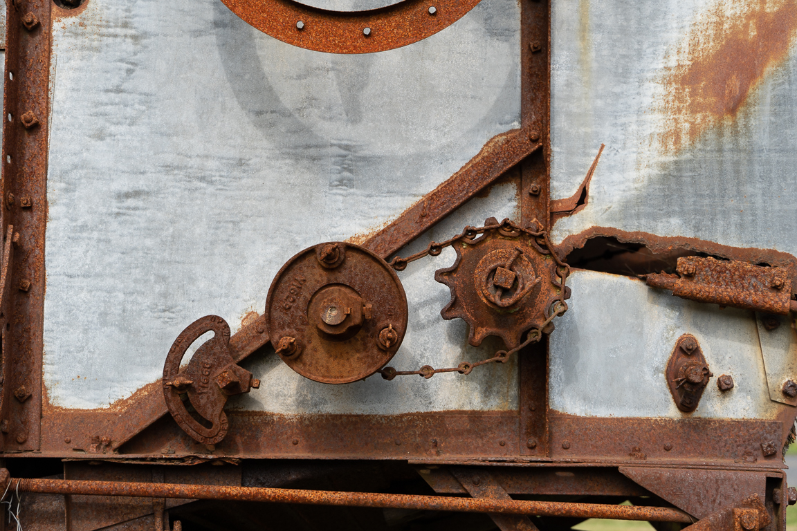
Hello Everybody. I'm looking forward to improving my monochrome photography skills and learning from y'all. It's been a LONG time since I worked specifically with B&W - High School in the old film days. I took this image this past September while visiting Lopez Island in WA State. It was a piece of old farm machinery in the yard of the Island's historical museum. I shoot with a Sony a6600 (APSC).
Lens: 18-135 shot at 45mm
ISO 100
1/350 @ f / 5.6
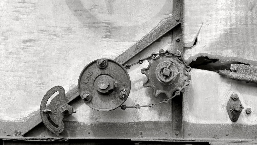
Crop and basic adjustments / enhancements made in Lightroom. Photoshop was used to remove the distraction of the hole on the right side of the image. Then took it into Silver Efex for the conversion, then back into LR for the final tweaks. Can't decide whether I like the color or monochrome image better. Your thoughts?


This round’s discussion is now closed!
14 comments posted


Lance Lewin   Lance Lewin
(Groups 83 & 87)
Good day, Michael! A very intriguing composition we often miss in our hurried pace, and with your good eye found and captured this Abstract-like narrative depicting the aging steel of modern man.

your interpretation is one that conveys a heavy amount of detail ("structure") and contrast: in this light reveals a dramatic aesthetic.

"Points to Ponder":
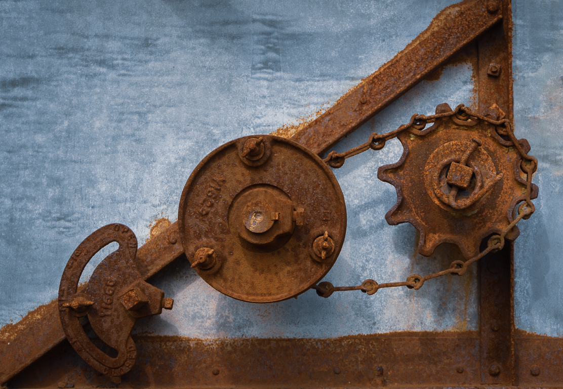
Though the PSA only allows us to post very low resolution images, I tried my best to copy your original and do some alternative edits: in my version I suggest actually revealing more than your seriously focused one. I am suggesting stepping back and open our gaze to more then a "snippet", but instead, allow the viewer to see more of the holes, rust, lines, shapes and perhaps in this way, open up to a wider narrative for interpretation. (crop is a 16:9 ratio) Note I particularly enjoy the almost hidden circle in upper-center and how if reacts with the rest of the details.

Another key component to my version is it is less bold by introducing a less "structured" and less contrast centered piece. Though softer, brighter, still intrigues. (FYI: I do not use any type of "layer" or other post-production additive in creating my finals).

In any case, this is just another view-point and one I hope you try as an alternative in the future. Your eye for detail capturing the dramatic and interesting is keen. Well done!

Lance A. Lewin PSA BW Photography Mentor   Posted: 02/10/2021 05:57:40
Comment Image
Michael Hrankowski   Michael Hrankowski
(Groups 3 & 83)
Lance, THANK YOU for your comments! Your points are well taken and much appreciated. I was going for a gritty, high structure look to accentuate the age and decay of the piece of equipment. You bring up a dilemma I constantly have in my photography: whether to hone in on the subject and let the viewer create their own context....or whether to include more context. Your composition does, indeed, work well and gives the viewer more of a sense of the extent of deterioration around the gears.

I'm new to PSA and newish to monochrome and am eager to improve. I notice you are a mentor. How do I go about getting some mentoring through PSA outside of the digital dialog commentary?   Posted: 02/10/2021 12:25:53
Lance Lewin   Lance Lewin
(Groups 83 & 87)
Mentoring: Michael, follow this Link to the Mentoring page to begin the process. You can also ask the Director, Sanjoy S. if you have questions as it relates to registration.
https://psa-photo.org/index.php?mentors-consultants

Michael, I look forward to learning more about your photography background and what motivates your creativity.

In the mean time, you may find the Bulletin Board on DDG83-Mono covers topics that will interest you....look forward to talking shop with you later. Ciao.   Posted: 02/11/2021 06:55:12
Lance Lewin   Lance Lewin
(Groups 83 & 87)
Michael, so sorry the PSA link is not working and this is due because the user needs to sign into their account to use it: after you sign-in on the PSA website go to the upper-right Search option and type in "Mentors". From there follow another link titled "Mentor and Consultants", from there you will see all the information you need as I described in the previous post above. By all means reach out to me if you continue to struggle with the website - some changes to the website are coming we hope will make it more user-friendly.

Thank you for your patience.   Posted: 02/14/2021 04:31:39


Michael, I like your crop over Lance's crop, he added too many extra items, for me I like groups of three, adding those extra parts just distracts from the image.

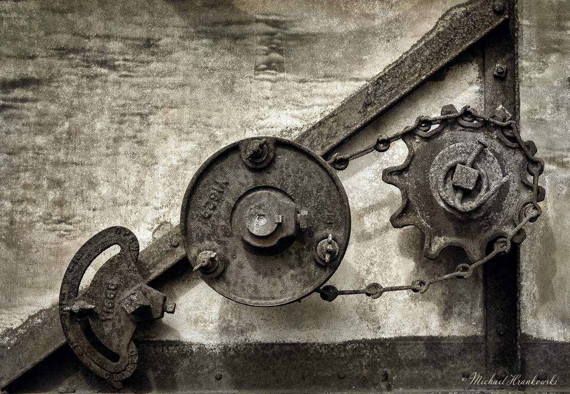
I like the gritty look of the image, I would add a little more contrast to grit it up even more. I would also add a slight warming filter to the image, perhaps a very slight sepia tone, it just gives a feeling of it being older.

It was great you saw and captures the old parts, it makes for an interesting image. I also think the monochrome is better than the color image.   Posted: 02/14/2021 14:54:41
Comment Image
Michael Hrankowski   Michael Hrankowski
(Groups 3 & 83)
Thanks for your comments, Jeffrey. YES! I like the slight sepia / warming rendition over my edit. And, yes, I was definitely going for "gritty", as I thought it better highlighted the age and state of decay of the piece of machinery.   Posted: 02/14/2021 17:28:36
Lance Lewin   Lance Lewin
(Groups 83 & 87)
And indeed, both are viable Compositions: one directs attention to a smaller subject and the wider view allows more in the way of interpretation by virtue of the added artifacts. My version is only to counter the constant practice of focusing too small, too narrow within a scene. In fact, Michael's work is awesome, but surely not the only way.

The other important dynamic I bring to the table for students of photography, (and my point in this example) is limiting post-production to (add or induce) an aesthetic not found through more normal (authentic) photographic technique. I like to try and convey the differences between photographic technique from a traditional posture, from those created through digital techniques outside the camera. Thank you.   Posted: 02/15/2021 13:47:37


Cindy Lynch   Cindy Lynch
I love old rusty, textured things and this one really handles that well. I love your composition with the strong diagonal and of course, the number 3 for your elements. Beautiful details, too. My only suggestion is to add a little to the bottom. Although not a merger, the element on the left comes a little too close to the bottom of the frame. I also like the color version, but think the monochrome is best. I think this is a winner.   Posted: 02/15/2021 11:21:38
Michael Hrankowski   Michael Hrankowski
(Groups 3 & 83)
Thanks, Cindy. I appreciate your comments.   Posted: 02/15/2021 11:30:48
 
I think Cindy is right, if you could get a little more on that bottom left, it would give a little breathing room, I don't think you would need to do too much just a little more.   Posted: 02/15/2021 14:04:04
Michael Hrankowski   Michael Hrankowski
(Groups 3 & 83)
Yes, I see what you mean. ...the devil is in the details!   Posted: 02/15/2021 14:07:27


Karl Hokanson   Karl Hokanson
I have to agree with Cindy's and Jeff's versions. The suggested larger image is too busy. I know your new to PSA so welcome. When I joined my focus was PJ (sports) depicting the expressions of the amateur athlete and competitions. I found getting comments from several people then going with what made me happy worked best for me.   Posted: 02/20/2021 15:41:28


Karl Hokanson   Karl Hokanson
  Posted: 02/20/2021 15:41:32
Michael Hrankowski   Michael Hrankowski
(Groups 3 & 83)
Thanks, Karl and to everyone for their comments. Much appreciated.   Posted: 02/20/2021 15:47:57