Gordon Saperia
About the Image(s)
The monochrome is edited in LR, PR, and Silver Effex.
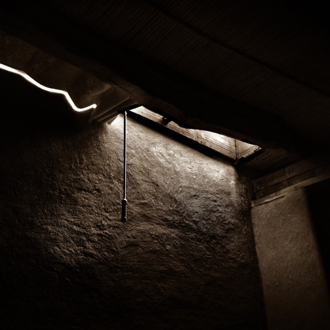
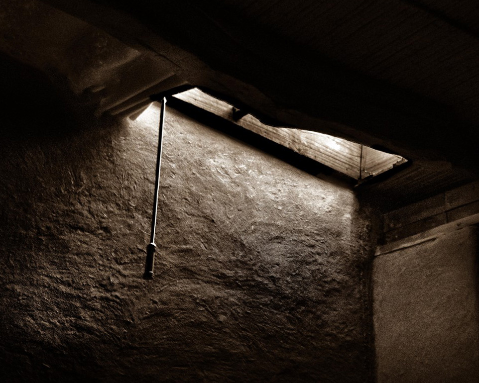
The image was captured just before sunrise in a hotel bedroom in a small town in Chile. This was handheld at high ISO as the light was increasing rapidly. Nikon D850, Nikkkor 14-24 @24, f/2.8, ISO 6400, at 1/4 second. Curious whether people like the composition and how to optimize it.
This round’s discussion is now closed!
6 comments posted
(Group 32)
I also been in situations where light has penetrated in moody ways, and always found the resulting image less memorable than the experience. I prefer that you had left the side window in the composition, as I think it adds interest, and you might consider straightening out the converging lines in PS. I see that you brightened the light shining in, but did not overdo it--good choice. Posted: 06/05/2018 19:37:11
(Group 5)
Stephen I have to compliment you for your a marvellous activity in DD This month you made comments in groups 4, 8. 13,19, 28, 38, 46, 50,51, 57, 71, 72 and 76--19 comments in all-- I wish we had more enthusiastic DD'ers like you; this is what makes for interesting study groups. Thank you for your wonderful participation.
OK members of no. 50 --where are you? Posted: 06/09/2018 15:53:01
OK members of no. 50 --where are you? Posted: 06/09/2018 15:53:01
(Group 5)
An interesting image. I prefer your crop and disagree with Stephen about the side window. My only suggestion for improvement is to remove the white line on the left hand side. I am not sure what it is but it does distract. Posted: 06/11/2018 09:48:16
Such a simple, but interesting image. I like the sepia tone you used. You handled the lighting well. I am not sure that I would keep the window on the right as suggested above. I think it would have pulled my eye from the focal point light source. I would suggest removing the light line on the left, as David suggested, as it almost looks like a neon light strip, thus taking away from the old-time feel. I also would suggest straightening the corner of the room (I used PS Transform - Skew and cropping in closer. Posted: 06/11/2018 11:41:52
I like Cindy's approach to your image, I also agree that the window on the right should be removed. Nice processing and I like the sepia toning, it fits the image. Posted: 06/18/2018 15:14:06
I have to vote with Cindy, David and Jeff. Posted: 06/24/2018 12:42:58


