Chuck Carstensen

January 2018 - Visitor Center
About the Image(s)
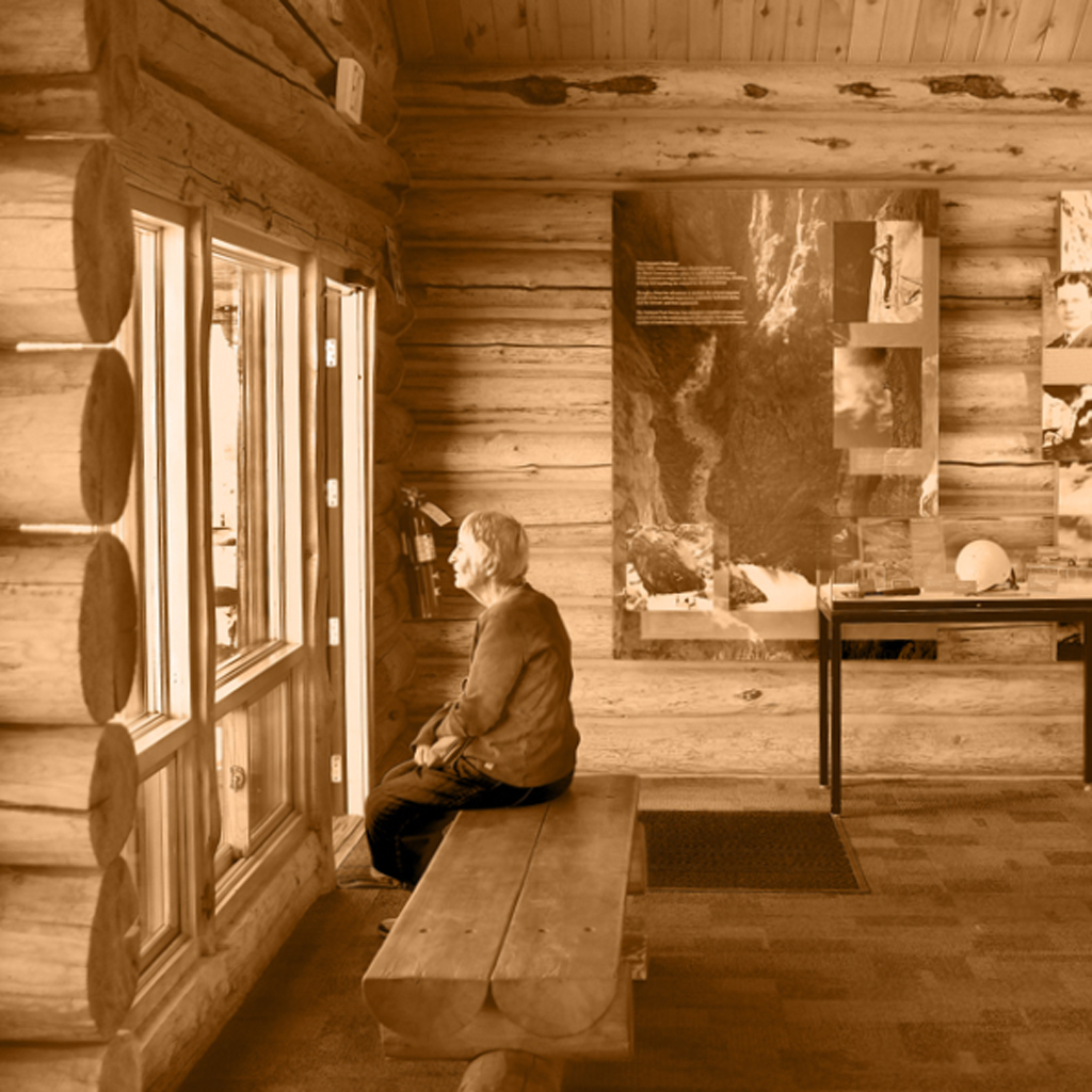
Black Canyon of the Gunnison National Park Visitor Center. Fujifilm X-Pro2 originally shot in color and converted to monochrome with PSCC. ISO 400, auto exposure, f/2, 1/160. 23mm lens.
This round’s discussion is now closed!
8 comments posted
It is an interesting shot, I like the color toning, it fits the image. I would drop the highlights down about -40 and open the shadows about +15. The main thing with the image is that it is crooked, I used the horizontal beam to straighten the pictures and it helps. If there would have been now writing in the image, I would have suggested that you flip it horizontally, Right now it sort of stops they eye from entering with the window on the right, it flows better flipped, but then the writing become a problem. Posted: 01/09/2018 10:46:41
I'd suggest making this image clearly about the woman and not the location. If you crop/remove the right half of the image to make a square, she becomes the focal point. From there you could make other enhancements to help the viewer wonder about what she is seeing or thinking. Posted: 01/11/2018 14:03:35
Thanks, Jeffrey, I just cannot bring myself to flip it. This for the reason if you have ever been there you would immediately know the light is wonky, inaccurate. You caught my error in straightening, my bad. Haste makes waste. Gordon, here is a square version as you suggest with Jeffrey's idea in highlights and shadows. That works. Posted: 01/11/2018 16:51:56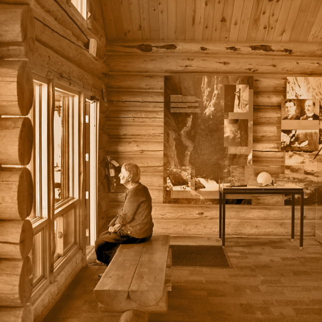
I like the crop on the right. You might want totake a little off the top too. I like the sepia tone with the log structure.
Posted: 01/16/2018 14:58:39
Posted: 01/16/2018 14:58:39
Thanks, Karl. By "crop on the right" do you mean the square crop or the flipped crop? Yes, I probaby should have cropped out the window lite at top left. Posted: 01/16/2018 15:14:30
(Group 5)
I prefer your second version but would possibly crop the top of this version. I would not flip the image. I like the sepia tone. You may consider adding a slight vignette. Posted: 01/25/2018 10:13:53
I like the nostalgic feel of this image. I also like the second version and, like David, I would crop below the small triangle of window. Posted: 01/27/2018 15:51:20
So, here is the result of the last crop. Thank you all for the critiques and help. Posted: 01/27/2018 16:35:39