Fred Doerfler, QPSA, JPSA Editorial Bronze Star
September 2019 - Watching the Cyclone on Coney Island
About the Image(s)
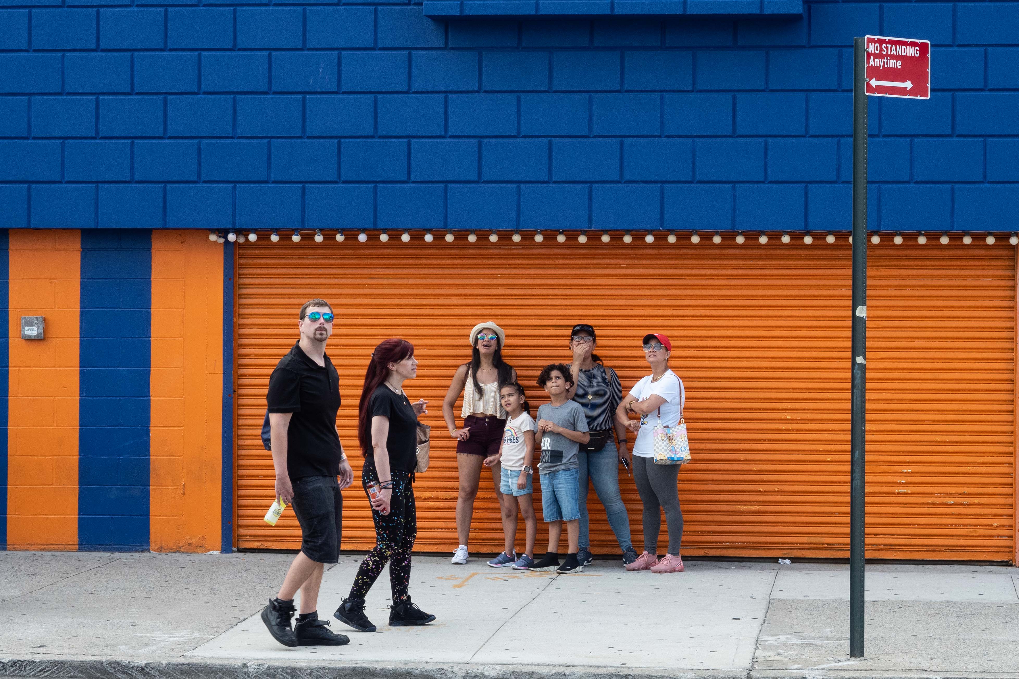
I took this image at Coney Island with street photographer James Maher. I cropped and only enhanced the contrast and clarity. The background was great and when a family stopped and “posed” i couldn’t resist taking the shot. and the the couple walked into the frame. And then all but one was watching at the Cyclone roller coaster behind me.
This round’s discussion is now closed!
6 comments posted
I like how the bright background highlights the people. It immediately captures my eye. I am wondering what the story is that you are trying to tell. The folks are obviously looking at something. Is this the story? Or is the fact that they are standing there despite what the sign says? I suspect the former, so you might want to crop out the sign. Posted: 09/11/2019 09:27:46
Nicer bright background colors make the people in the image pop. There is a very distracting grey box - center far left that should be cropped out. I think a much tighter crop would help immensely - just above the arcade lights and focus on the people. You can see the reflection in their glasses of the Cyclone. Posted: 09/18/2019 12:19:57
Yep, gray box needs to come out but I can't remove if submitted to PJ. I will try cropping it out. I had not noticed the reflection in the glasses. Thanks for the advice, I will work on it. Posted: 09/28/2019 18:45:14
I agree with everyone else about the gray box. I think cropping in so that you eliminate the distraction and allow the viewer to notice the reflections in the sunglasses is an excellent suggestion. I like the idea of the sign that contrasts with the people standing there, but it would be much more effective if you could find an angle that would get the sign closer to the people. Posted: 09/30/2019 09:30:15
Interesting... I barely noticed the gray box. I was under the influence of yellow and blue colors. But I must agree with the others, the gray box is unnecessary. Nevertheless I think this is an exciting picture, makes me curious, I also want to see what the people are watching. Posted: 09/30/2019 12:04:47
(Group 81)
I like the image gray box included... its Coney Island...there are locks on the opposite side - just smaller than the gray box. What I really like about the image is that everyone is engaged... and whatever it is they are watching... it has them excited. Posted: 09/30/2019 21:48:58