Jack Florence Jr
February 2021 - Untitled
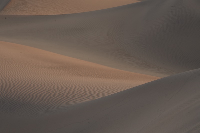
Original
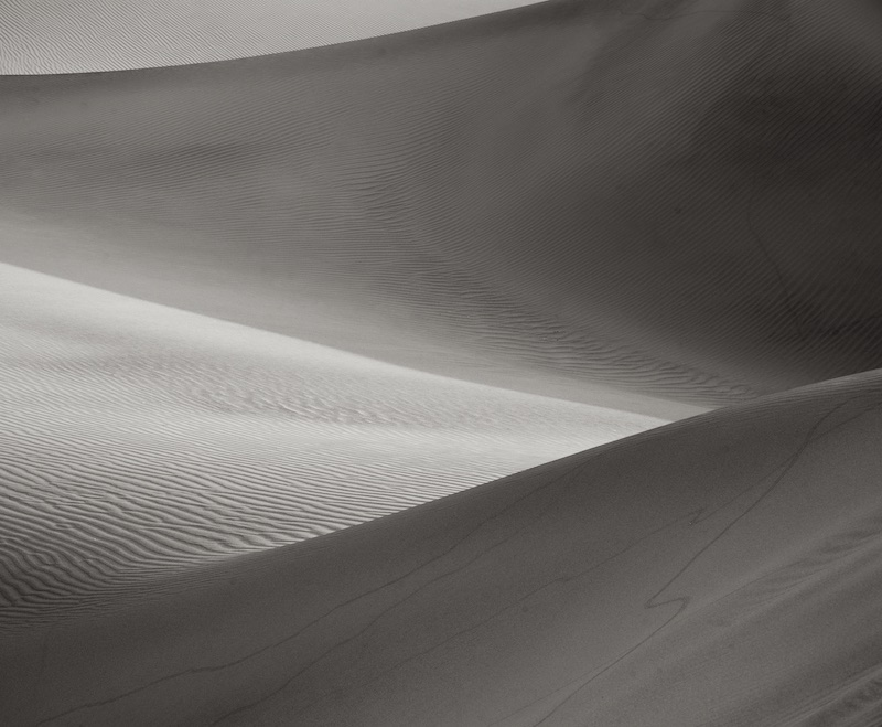
About the Image(s)
Sand dunes appeal to me for the graphical qualities they lend to images - so easy to play with shapes and lines. On this one, I'm not sure if I've got the contrast just right. I decided to leave it a little soft, such that there are no true black and white tones in the image. Thoughts on that, and the crop I've chosen, are appreciated! This one also had several sensor spots, so hopefully you don't see more, but you might.
Sunrise shot f16 1/30, 101mm
This round’s discussion is now closed!
7 comments posted
Hi Jack! The lights and shadows are beautiful! I think that the softer approach suits this very well; I wonder if just a little more midtone contrast would bring the fine wave formations out a bit more clearly? A tighter crop omitting the uppermost bright sliver of sand would be more restful, leaving only three triangles, but I think that it would also take off most of the tension from the image. What do you think?
- This would work well also in color with the bluish shadows and the warm yellow tones. Posted: 02/07/2021 16:18:32
- This would work well also in color with the bluish shadows and the warm yellow tones. Posted: 02/07/2021 16:18:32
(Groups 66 & 86)
Thanks, Kirsti. Good point about the midtone contrast; I will work on that! I also thought about the top sliver, on balance, I think I like the bit of tension it provides to the image as you say. Posted: 02/07/2021 17:00:49
Hi Jack, I like the composition as Kirsti says a bit of mid tone would bring out the ripples also I think I can see a few sensor spots towards the top of the image, bright areas seem to have lost a bit of detail might be worth toning them down a touch Posted: 02/08/2021 09:43:03
I like this for its curves. It is also suggestive a a human body (darker areas ar leg-like. Really an unusually interesting photograph. I would just darken the deep shadows a little (using the contrast slider) to get a better distribution of tones Posted: 02/19/2021 14:45:29
Hi Jack,
I like how you processed the image from the original. The shapes of the dunes and the contours of the sand waves come clearly to my eye. In addition I like how you handled the light and dark areas, I see a nice balance to both. It really stands out with respect to the original which to my eye has a rather murky appearance. Your processing has done away with that issue making for a much nicer image as I see it.
For me, I would have liked an object to serve as a focal point in the image - plant, tree or something else. That is simply a personal preference.
Thank you very much for sharing it with us. Posted: 02/23/2021 09:59:43
(Groups 66 & 86)
Thanks everyone for the good comments. It's interesting and helpful to see how an image like this works with different viewers. Posted: 02/23/2021 10:08:09
(Groups 72 & 91)
Jack. Sorry for being so late!
A minimalistic image -but one that has got a lot of detail given the time to sit, look and enjoy. The more I look, the more I see and that makes it an unusual but rewarding image.
Sorry this is your last of this group! I've learnt so much from you! Posted: 02/28/2021 10:49:05
A minimalistic image -but one that has got a lot of detail given the time to sit, look and enjoy. The more I look, the more I see and that makes it an unusual but rewarding image.
Sorry this is your last of this group! I've learnt so much from you! Posted: 02/28/2021 10:49:05