Jack Florence Jr
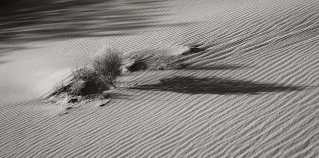
June 2018 - Shadowy Sands
About the Image(s)
I liked this for the lines and shadows, and the way they interact. I hope I've placed the clump and bush just right, and that the contrast is sufficient; your thoughts are appreciated as always.
This round’s discussion is now closed!
7 comments posted
For my part I find this to be an interesting study in texture, light and shadow. To my eye the technical aspects (lighting, DoF, Focus) are all excellent for what you appeared to be trying to do.
With respect to the placement of the clump, my eye stops at it, then travels on toward the left of the image and the shadows from the clump which then lead it out of the frame.
I tried flipping the image so my eye travels from left to right where the clump is, focusing my attention at the clump which is the center of my interest.
I would interested in your thoughts.
Thank you for sharing it with us.
Posted: 06/09/2018 19:50:01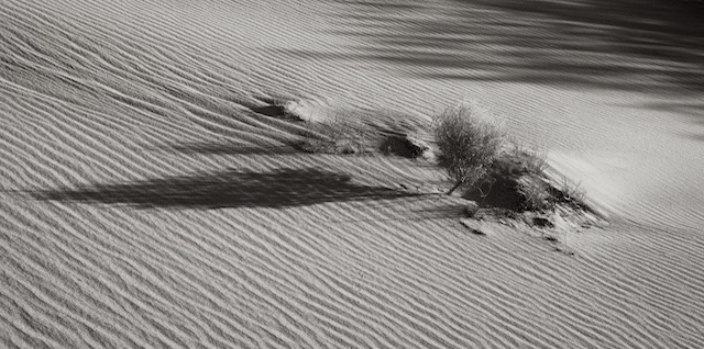
(Groups 66 & 86)
Thanks for the flipped version, Ed. I have to admit, I'm torn, and can't decide which I prefer. Maybe I have the photographer's bias to the original. I look forward to hearing what others think. Posted: 06/10/2018 13:04:08
technically,it is done very well. I agree with Ed that the shadow is distracting. Flipping the picture does keep my eye in the picture because we are sed to reading left to right. An Arab or Israeli might have an opposite sense. The problem, I think is that the shadow seems to be an unrelated object. Perhaps if the camera had been moved so that the shadow was more diagonal it would lead the eye to the clump. If it were my phot I would crop alot on all sides Posted: 06/12/2018 20:10:15
(Groups 66 & 86)
Thanks Albert, Less is More is my mantra so I like your idea of a crop... still, seems to lend itself to almost a pano or 16x9... the shadow of the bush cris-crossing the sand lines is kind of what I was after. Thanks for the comments. Posted: 06/12/2018 20:40:20
Image is perfect but I would prefer more contrast and I would suggest to move image around, 45 degrees clockwise, make the shadow diagonal, which would result in more dynamic image. I think. Posted: 06/14/2018 14:32:39
I feel the lines of the sand and intersecting the direction of the shadow are just right. A pano crop would work well, to my mind Posted: 06/18/2018 15:44:12
I agree with the others, the dark shadow is a bit distracting. I do like the idea of a pano crop. It might make the shadow work a little better.
It is a nice image. Well done. Posted: 06/22/2018 10:04:53
It is a nice image. Well done. Posted: 06/22/2018 10:04:53