Rick Cloran, HonPSA, MPSA
June 2020 - West Thumb Morning Walk 3
About the Image(s)
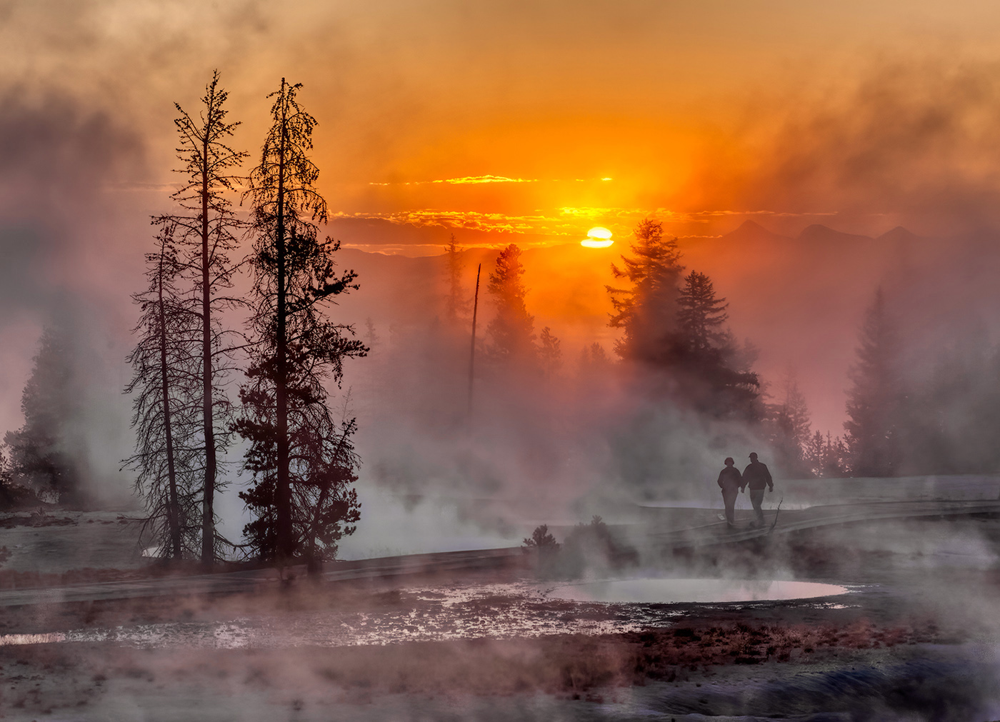
I’m still having to go back through my old files to come up with things. We have done virtually no shooting since the lock down started, since most of where we would have gone locally are buildings, beaches, or parks or refuges that are closed because of the restrictions. With things starting to open, hopefully we will get out a bit more. The image this month was made in West Thumb thermal area in Yellowstone, obviously sunrise and late fall so the air temperature is low enough to provide a lot of steam off the thermal pools. It was shot on a Canon 50D with a 24-105 F4 lens at 80 mm F22, 1/40 sec and iso 200 for the base exposure. The bracket was one shot either side at +/- 2 stops. I did have a negative 1/3 stop compensation set for the initial exposure and that would have carried through the bracket. The initial blend was done in Aurora 2019 with all manual settings. I’ve done a fair amount of tweaking on the mists. In some places the sunlight coming through made them too magenta for me. In other places there seemed to be some refraction going on that was causing a cyan coloration. What I ended up doing was adding a solid color fill layer based on the colors I wanted to offset and shifting to the Divide Blend mode to cure that to a white and then adjust the brightness of the color in the color picker to tune the white to where I wanted it tonally and then mask that result to the locations that needed correction. I’m sure it sounds more complicated than the process actually is. I’m finding using the Divide blend mode as yet another way to resolve color shift I don’t like. The one caveat is that you need something that should / could be actually white in the area on which to base the offset color that makes the process work.
This round’s discussion is now closed!
7 comments posted
(Groups 7 & 32 & 57)
This has a lot of impact! I love the sun and the steam
The verticals are strong, from the trees to the people
The placement of people is perfect too
The only thing I would suggest to improve is content aware the stick that is vertically right next to the couple.
The tone mapping is awesome and thank you for the details of your edit.
"I'm finding using the Divide blend mode as yet another way to resolve color shift I don't like."
I am using blend modes all the time, but have only used divide for creative use, not for color shifts -- do you have any resources on using divide for color shifts? Posted: 06/29/2020 12:32:00
You will probably have to cut and paste the link but it does go to the correct place. Posted: 06/29/2020 13:46:37