Maryellen Bauer
October 2020 - Haunted House
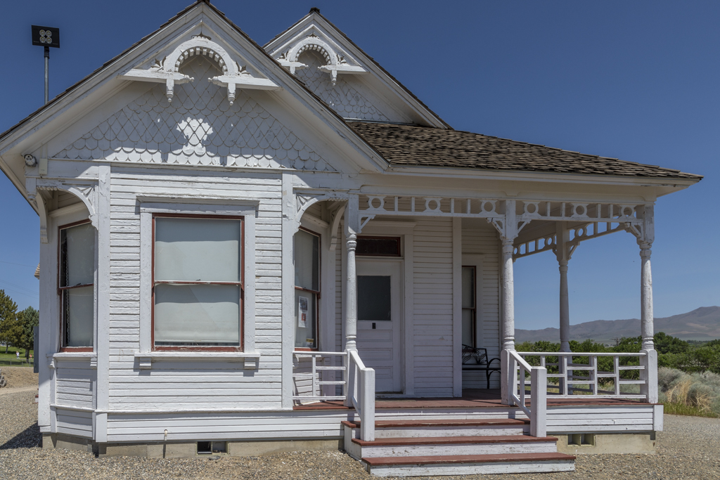
Original 1
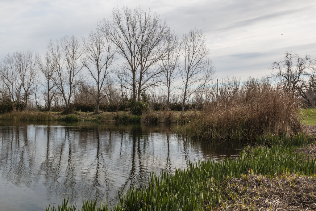
Original 2
About the Image(s)
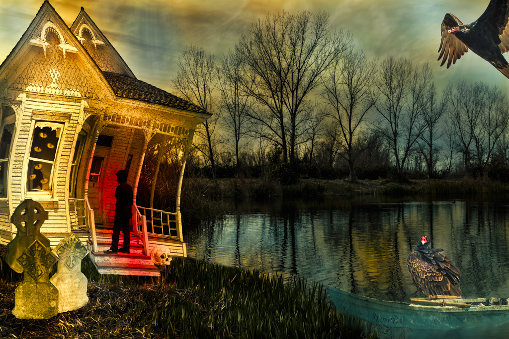
I've been wanted to try a composite. I really had fun with this....especially wrecking the house. I was thinking that it's the end of the day and the last of the light would be from the left but that doesn't work with the tombstones and I really wanted light on them. (I don't think I can get away with the suggestion that there is a car with its headlights on parked diagonally in the front left of the house.) I think that light and shadows are the most challenging part of composites. Anyway, this kept me occupied and having fun for a few days.
This round’s discussion is now closed!
8 comments posted
Maryellen, This is a fun exploration. I really like your handling of the skies/reflections in the water. Overall the image feels a bit crowded to me. I would invoke the adage "less is more" for this image. I might consider removing the bird at the bottom left. Posted: 10/10/2020 13:04:14
Thanks. I definitely agree. Posted: 10/30/2020 11:00:51
(Group 40)
Maryellen, you worked with a lot of elements here, the altered house, the tombstones, the turkey vultures, the figure on the steps, and the torn window shades. Blending all that in must have been a challenge! For me the figure doesn't quite work as I would like a little detail showing but that is just a personal feeling. I look forward to more of your composites.
Posted: 10/12/2020 09:34:13
Posted: 10/12/2020 09:34:13
Maryellen, I love that you threw in the kitchen sink here! That's the way to learn and have fun! The bendy house is perfect!
I agree with Brad that a bit less might make a more pleasing image only because you have a lot of bright colors and many elements.
My suggestion is to pick one or two elements that you really like and strip everything else away. You might find another great image. Posted: 10/14/2020 22:15:40
I agree with Brad that a bit less might make a more pleasing image only because you have a lot of bright colors and many elements.
My suggestion is to pick one or two elements that you really like and strip everything else away. You might find another great image. Posted: 10/14/2020 22:15:40
Thanks. I appreciate the input. I definitely agree that I went overboard here. Posted: 10/30/2020 11:01:42
(Group 22)
Maryellen, this is an innovative creation and I am impressed. However, I think that the bird in the top right corner is distracting and not needed. You are an "outside-of-the-box" thinker. Posted: 10/19/2020 09:13:42
This is very creative, to take that starting image and warp the house and add all of those elements! wow! I like the house and the trees and the way you added the reflections in the water. Lots of detail, down to the red on the person on the steps
The birds do not match the color palette. When I do composites the last step is to add a new layer, change the blend mode to color, and then pick a color that sits over top of all of the layers, then reduce the opacity (maybe end up with 10-50%) and mask out what is too affected with a 50% black brush. Other people do the same tie in with LUTs Posted: 10/31/2020 14:33:04
The birds do not match the color palette. When I do composites the last step is to add a new layer, change the blend mode to color, and then pick a color that sits over top of all of the layers, then reduce the opacity (maybe end up with 10-50%) and mask out what is too affected with a 50% black brush. Other people do the same tie in with LUTs Posted: 10/31/2020 14:33:04
I think this is a great start on using different elements in a composite Mary Ellen. I do think composition in a composite is as important as composition in a single traditional image, and that is what I notice first about your image. There is a lot of visual weight on the left and right sides, but really nothing in the center. My interest flip flops from one side to the other and my eye doesn't flow through the image. I would suggest making connections, such as turning the silhouette of the boy towards the birds. Posted: 10/31/2020 22:20:29