Brad Becker
March 2019 - Inner vision

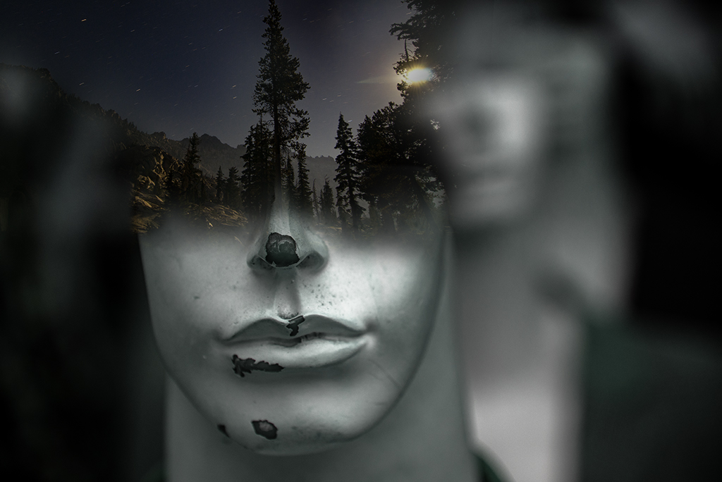
Original 1
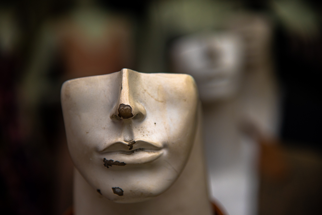
Original 2
About the Image(s)
I wanted to do something with this unsettling mannequin from a recent trip to Vietnam. After playing around with a few images the vertical tree caught my eye and I thought it might tie in nicely with the nose. Desaturating the mannequin image helped tie together the night sky image
This round’s discussion is now closed!
7 comments posted
Brad,
This definitely is an "unsettling" mannequin!
I love your concept!
I wonder about making this a portrait aspect instead of a landscape. Then cutting off the white mannequin shadow in the back right so that our eye stays on the intended mask and trees.
Also, how would it look if you added a star field around the mask so you get a feel of it floating in space with the forest scene in it's head.
Just thoughts for you to think about. Posted: 03/04/2019 22:43:53
Kathy, Thanks for your thoughtful suggestions. I'll play with it some more. Posted: 03/04/2019 22:59:46
I love the concept!!
Darken blend mode?
Can you select just the front "face" and only use that portion -- would be stronger with the OOF brighter pieces in the back and right.
Posted: 03/05/2019 01:16:21
Darken blend mode?
Can you select just the front "face" and only use that portion -- would be stronger with the OOF brighter pieces in the back and right.
Posted: 03/05/2019 01:16:21
Hi Brad.. You've certainly achieved the unsettling theme you were going for.
I like the way the tree appears to be growing out of the mannequin's nose.
I really like the left hand side of this image but find the mannequin in the background on the right hand side quite distracting. I'd like to see it with this part cropped out. Posted: 03/05/2019 01:32:15
I like the way the tree appears to be growing out of the mannequin's nose.
I really like the left hand side of this image but find the mannequin in the background on the right hand side quite distracting. I'd like to see it with this part cropped out. Posted: 03/05/2019 01:32:15
perhaps clone out the right spot in the night scene before merging the two.
I like these kind of blended images and your final result has cool impact. I also like how you desaturated the head first. Posted: 03/09/2019 14:26:28
I like these kind of blended images and your final result has cool impact. I also like how you desaturated the head first. Posted: 03/09/2019 14:26:28
(Group 40)
Brad, 'Inner vision' is a nice creative idea and concept. But for me it doesn't seem to work. I like the original 2 image better in color than black and white. And on the original image 2 I would clone out the upper and lower light areas. And perhaps the transition or blending between the two images could be more gradual.
As I read the suggestions of the others above, I think they have some good ideas.
How about working some more on merging image concepts. Posted: 03/16/2019 14:27:21
As I read the suggestions of the others above, I think they have some good ideas.
How about working some more on merging image concepts. Posted: 03/16/2019 14:27:21
Hi Brad, I like the entire left side of the image, but not the right side. I would rather see more of the forest image developed on the right side of the face. Perhaps even creating a vertical image of just the mannequin's face would allow the viewer to make more of a connection. Nice concept! Posted: 03/19/2019 00:59:43