Andrew Hersom, APSA, EPSA, EFIAP
October 2020 - Crane Reflections
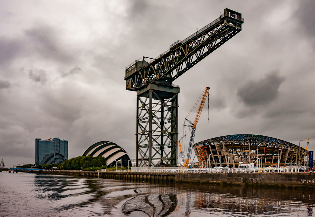
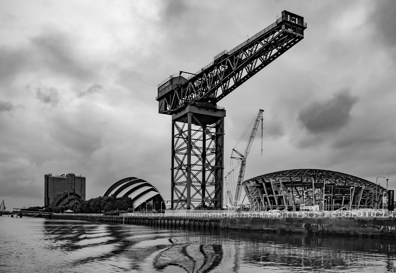
Original
About the Image(s)
This was shot in about 2014 from a boat on the River Clyde in Glasgow of an old crane which I believe was used to load steam locomotives into ships for export before WW2 and a modern crane involved in urban renewal. I liked the reflections in the river.
Processing was straighten the verticals, enhance the yellows, add a bit of contrast with dehaze and decrease grain. Crop a bit and tidy up the edges. Then convert to black and white. I like both versions but perhaps the black and white more. What do you think?
This round’s discussion is now closed!
9 comments posted
There is lots to peruse in this Andrew beginning with the curving reflections, dominant crane, the lesser crane as well as buildings in the background. I know we are tasked to make suggestions but I can't think of any. Nice work! Posted: 10/06/2020 12:28:29
Hello Andrew!
I am really torn between the two versions. Generally I lean towards black and white, but the tones in the color version are fabulous. Both versions are well exposed, while the clouds act as a natural diffuser. The levels are great as I am sure it must be on your histogram. I think the only thing I would do would be to crop a very tiny bit off the left side, but it doesn't even really bother me that much. The low horizon line works well and give emphasis to the vertical crane. Well done! Posted: 10/06/2020 16:16:47
I am really torn between the two versions. Generally I lean towards black and white, but the tones in the color version are fabulous. Both versions are well exposed, while the clouds act as a natural diffuser. The levels are great as I am sure it must be on your histogram. I think the only thing I would do would be to crop a very tiny bit off the left side, but it doesn't even really bother me that much. The low horizon line works well and give emphasis to the vertical crane. Well done! Posted: 10/06/2020 16:16:47
(Group 18)
Andrew, I think you were right to present this image in monochrome which suits the starkness and angular crane as well as its surroundings. Splendid reflections. Posted: 10/09/2020 13:52:50
I find myself returning to your image, Andrew, and loving the lines, especially the reflections. I really enjoy this as is. Posted: 10/12/2020 07:01:16
I like the color version because it makes the reflections on the water pop more. This is a striking image you could hang on your wall and look at it often - there is so much to see. Posted: 10/12/2020 10:13:43
A beautifully balanced composition! Right out of the camera! I would not crop any. I think that little last crane to the left is necessary balance to the round mass of the building on the right. Beautiful diagonal line of the wharf. Fabulous textural contrast between the water and the metallic structures and then the sky.
At first I was going to say I favored the color version. The way you have it (is that the result of slider work?) the varying shades of yellow/gold complement each other.
But on further study (it's definitely an image that rewards study) I realized that the central crane is slightly out of focus- probably the movement of the boat. This is more obvious in the color version, the B&W minimizes that. So if you are deciding which to hang on the wall, I'd go with B&W, but both images do a great job of showing off your skill. Posted: 10/14/2020 03:35:13
Thanks, but I just fancy a slight crop of the left hand side to remove those little cranes. Posted: 10/15/2020 11:43:29
Why don't you try it and post? Posted: 10/26/2020 06:33:32
Hi Andrew, I like both images. The colour one keeps bringing my eye to the newer, orange crane. I enjoy the colour palette too. I also like the mono image as there are no distractions there. The reflections in the water are interesting too. Posted: 10/15/2020 22:38:22