Richard White
August 2020 - Bristlecone Pines
About the Image(s)
Equipment: Camera: Canon Camera 5D Mark IIl
Lens Canon EF15-105mm, f4/L IS USM
Polarizer
Tripod: Gitzo GT3542LS
Head: Acratech
Settings: F/16.0, 4, +033, ISO 100, Evaluative
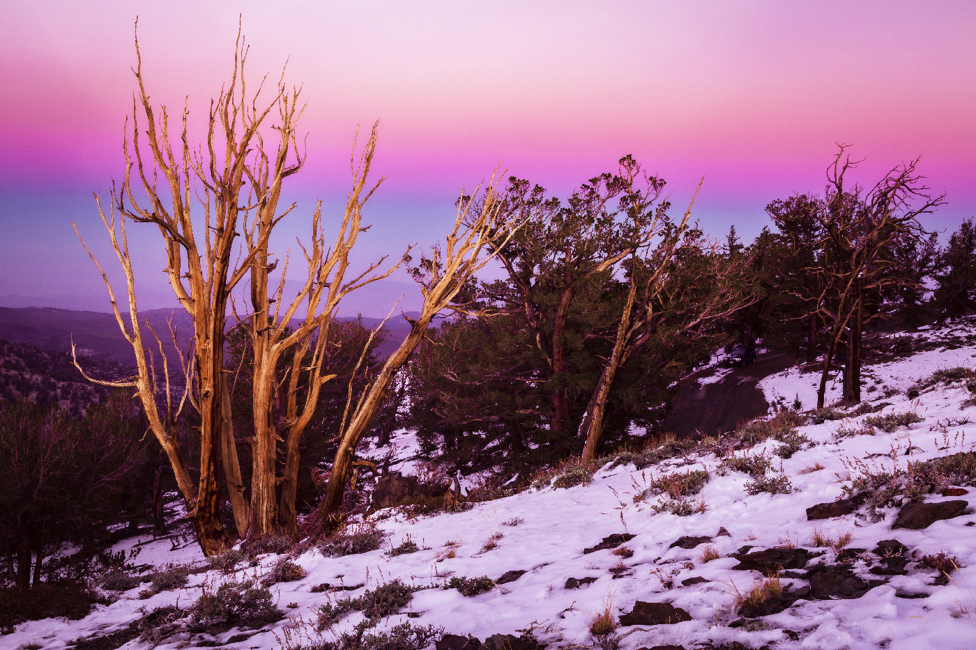
Deion: Sunset with Red, White and Blue Sky of Bristlecone Pines
I was with a photo training session in October 11, 2013 at the Bristlecone Pine National Park in California. This photo is one of several I took just at sunset. It was at the end of the day of taking photos in the Sierra Mountains in California, which started with fall colors of the trees near Bishop, California and moved to the river and ended at the Bristlecone National Park.
This round’s discussion is now closed!
7 comments posted
I can certainly see why you like this image. The sunset has one of those just magical moments to it and that warm glow is something that just can't be duplicated. I feel the diagonal slope, anchored by the bare branches on the left makes for a strong composition. The almost patriotic sky with the red white and blue adds an extra touch the scene.
While I liked the image at the first viewing it just felt something was odd. It finally came to me that it was the snow. It feels like you enhanced the colors just a bit---nothing wrong with that-as that really makes the scene pop. However for me I didn't like the red tint to the snow. I loaded the image in Lightroom and using the adjustment changed the white balance of the snow so that it appears white. This may be a very personal preference so if you prefer the pink tint to the snow I totally get it. I've attached my edit. Curious about your thoughts.
Posted: 08/02/2020 15:26:13
Larry, good point about the color of the snow, but it was that color. Your color adjust of the snow makes it look more like snow, but it makes, in my opiton, a harsh light to the photo. Posted: 08/06/2020 18:36:20
I really like the composition. The upward slope adds energy and the sunlite bush is balanced by the dark brush on the right. I have images where the color of the sky is reflected in the snow so that is a personal preference, I think. However, to my eye in this scene it does look a bit off because it would be reflecting a portion of the sky that probably does not have that full hue. Again, to my eye the sky looks over processed which for me creates an artificial banding look. I would consider pulling back the saturation a bit to get a more natural look. Just me. Posted: 08/02/2020 17:44:02
This is a fantastic image. I love the colors in the sky, and the composition of the barren tree against it. The pink snow does not bother me, I think it reflects the sky color and I would not expect it to be white. Great job! Posted: 08/04/2020 20:14:24
Nice image and composition Richard. I especially like the colors in the sky and the layering from the front bushes to the hills in the back. The overall color seems to me to be a bit to over saturated. The snow being white or pink is a personal preference I think. The detail in the image is really good. Nice image! Posted: 08/11/2020 14:14:43
Beautiful tones of pink and blue. I am a bit in doubt about the snow. My first impression was that it is too pink (or magenta), but seeing the alternative, I am not so sure anymore. I think it is OK as it is. Posted: 08/12/2020 00:39:38
My thoughts mirror those that Bill made. Beautiful, vibrant colors. Great capture! Posted: 08/16/2020 13:21:54