Julie Walker, EPSA
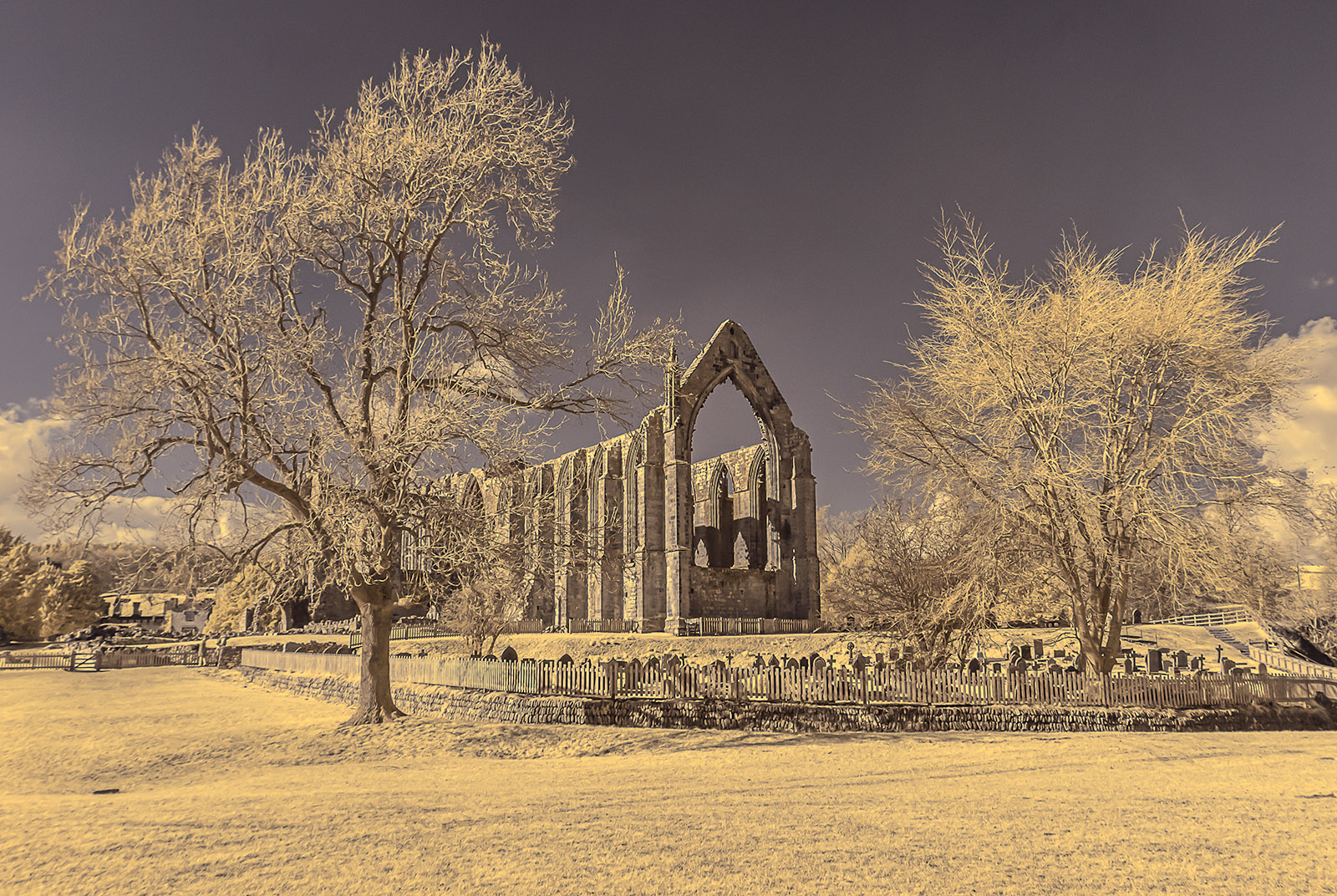
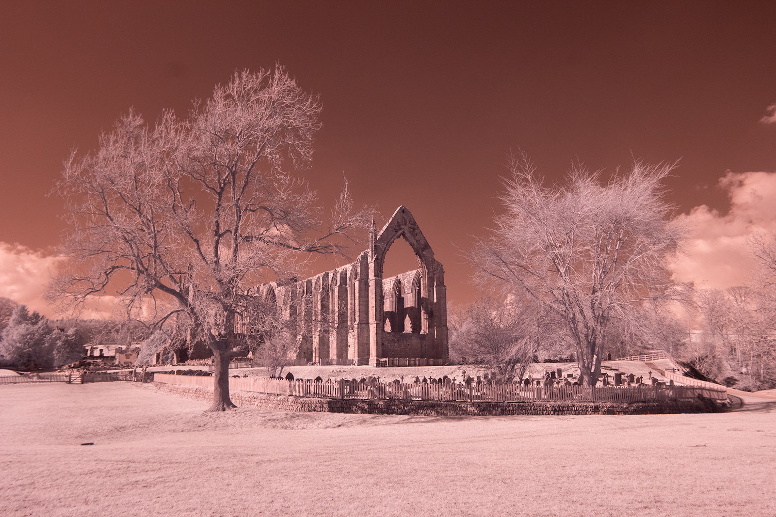
August 2020 - Bolton Abbey
Original
About the Image(s)
The image is of Bolton Priory taken earlier this year before lockdown. The ruins are what remains of a 12th century monastery which was closed during the reign of Henry VIII. Rather than sticking to my usual monochrome images I decided to have a play with colour. I made the usual adjustments in Lightroom to the contrast, shadows, highlights, texture and clarity and applied some noise reduction. I then used the channel mixer in Photoshop to colour the image. This resulted in colours that were too saturated for my taste so I adjusted the hue, lightness and saturation in an adjustment layer. Finally I sharpened the image using the high pass filter. I hope all is well with members of the group in these challenging times.
This round’s discussion is now closed!
7 comments posted
I like the colour version of this but agree it would do well in monochrome.
Suggestion: there is a fair amount foreground, which you need and should not crop. But to guide the viewer to the more interesting areas of the image you could try putting a slightly darkened area along the bottom edge. The viewer will then look to the lighter areas which is where all the interesting things are. Posted: 08/07/2020 15:02:42
Suggestion: there is a fair amount foreground, which you need and should not crop. But to guide the viewer to the more interesting areas of the image you could try putting a slightly darkened area along the bottom edge. The viewer will then look to the lighter areas which is where all the interesting things are. Posted: 08/07/2020 15:02:42
Lovely composition Julie. Never been here but definitely looks worth a visit. Trees to either side are well placed. I particularly like the character of the one on the left. Unlike Terry I feel a crop of the bottom would strengthen the scene but perhaps hie suggestion would also. Posted: 08/12/2020 07:11:56
(Group 52)
I like the wide angle view of this subject that lets me see the context in which this interesting ruin is set. I hope you also zoomed in and did some detail work, because I would bet that this is a place where many, many different compositions could be made, all equally compelling. In my opinion this image could be imporved by selective dodge and burn to give it more tonal range. I also think that Terry made a good suggestion to deal with the foregrund which is much less interesting than the area beginning with the fence. I think either crop or darken it would work. Posted: 08/12/2020 10:51:05
This is a location I have visited on several occasions but this is the first time I have used infrared. I have many detailed shots of the building but they are all in colour. On this occasion unfortunately I did't have much time. I think I may have reduced the contrast by darkening the highlights and lightening the shadows in processing it as it was a very bright day with strong shadows but I will have another attempt at processing it as you suggest. Posted: 08/12/2020 14:10:57
Interesting place with such great possibilities. Hope you can go back with the IR for more photos. I like you color choices and I think they help with a bit of the mood. I do think having a way to draw the viewer more into the photo by either darkening the foreground or burning it and then dodging some areas to highlight them would be a good choice. I would love to see more of the details of the old building. I could spend hours exploring this scene!! Posted: 08/13/2020 11:09:46
I really like scenes like this one as those old buildings are fascinating. This one, in particular, has a cemetery in the foreground that adds to the interest. The trees give balance to the composition and your colorization is "soft" and echoes the emptiness of the building. Extremely well done. Posted: 08/15/2020 08:41:40
Very nice, the only thing I would try is maybe crop up just a bit from the bottom, and try adding a little more whites. Posted: 08/24/2020 09:51:07