Nelson Charette
June 2020 - Idlewild Park
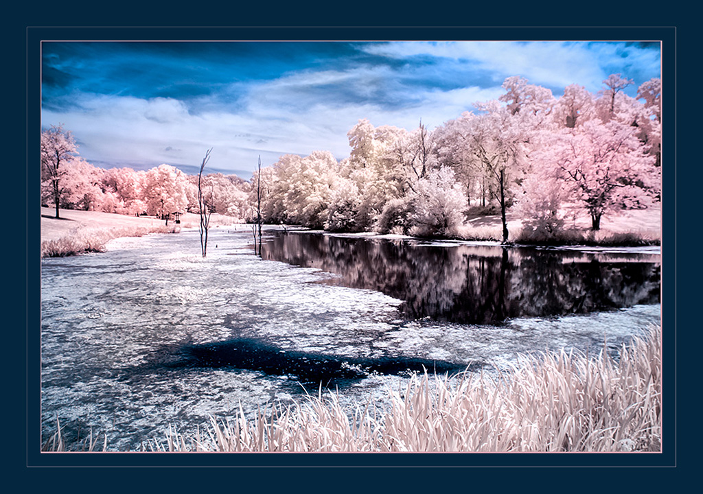
Original 1
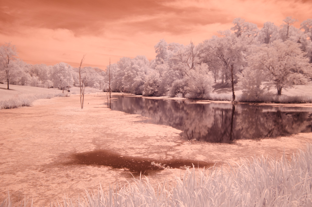
Original 2
About the Image(s)
I made this image a few years ago at a local park. Shot this with my Nikon converted d5100 at 590 nm, I was just playing around with the false colors, trying to make a surreal looking image. Swapped colors in Photoshop, and added a border in Photoshop. Camera settings 1/400 sec at f /8, ISO 200, at 18mm from the kit lens.
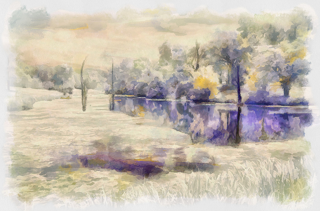
I was also playing around with a new painter program Terry suggested Dynamic Auto Painter 6, I've also included that one.
This round’s discussion is now closed!
6 comments posted
I do like this Nelson an like the way you have kept the grasses
at the bottom. It would have been so easy to have cropped them off but I feel they are holding the scene together. The delicate colours of your trees are very nice. Good sky but perhaps a little desaturation of the Blue would be more in keeping with your subtle colours. Easy for me to say who sometimes goes overboard in CLiR, but sometimes you don't see your own failings and this is why a group like this helps to put us back on track. Love the arty one (Original 2). Gives it a water colour look. Posted: 06/10/2020 02:58:39
at the bottom. It would have been so easy to have cropped them off but I feel they are holding the scene together. The delicate colours of your trees are very nice. Good sky but perhaps a little desaturation of the Blue would be more in keeping with your subtle colours. Easy for me to say who sometimes goes overboard in CLiR, but sometimes you don't see your own failings and this is why a group like this helps to put us back on track. Love the arty one (Original 2). Gives it a water colour look. Posted: 06/10/2020 02:58:39
I agree with Helen about leaving the grass to anchor the foreground. I often include things like this and have been chastised by others. But, I would suggest darkening the grass a little, e.g pulling a gradient up from the bottom. The viewers eye will then look away from the dark, upward, to the light area of interest. (Old trick I learned from works by the Hudson School.)
I see you are having fun with DAP! You can do an amazing amount of image interpretation with that program. Please show more. Posted: 06/10/2020 10:02:18
I see you are having fun with DAP! You can do an amazing amount of image interpretation with that program. Please show more. Posted: 06/10/2020 10:02:18
Well, I think you achieved your surrealism! I love the pink and dark, deep inky blue of the water. For me the blue area of the sky is a bit overwhelming. I do love artistic version, though. Both are well done! Posted: 06/11/2020 13:31:27
(Group 52)
I like the way you have used leading lines to draw my eye into the scene. I think leaving some of the grasses in the foreground was a good choice; that area sort of anchors the image for me. I also like where you are going with color, but I feel the blue is too intense. The feeling of this scene is one of calm and peace, but the blue jumps out at me in a way that interferes with that feeling. The artistic rendering you created is one I find very pleasing. I think those colors are lovely and I enjoy the water color effect. Posted: 06/14/2020 12:13:47
I don't understand what Original 2 is but in a close examination it looks quite good and for me I prefer it over what you displayed. As far as the latter, it is well composed and has many interest points. Posted: 06/14/2020 14:26:34
This is a lovely scene but for me the blue border is too dominant. The colours in the image itself, especially the pinks, are lovely but I agree that the sky needs toning down a little. The water colour version is very appealing. Posted: 06/15/2020 01:50:39