Jan Handman

June 2020 - A Bird in the Hand
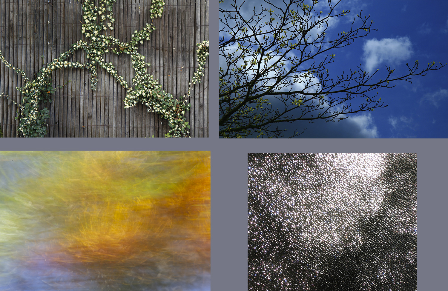
Original 1
Original 2
About the Image(s)
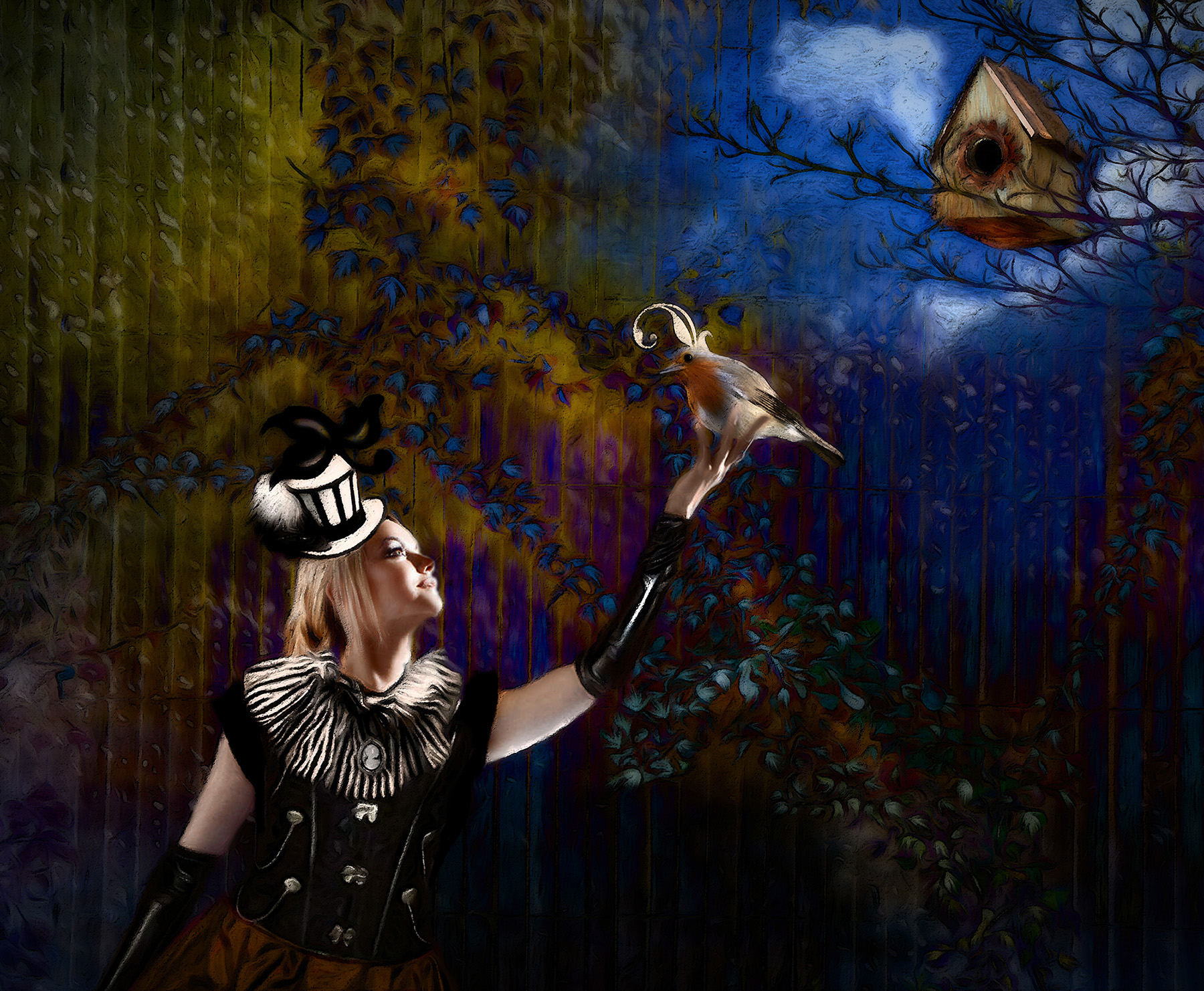
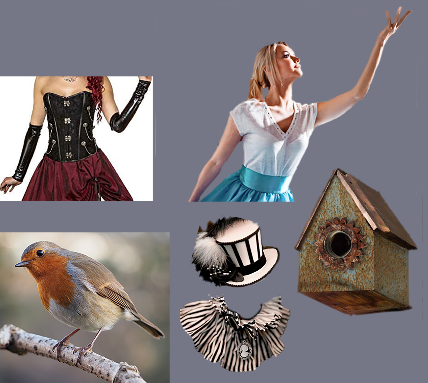
I went totally cuckoo with my starting background images (Original 1). I didn't have much of a plan except to experiment with Blending Modes and see what happened. I've played with Difference mode many times and usually like the effect it gives, but it always seems to be too intense and busy for a background. This time, however, I decided to stick with it and see what I could put in the foreground to complement it. A few failed tries later I found this image of a young woman reaching for a bridal bouquet and figured I'd strengthen her by giving her a quirky Steampunk outfit. She needed something in her hand and the bird seemed as good as anything else I was thinking about using, so I went with that. The birdhouse was a logical third element. To ramp up the quirky factor, I added the topknot on the bird using a decorative typeface character; at first I used black, but it looked disconnected, so I used the eyedropper tool to pick color from his head so it would blend in. She needed a quirky topknot too, so I did the same on her hat. Then it was on to PS Filters to blend everything together: Oil Paint, Rough Pastels, and Watercolor. Finally into On1 for Glow and Vignette. I guess I could have tamped down the saturation of the background or blurred it, but I decided I liked it as it was. What do you think?
This round’s discussion is now closed!
9 comments posted
(Group 54)
(Group 54)
I like the diagonal you've created to give the leading line. For me, everything works in the image - even the light direction on the robin has been made to fir with the line of light in the young woman. You've dressed her so well and the 'quirky' topknots are right for the image.
Thanks for putting a smile on my face again! Posted: 06/09/2020 15:28:34
(Group 77)
My only suggestion is to put a few lighter spots above the lady, to bring the eye back into the image in a circle. here is what I mean.
Love your image! Posted: 06/09/2020 21:29:17