Randy Dykstra

February 2021 - Shane's View
About the Image(s)
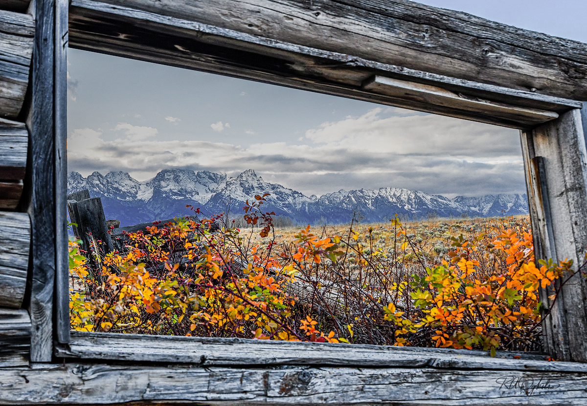
Shane's View
This is the view from the cabin used in the movie "Shane" back in the 50s. The Grand Teton range is in the background. It was shot with a D850 and Tamron 24-70mm @31mm 1/320 f/6.3
I'm actually surprised at the depth of field of this image. I believe I focused on the far wood in the left side of the frame and was able to get most of the shot in acceptable focus. This was before I learned to blend focus stacks and I've gone back and done so but the colors, clouds and snow haven't ever looked the same.
This round’s discussion is now closed!
8 comments posted
Great shot. The only suggestion I have is maybe burn in the clouds a touch. Posted: 02/01/2021 10:32:42
yeah that could help as they look blown out. This was a shot accidentally in jpg format. My camera had a major glitch and completely froze up the day prior. I had to completely remove all power and do a full up factory reset and eventually got working again. But it took me a while to get all my settings set back to what I had them. I didn't try to re-edit the photo, as I wanted to hear comments first. Posted: 02/01/2021 12:38:45
Charming image where the logic is reversed by the deterioration: the beautiful nature becomes apparent by looking into the 'interior' of the dilapidated building.I really like the composition, the colors and the angle of view - well done! Posted: 02/02/2021 10:31:08
That's an absolutely delightful photograph! It works especially well with the bright colors. Posted: 02/03/2021 23:00:20
Great idea to use available woods as frame. Color combination between orange and blue always interesting. Nice shot. Posted: 02/05/2021 03:57:33
One of my favourite films, looks like the cabin has not done so well, shame the highlights have blown, I did have to look twice to see if this was a reflection. Good view to have from your window. Posted: 02/08/2021 06:55:47
I went back and did just a little bit of work as my PS skills have improved since I last worked on this image. It is interesting what I thought was acceptable 4 years ago vs now. Posted: 02/08/2021 11:34:24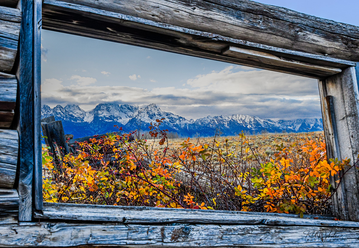
(Groups 4 & 15 & 58 & 59 & 72)
Randy, I like your second iteration better than the first. You removed most of the blue hue present in the wood and the background, and perhaps could benefit from additional desaturation. I like the framing. Posted: 02/22/2021 14:08:17