Jennifer Doerrie

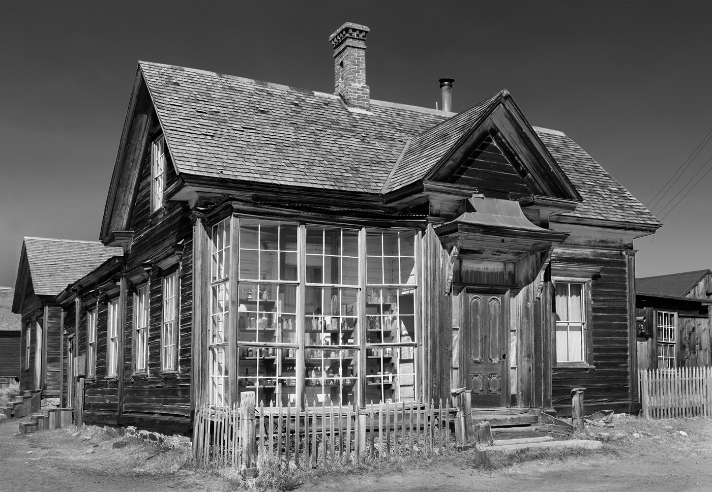
October 2020 - Cain House Bodie
About the Image(s)
Cain House - Bodie
100 ISO
f/8
1/125 sec. exposure
-0.3 exposure compensation
24 to 105 mm lens at 24 mm (perhaps I should have used my wide angle lens, but it tends to distort architecture a lot)
Bodie, California is an old mining town that was abandoned in the early 1900s after the mining boom ended, and is now a state historical park. It is an intriguing place to explore and photograph, although keeping other people out of the photos can be a challenge.
I'm wondering if I've got the sky too dark in this image, as well as whether I need to remove the utility wires on the right side or leave them as they are? (I'm not planning to use this image in photo travel, where I could not remove the wires or make other such alterations, as I don't think the place is sufficiently recognizable to those not familiar with Bodie.) Also, I'm wishing I would have left more space at the bottom of the image. I perhaps could add (clone) some extra dirt there. Would that help?
This round’s discussion is now closed!
10 comments posted
Contrast and sharpness are very good. I don't find the sky too dark. I think it differentiates very nicely with the tone it has (Diana would have made it darker). Yes, it would be nice to remove the wires. About the foreground, it would be a bit better to have a bit more, but I don't think you need bother.
One special comment. You tilted the camera up to get this, so there is some "lean-back" perspective to the house. I like to keep that in for tall buildings, like skyscrapers, to emphasize the soaring height, but for buildings of three stories or less, it sometimes helps to alter the perspective. In the attached sample, I did not quite completely straighter the vertical parallels, but left a slight hint of the vertical perspective. What do you think? Posted: 10/08/2020 19:43:21
About the perspective, my PS Elements has several controls for stretching and pulling an image. The one most people might choose is "perspective," but I don't use it so much because it is left/right symmetric, which is fine if your image is perfectly centered and needs adjustment equally on both sides. I prefer to use "skew" which allows each side to be adjusted separately--more on the right in this image. "Skew" can be pulled up/down/left/right, but for this image I only pulled the left side to the left and the right side (a bit more) to the right.
Since your eye actually sees the same tilt as the camera--but your brain diminishes it--I left a hint of tilt in my suggested image, which I find more pleasing than complete straightening.
All such perspective changes are actually "distortions," not "corrections," since the camera image is optically as correct as your eye. Interestingly, your eye has no such trouble with perspective convergence to the left or right, like streets running off to a vanishing point--no one feels the need to "correct" that perspective. But oddly, we have trouble with vertical perspective. Posted: 10/08/2020 23:49:49
Stephen suggested the "skew" function to straighten the perspective a bit. Admittedly, I have never used this tool before, I normally choose "Lens correction". But the skew function seems to be easier, so I appreciate the suggestion. Will use it in the future as a good alternative. Posted: 10/09/2020 08:21:30
But the perspective tapering of tall buildings is best approached with "perspective" or "skew." Perspective is not a distortion--it is a valid property of your point of view, whether seeing it with your eye or with a lens. Posted: 10/09/2020 10:17:01
Coincidentally, last week I was working on some images of a highway intersection, with roads crossing in several layers. I never really managed it well to correct perspectives or straighten lines (pillars). Now I look forward to trying the "skew" function. Thanks again. Posted: 10/10/2020 06:31:32