Asbjørn M. Olsen
September 2020 - Lonesome house
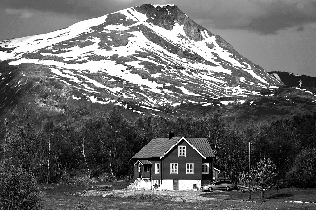
Original
About the Image(s)
I took this shot across a narrow fjord, with a 300mm handheld. It was in the month of May some years back.
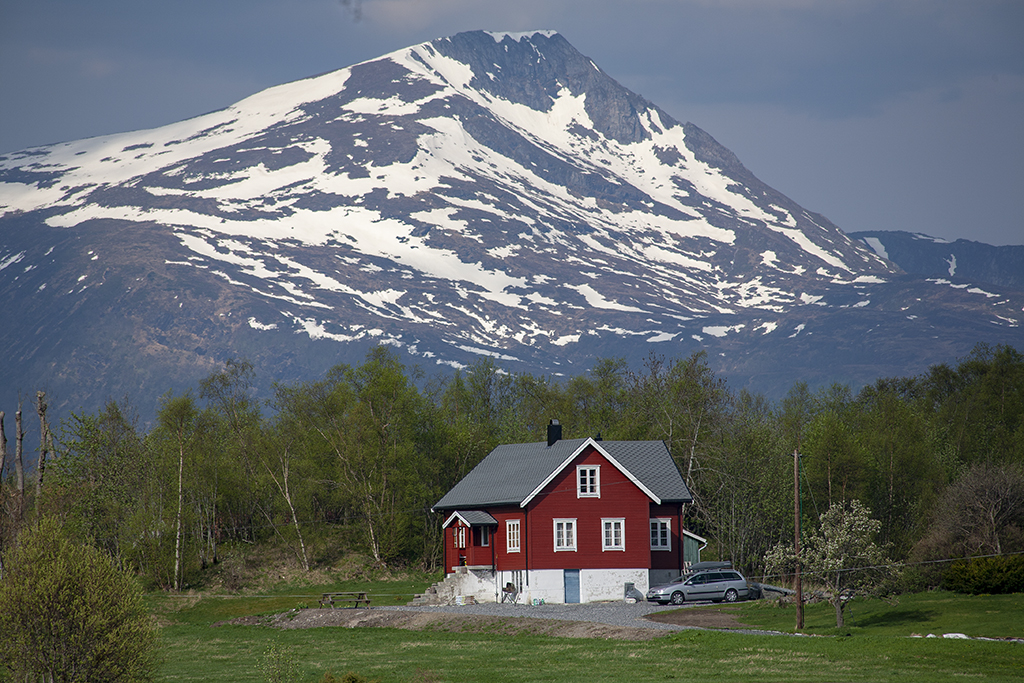
Not the sharpest of images, and hazy as well, but I liked the majestic mountain filling the background. I prefer the monochrome version, as it gives the image more push. The attached original is the jpg version of the raw file, with no adjustments.
This round’s discussion is now closed!
8 comments posted
Nice image of a peaceful mountain cabin with drama from the majestic mountain. My only suggestion is remove the car, but that is just me. I like the image. Posted: 09/03/2020 17:33:21
Ha! How do you like that? No one will believe me now that Russ has said it first. That was my only suggestion, too. How will I ever convince any of you that I really thought so?
I like very much the how the mountain fills up the frame. Posted: 09/05/2020 00:21:42
I like very much the how the mountain fills up the frame. Posted: 09/05/2020 00:21:42
Thanks to both you and Russ. And yes, I believe you. I have thought about removing the car, but not sure if I should use this image in some competitions. If I use it for Travel sections, the car van not be removed. Perhaps just use it for PIDM, or for landscapes. Or may be not at all? Posted: 09/06/2020 09:23:29
I thought the same thing before reading the comments! Yes that was my suggestion as well. I might also crop off a bit on the right so the house is a little more off center. It's still May and there remains remnants of snow. That and the birch trees tells me that this lonely house may get even more lonely in the winter.
The monochrome version does give this more image more push, and the mountain behind is both majestic and dramatic. Posted: 09/07/2020 09:27:26
The monochrome version does give this more image more push, and the mountain behind is both majestic and dramatic. Posted: 09/07/2020 09:27:26
I really like the colors in your color image. The red house with green grass and the blue mountain. However, for your title of a lonesome house, the monochrome is a better choice. I will say "me to" about the auto if you want to use it for pictorial. Posted: 09/09/2020 14:15:04
Again everyone has mentioned that car which is annoying though it isn't as noticeable in the mono as in the colour. My only other suggestion is to crop off the white bits along the track, just to the right of the tree. That removes a distraction and also puts the house offcentre. If you are not going to use it for PT, then the car and the telegraph pole could be removed. This reminds me of beautiful weather in Norway and how dramatic the landscape can be. Posted: 09/13/2020 13:03:59
Like Tom, I believe the colors work well in your color version of this image. However, the color image does make the broken trees on the right side more noticeable. I think I would be tempted to crop those out. In the monochrome image, the white part of the house seems very bright on my monitor. I don't know how challenging it would be to adjust, as it doesn't seem to have a lot of texture there. Of course, if you do use it pictorially, you could clone some from the right side. This photo looks very tranquil. I'm wishing I were there right now. Posted: 09/26/2020 21:39:20
Thanks to all! Yes, the car should be removed if I use this for a section where removal of stuff is allowed. But I will crop some of the right side,to get rid of the white spots on the ground and get the house off center. Posted: 09/27/2020 05:31:19