Stephen Levitas
About the Image(s)
Title: First Jumble
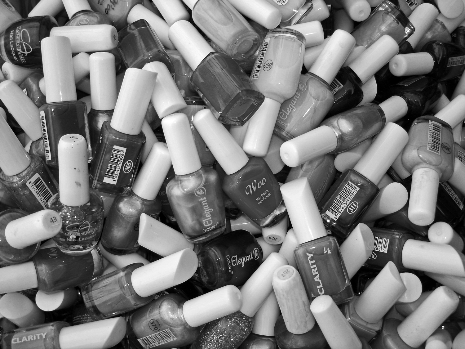
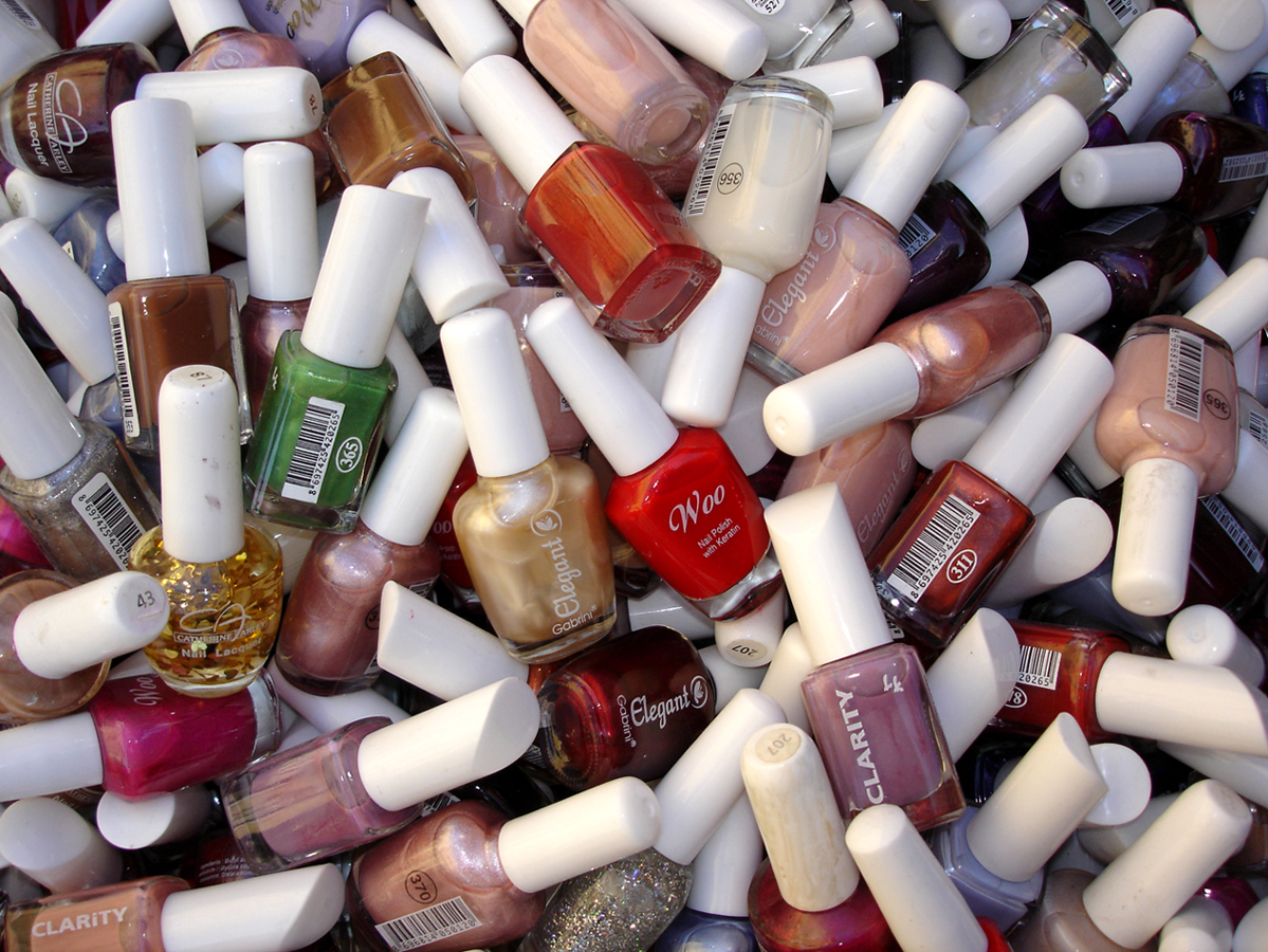
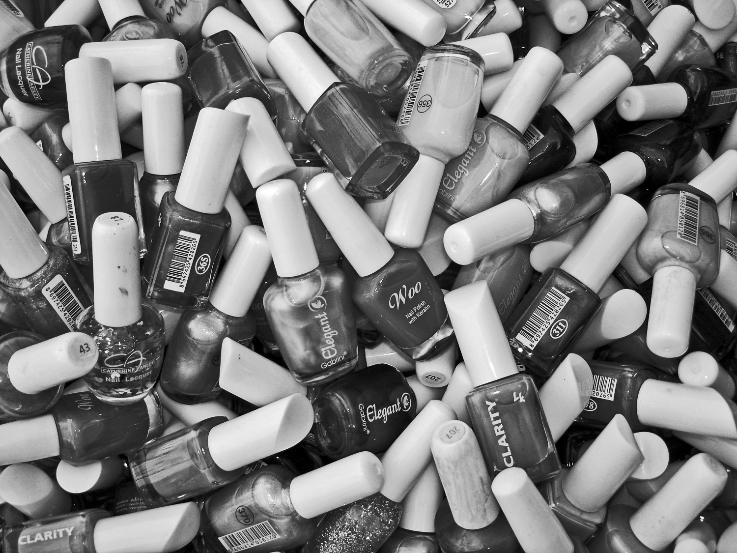
I have been shooting Jumbles for about 20 years. Here is how it all started�”shooting straight down into a basket of nail polish bottles at an open-air market.
It looks better in color, I think? What do you think?
This round’s discussion is now closed!
17 comments posted
(Groups 36 & 67)
Actually I like the B/W better. My eye is naturally drawn to the light and bright and in the color version the numerous white caps make my eye feel like it is jumping around the image. In the B/W version the more even tones allow me to enjoy the other compositional features such as leading lines. I feel that there are many caps that in one way or the other are pointed at the "Woo" bottle, which for me becomes the dominate subject.
While jumbles like this are not my favorite subjects (I'm a naturalist) I find that this one captivates me. Posted: 01/03/2020 07:26:51
While jumbles like this are not my favorite subjects (I'm a naturalist) I find that this one captivates me. Posted: 01/03/2020 07:26:51
Stephen: I agree with Larry! The only thing that I would change is the Title. I would call it "Woo" or "Elegant Woo" because that is what caught my eyes. Posted: 01/03/2020 07:41:05
(Groups 36 & 67)
Woo Hoo!!! :-) Posted: 01/03/2020 20:26:09
You nailed it, Larry. That's so much fun. Thanks. Posted: 01/03/2020 22:39:36
I like the B&W version as well. The color version is fun, but the other glittery polishes distract. Elegant Woo Hoo really fits and Larry is right about the bottle caps leading to the woo bottle. Nice job! Posted: 01/06/2020 19:12:16
Great idea! Posted: 01/27/2020 15:54:17
(Group 57)
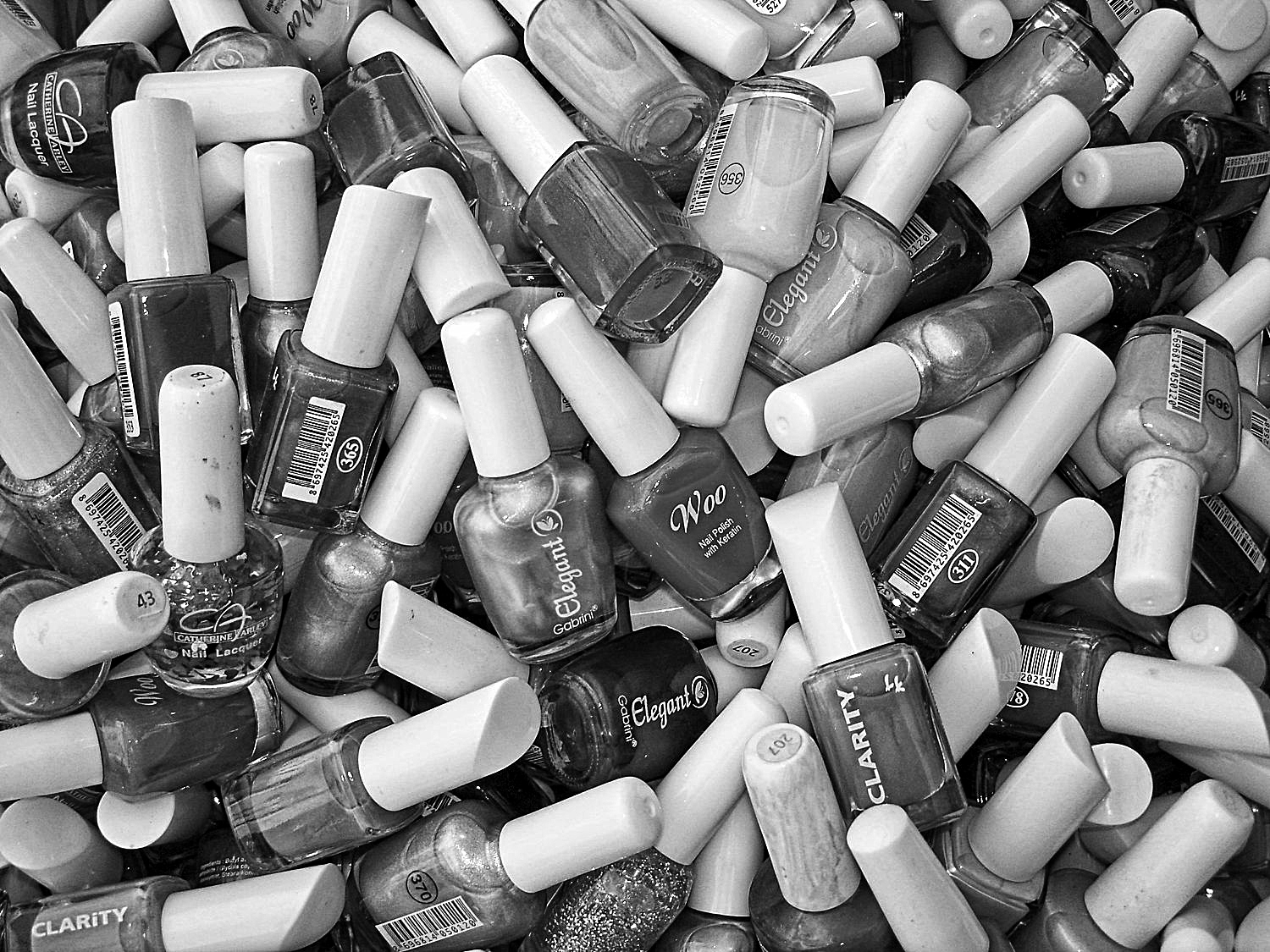
Hi Stephen, dropping by from Group 60 to check out your Jumbles. I like these types of shots for Macro work. I do prefer the monochrome image but in saying that, I'm kind of a Contrast guy when in comes to B&W, so one alternative thought might be to use the Black slider to add a little more black to this image. There is a lot of middle gray; maybe a little more black could add more depth. Not too much so you loose details in shadows but a little. If your editing software can do Luminosity masks, that could be way selectively darkening some of those middle grays. Just a thought. Happy Jumbling!
PS Played around with your image in ON1; bumped up the Whites and midtowns and selectively in some shadow areas. Wanted the bottom of that Elegant bottle under the Woo bottle show up, to add more depth. Did it work or did I go to far? Posted: 01/15/2020 10:32:43
PS Played around with your image in ON1; bumped up the Whites and midtowns and selectively in some shadow areas. Wanted the bottom of that Elegant bottle under the Woo bottle show up, to add more depth. Did it work or did I go to far? Posted: 01/15/2020 10:32:43
(Group 57)
Cool, I like it. A little contrast goes a long way. Give it a little pop and depth. Posted: 01/15/2020 16:59:57
(Group 43)
I thought I would look at your work and am in Group 43. I appreciated your comments on my photo. I think your B & W has great whites blacks and grays.It really seems to work.
Posted: 01/19/2020 10:09:54
Posted: 01/19/2020 10:09:54
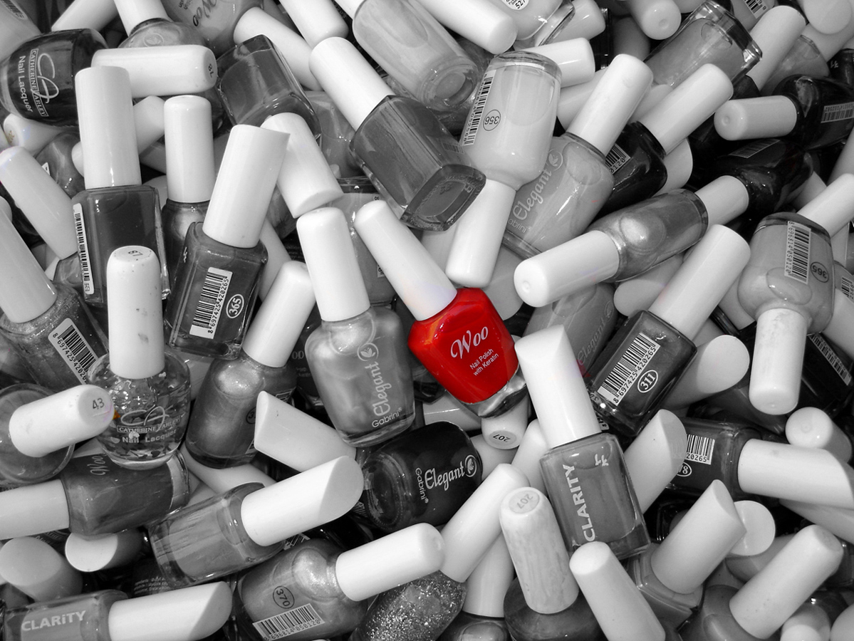
Women are the main supporter of world economies:) Surely, color image is better to take a trip in rainbow. Red splash as Tom edited is also impressive. Nevertheless, I enjoyed your bnw version as well. Posted: 01/25/2020 09:32:00
Thanks for visiting, Ata. I shot this in Çeşme, Turkey town center in a market basket outside a souvenir shop. Posted: 01/25/2020 14:20:02
I'm very surprised Stephen that you shot in Çeşme. Possibly they are 50 cents polishes, but good for photography. Posted: 01/26/2020 07:22:55
Lots of comments here! I preferred the colour over the mono when I first looked, but having seen Tom's single red one, I transferred my allegiance to that. The red had stood out for me in the colour anyway. My eye just jumped around in the mono one, although the increase in contrast does improve it. I might have been tempted when taking it, to turn round the ones with names except for the Woo name to increase its impact. Nice one! Posted: 01/27/2020 14:47:33
Thanks to everyone for their comments. I just love the "Woo Hoo" name suggestion from Larry, and Tom's coloring suggestion. Thanks also to Bob for the contrast work. And to Diana for reminding me that I can manipulate a scene before I shoot it. Posted: 01/27/2020 15:53:36
Not sure I can add anything new here, but I do very much like Tom's idea to leave just the small amount of color in the featured bottle, and agree that the increased contrast benefits the image. Posted: 01/27/2020 23:39:56
