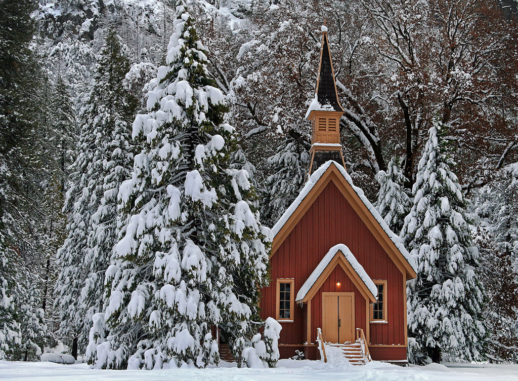
ISO 1000 - photo was taken in early February after 4:00 p.m., so it was getting dark
1/50 sec.
f/6.3 - not sure why I chose that, rather than 5.6 for the darkness or or a wider aperture for the landscape since I did use a tripod
24-105 mm lens at 35 mm
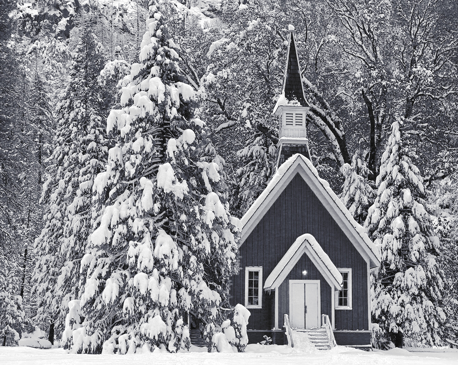
Although practically everyone takes photos of this little chapel in Yosemite, I seldom can resist taking my own photos of it, too. Last February was the first time they had significant snow in several years, and I couldn't help but be attracted to the contrast of the red chapel and the snow-covered landscape. While it is nice in color, I thought this image possibly might work in monochrome, too. Alas, it's always a struggle for me to get the contrast right with snow scenes in monochrome. I'm curious, how does the contrast look on your monitors? Also, I'm wondering if I've tried to include too much in this image, particularly on the left side? I already feel like the top and bottom are more tightly cropped than really is ideal, though, so if I take anything from the left, I may end up with a nearly square format. I'm not convinced a square format works well with landscape photos, does it?
This round’s discussion is now closed! 7 comments posted
Jennifer,
I am not that technically savvy to answer some of your questions. I love the photo in black and white especially with the snow around the borders of the church. The black and white rendition looks more natural to me and I really get a sense of belonging. I look at the trees as protecting the church.
It certainly is the right season for such a beautiful picture.
Gloria Posted: 12/08/2019 18:30:48
Stephen Levitas
I think you are absolutely right to crop the left side--no problem with a square format if that is the subject matter--in fact, I think it makes the shot intimate. Good idea. The snow tones look fine on my monitor. Fine overall shot. Posted: 12/10/2019 06:36:59
I agree with Gloria and Stephen - totally. The colour looks cliche Christmas card, whereas the monochrome has extra atmosphere. Definitely well captured and correct for monochrome. Posted: 12/10/2019 13:27:58
Tom McCreary
The image looks good on my monitor. I would not crop off on the left, because I like the chapel being off center. I like both the color and the monochrome. Posted: 12/11/2019 15:09:07
Rick Cloran
(Group 44)
Apologies for kibitzing on your group and image. I think the subject matter is very conducive for a nice BW image. I'm going to take a middle ground on the cropping suggesting a slight crop from both sides that will leave the lower right "crash point" of the rule of thirds directly at the apex of the cupola over the door. I have a bit of an odd way of doing some of my conversions that I throw out just for consideration. After adjusting primary white and black points, I convert with the standard BW adjustment layer and tune that with the selective control (hand) to get the basic tones the way I want them. I then drop in HSL (Hue-Saturation) adjustment layers UNDER the BW layer and use masks and the HSL Hue and Saturation controls to make targeted adjustments to the areas where I want to shift that initial conversion. That lets me push the red darker and the yellow lighter. I'm attaching an alternative version so that what I said might be a bit more clear.
Again, apologies for butting in. I'm finding a new love in monochrome and so peek in on occasion. Posted: 12/12/2019 15:09:06
Tom McCreary
Rick, Thanks for your comments. I had not thought of using Hue-Saturation under the B&W conversion. Your image is really quite striking. Posted: 12/18/2019 16:52:59
Diana Magor
Just realised how the days have flown by. I like Rick's crop and I prefer the slight offcentre look. I don't object to square format for landscape when it is something like this which lends itself to square. The scene is beautiful and you were so lucky to get the snow. Both colour and mono are attractive in their own right -use the former for your Christmas cards and the latter for competitions. Posted: 12/20/2019 09:17:52