Michael Duke, QPSA
August 2018 - Lucy May Walker
Original
About the Image(s)
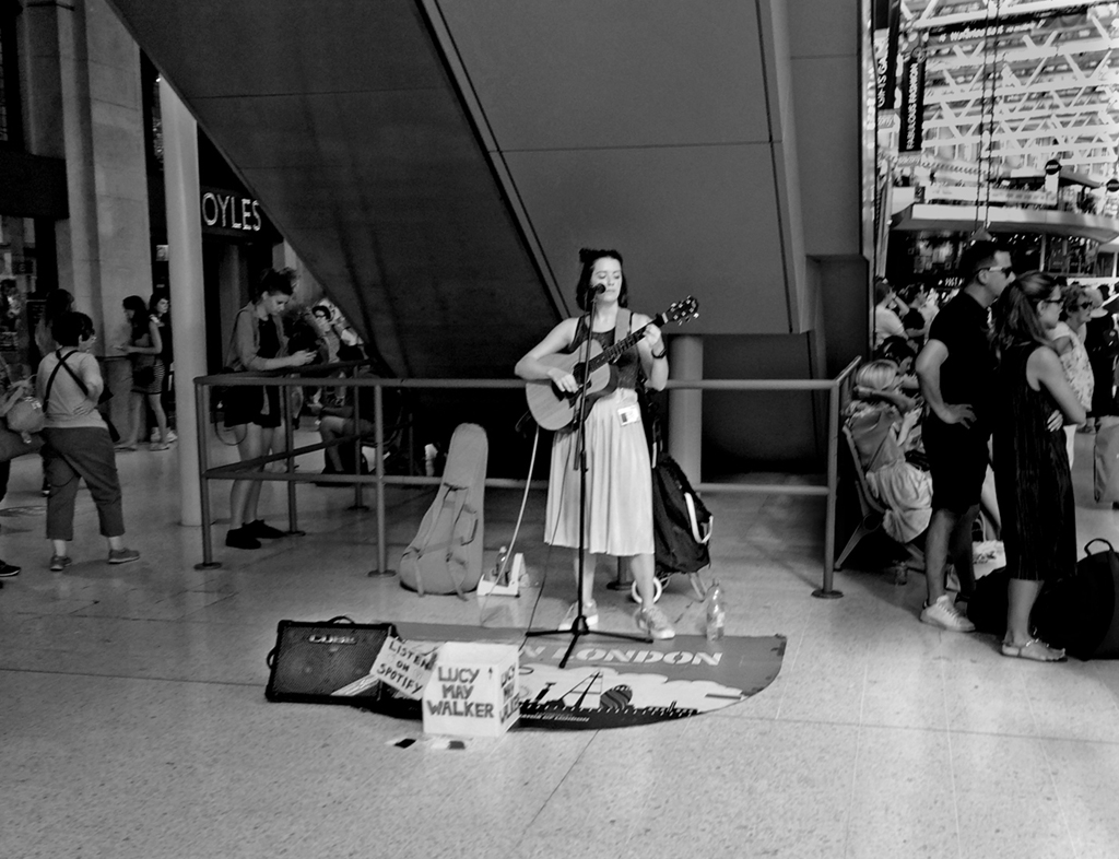
I captured this image at Waterloo Station in London on my way to catching the train to Portsmouth Harbour. What got my attention (apart from her voice) was the girl on the left who seemed to be the only person listening in while everyone else was either rushing off or looking at the electronic departures timetable. I have tried to brighten up the singer and tone down the rest so that she would stand out a bit more from the scene without her looking like a cut-and-paste job. I am not over satisfied, so I would appreciate suggestions.
This round’s discussion is now closed!
12 comments posted
I am not sure. How about the cropping? Like below? Maybe make the second person also brighter, and compare the singer to a single passer-by, who happens to be looking at her phone rather than the singer? Posted: 08/03/2018 13:10:23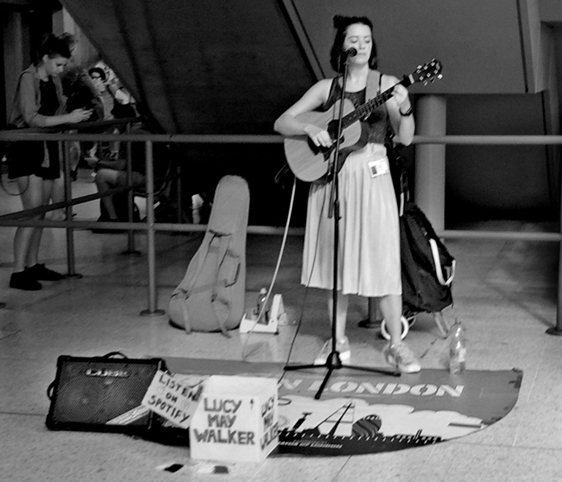
I was at the scene and she was looking up and down at her phone at regular intervals. However...............nice crop, but the group to the right was part of a story. As a stand alone image, what you have done looks good and could be considered for future use out of the context of the whole part of my Waterloo Station series as well as the fully peopled version the series for which I intended the image. Thanks for the input Posted: 08/05/2018 15:53:15
I understand your reply in that this is one of a sequence, but I like Stephen's crop for a stand alone shot. The listener is looking at her phone at this particular moment so I don't think she's important though having the whole picture does illustrate the lack of interest of passers-by to buskers however good they may be. I don't think it's as sharp as it might be - the notice looks out of focus. You've quite a good job of darkening the lights top right Spending more time looking at this , I found the extra people were good and therefore this is suitable for PJ comps if you enter them but I suspect you'd need to bring them out more to emphasise the point of dissociation from the singer. Posted: 08/07/2018 04:55:35
I totally agree Diana - and Stephen is to be thanked for his input. I had not thought of using it as a stand-alone shot, but definitely both of you are correct. Posted: 08/07/2018 04:58:48
We try! Posted: 08/07/2018 05:01:47
What I like about the crop that Stephen suggested is that it leaves out the people on the right who are looking out of the frame, but I think the singer needs more headroom and therefore a vertical with the angular stairs above her would be a better choice. I like the person in the background looking at her phone because it is a sign of our times. People are always checking their phones in 2018 and perhaps missing the wonder around them like Lucy May Walker's song. Posted: 08/09/2018 23:04:16
If you do make it a vertical, I would erase the lettering on the upper left because it would cause the eye to go there for no real reason. Posted: 08/09/2018 23:05:57
Your choice of using monochrome is a good one. It simplifies the image to tell the story better. I like Stephen's crop, except that I would leave in the person walking away on the left side. The people on the right are just a distraction and make the image look too busy. Posted: 08/17/2018 19:29:41
Your commentary on our busy society where so few people can/will make time to stop and listen or observe what is happening around them is very telling. I think that concept still works with just the people on the left. Like others already mentioned, I find the two people on the right draw my attention away from the rest of the image. I tried a bit wider crop than Stephen's, but still eliminating the people on the right. You can see what you think about it.
Posted: 08/27/2018 23:54:06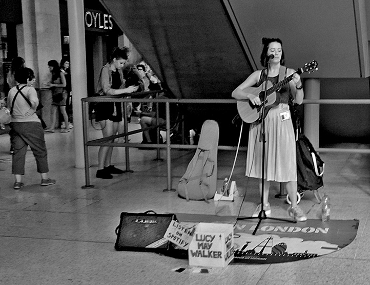
Posted: 08/27/2018 23:54:06
Perhaps I should have said at the beginning - this image is one of a series of life at Waterloo Station and not a 'stand-alone' image. Therefore all the 'crop, crop, crop' suggestions do not really answer my question. Since joining this group, I get the feeling that members see monochrome as a study of a particular subject totally out of its' context. I may be wrong here, but when I go for monochrome, I still believe the image should tell a story rather than just be a study of a person or object. Is this a cultural difference between the USA and the UK? Posted: 08/28/2018 12:28:51
Michael, you are raising a very interesting point. I don't think its a USA/UK cultural difference, just a choice that must always be made, especially if you are preparing a body of work that has a unified approach, as you point out. That would be a good reason not to crop, to keep consistent with the entire body of work.
As for story-telling in a single shot, not in a body of work, I think those of us who suggested crops did so with the idea of focusing more sharply on the most interesting story in the frame--at least I did. I think you are right not to want to reduce this shot to a portrait, and I would not suggest that. Posted: 08/29/2018 17:51:49
As for story-telling in a single shot, not in a body of work, I think those of us who suggested crops did so with the idea of focusing more sharply on the most interesting story in the frame--at least I did. I think you are right not to want to reduce this shot to a portrait, and I would not suggest that. Posted: 08/29/2018 17:51:49
Thanks Stephen - where the suggestions HAVE been useful is when entering mono images for the salons/competitions. I have just looked back up at the version you posted and looks like a good-for-salon use. One thing I have learned a few years back is that competition photography and exhibition photography are two very different ball games. For the salons, the less is the better. Judges don't like what they see as 'clutter' as (point by Tom) it does distract. Posted: 08/29/2018 18:28:32