Jennifer Doerrie

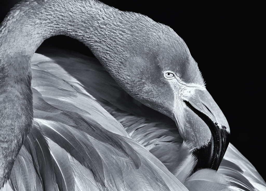
April 2018 - Flamingo preening
About the Image(s)
Flamingo Preening
ISO 125 (set on auto, I believe)
f/8
1/640 sec.
-0.7 stop exposure compensation
100-400 mm lens at 349 mm
Although I enjoy photographing flamingos, it seems their bright pink/red color usually doesn't project well for competitions. I decided to see if a monochrome version might be more effective. Even though I adjusted the contrast and structure and added some shadow recovery in Topaz, many of the feathers in this image still seem a bit dull to me. Do I need to try to add yet more structure or contrast to them? I don't want to overdo it. I'm also trying to decide if I like the dark corner on the upper left, or if it would be better cropped out. What do you think?
This round’s discussion is now closed!
13 comments posted
Yes, I think you are right, it does seem a bit dull. I don't know about adjusting contrast and structure more--you could give it a try. You have the essential eye perfect--so important for this particular bird. I have no problem with the upper left corner; I like seeing the full neck curve. Posted: 04/09/2018 21:55:34
Agree with Stephen about showing full neck. Posted: 04/18/2018 15:42:43
I'm agreeing with Stephen here. I like the full curve of the neck but I wouldn't crop any more. Have you got the rest of the neck on the original? I'm also not entirely sure whether flamingoes work in mono as we know in our mind's eye that they are pink and essentially quite light coloured, so to see it as darkish grey looks completely wrong. I think maybe this is a bird which has to stay in colour. So in answer to your question about dullness, yes I think it is too dull. The only other alternative is increasing contrast so some of the feathers go lighter. Your detail and structure of the feathers is of course excellent and it's wonderfully sharp. Can we see the original? Posted: 04/10/2018 04:32:05
It would be interesting to see the original. The upper left corner is fine and not distracting at all. The image does look dull and I'm thinking the same as Diana - we know Flamingoes are bright pink in color so the grey tones just don't seem right. I took your image and played with it but no matter what I did I just couldn't get it to pop. The eye is sharp and the feathers are rich in texture. Posted: 04/13/2018 16:22:36
Nice curve of the neck. The dark area in the upper left is fine. Excellent composition with the eye in a "power point" location. The image is very sharp and the structure is good. The image seems a bit flat. I used levels to make the light areas a true white. Posted: 04/15/2018 13:47:22
Yes, increased contrast helps a lot, because it separates the feathers, but I still think the grey is wrong. Posted: 04/18/2018 04:25:25
I agree that the curve of the neck is nice and that it is fine the dark area in the upper left.
I also agree that the bird's tone is too gray, that's why it's boring.
I think that by giving it more contrast some whites will appear that will make it more interesting.
Posted: 04/17/2018 18:31:06
I also agree that the bird's tone is too gray, that's why it's boring.
I think that by giving it more contrast some whites will appear that will make it more interesting.
Posted: 04/17/2018 18:31:06
Thanks for the feedback. I'll post the original when I am back on the home computer. I don't have the photos loaded on my laptop. Posted: 04/17/2018 20:15:00
Hi, I'm Hattie Stamer from group 36. Since Stephen poked his head to our group, I decided to visit your group. I love the composition and the expression of the bird, lovely. However, there seems more mid tone in this image, not much other variety. I like using NIK, but never used Topaz. In Nik, I would suggest to add control points to give some areas boosted with white or black to increase more interest in the image. Also, since the bird has color, not sure if you tried using a filter in either Lightroom or Nik to see if it add more shades. I don't have photo editing tool right now to try. Posted: 04/18/2018 15:40:13
Hi, I'm Hattie Stamer from group 36 & group 62 (mono). Since Stephen poked his head to our group 36, I decided to visit your group. I love the composition and the expression of the bird, lovely. However, there seems more mid tone in this image, not much other variety. I like using NIK, but never used Topaz. In Nik, I would suggest to add control points to give some areas boosted with white or black to increase more interest in the image. Also, since the bird has color, not sure if you tried using a filter in either Lightroom or Nik to see if it add more shades. I don't have photo editing tool right now to try. Posted: 04/18/2018 15:40:21
Hi Hattie,
Thanks for visiting our group, and for the suggestions. I do have Nik with the control points, so I'll have to try that and see if I can add some contrast that way. Posted: 04/25/2018 23:35:16
Thanks for visiting our group, and for the suggestions. I do have Nik with the control points, so I'll have to try that and see if I can add some contrast that way. Posted: 04/25/2018 23:35:16
Here's the color version. Sorry I didn't get it posted sooner. Posted: 04/25/2018 23:38:26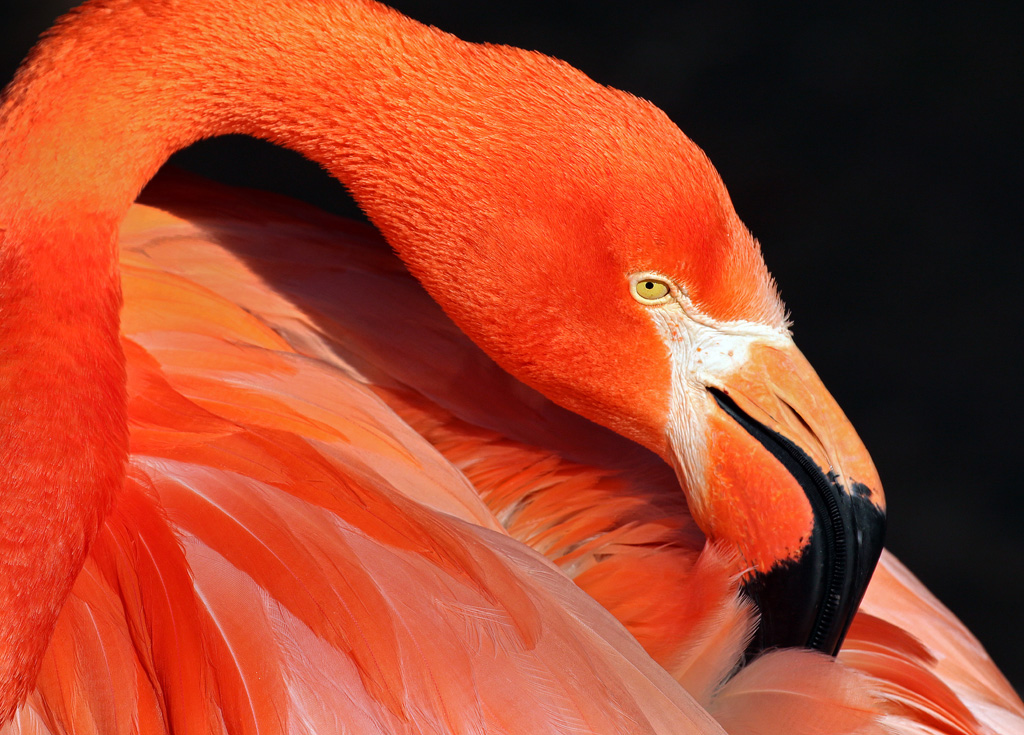
That is one beautiful color bird! I made an attempt, mainly brought some white back, bring some highlight to the beak and other areas to the feather. Matching some deeper color of some other feather area. Darken the background completely. Attempting on a cooler tone. May not be your interpretation though but the bird is too pretty not to play with the image. Posted: 04/26/2018 01:19:03