Brad Ashbrook
March 2023 - Statues of Versailles
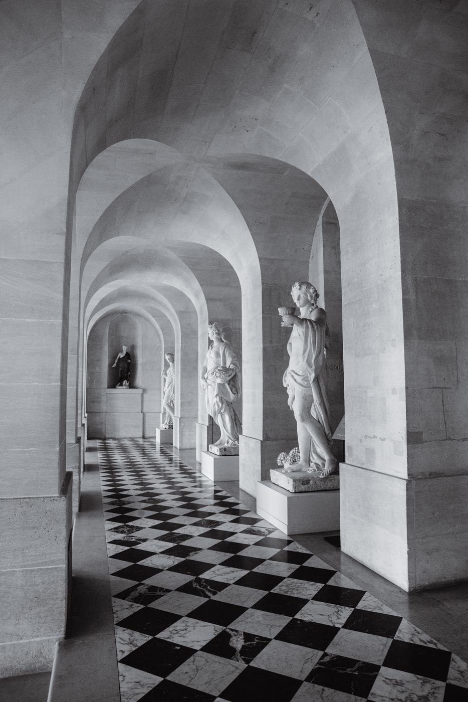
Original
About the Image(s)
This was taken back in December of 2018 while on vacation in France. Going back through some old images (not shooting much lately), this one was definitely meant for black and white. Everything was done in Lightroom using Seim Silver Effects which added some nice selenium color from a preset.
This round’s discussion is now closed!
7 comments posted
I do like the B&W version much better than the color one. I like how the pattern in the floor takes you back to the statue in the back. I do think that bringing out the texture in the arches would make it a much stronger image. Posted: 03/04/2023 21:27:35
I really liked your comments which made me look at the photo again and re-edit this time in Silver Efex. What do you think? Posted: 03/07/2023 09:29:03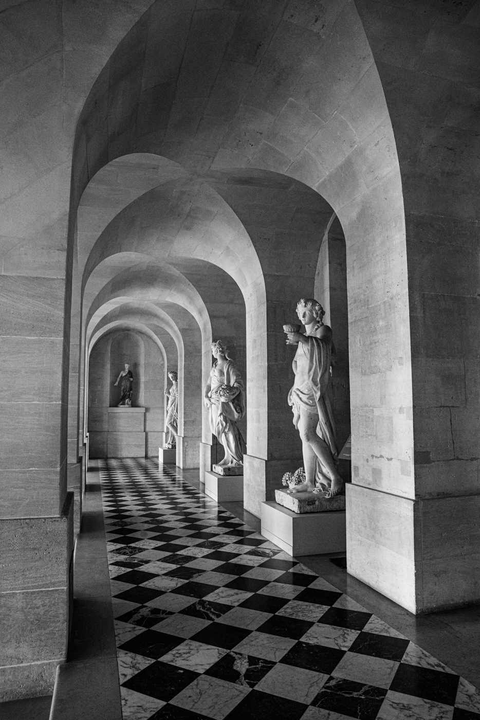
Wow! That makes all of the difference in the world. It takes your eye to the statue in the back and gives you a focus point. Good job!! I hope you like it, which is the most important thing. Posted: 03/07/2023 10:35:13
The B&W chequered pattern leading to the back statue is very effective, as is the diagonal slope of the right wall.
The extra texture in the rework is good.
Have you considered a closer crop. Up to the bottom of the left wall, and down to just above the complete arch. Posted: 03/08/2023 12:19:46
The extra texture in the rework is good.
Have you considered a closer crop. Up to the bottom of the left wall, and down to just above the complete arch. Posted: 03/08/2023 12:19:46
Images taken along cloisters like this can be very difficult if there is strong directional light rather than the softer light you had here. I feel that your rework is great improvement on your original processing, it has strengthened the effect of the directional lighting, and the increased contrast has made the statues appear sharper, not to mention increasing the texture of the stonework.
Posted: 03/13/2023 04:00:40
Posted: 03/13/2023 04:00:40
A well composed image. The monochrome version brings out the detail effectively and your subsequent improvement makes it an even better image. Posted: 03/14/2023 16:30:12
I'm really late to the discussion. I like the conversion and the suggested cropping.
The first statute really pops in the black white.
I like the diagonal leading line formed by the top of the statue heads. Posted: 03/21/2023 09:36:15
The first statute really pops in the black white.
I like the diagonal leading line formed by the top of the statue heads. Posted: 03/21/2023 09:36:15