Becca Cambridge
April 2021 - Thats What We Wore
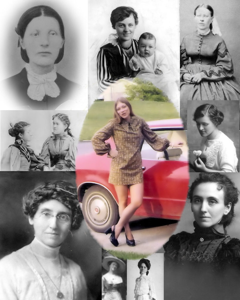
About the Image(s)
Local New Normal photography club's mission for March was "We can't all be Irish, so what is your history?" This had fellow photographers out in cemeteries, researching various ancestry sites and doing covid cleaning of family archives. Our zoom meeting was fun. Photos included caveman sketches, lineage to General Starks, and historical community landmarks long gone.
For me, this month was spent trying to scan old family photos. This worked fairly well with the black and white photos. HOWEVER, what is with those 60's/70's color prints? What post processing can be used or does one just have to deal with that "Kodacolor" color?
Composite of What we Wore
This round’s discussion is now closed!
5 comments posted
You were again set an interesting challenge by your club. I like your layout of your family members, I take it the centre one was a young you. Copying old colour images can be frustrating as unless they have been well stored in the dark the colours will have deteriorated - its worth trying the auto-tone and auto-colour in PS sometimes it works better with auto tone first so, try both ways round, also using the eye droppers in levels can have an effect. If these do not work convert to mono, but do not just desaturate as this will create flat result. On your final version I would preferred to see softer transition between the images rather than the some hard edges.
Posted: 04/10/2021 05:42:31
Posted: 04/10/2021 05:42:31
Totally agree on the softer transitions between images...I ran out of time and wasn't able to get back to it. It took all month to find the photos rummaging through 8 barrels of family archive documents, selecting, deciding on a theme and then trying to balance the arrangement. It does need to be soften. Thanks for the insight and info of color correction. I suspect this will go on for a year or so until all the "barrels" are digitized. I don't have PS but have found SmartPhotoEditor a workable program. It has an auto tone (tries to fix color cast) and auto levels. It also has sliders for multiple colors to adjust vibrance, brightness, contrast and hue. And then there is gamma...gamma? What's that do?
I have not explored the training videos offered by PsA but would hope to find one that might educate me in these sliders.
And yup, young me. What a giggle. Posted: 04/11/2021 10:02:28
I have not explored the training videos offered by PsA but would hope to find one that might educate me in these sliders.
And yup, young me. What a giggle. Posted: 04/11/2021 10:02:28
This is a very original idea. I like the contrast between old and new. I would not worry too much about the colors in the center image. What is important here is the depiction of history and that is excellently executed. Posted: 04/12/2021 14:15:48
Very well done, no suggestions on my part. Posted: 04/27/2021 15:03:57
Interesting collection for a project.
I feel that photography is really about images that we capture ourselves. Posted: 04/28/2021 05:38:04
I feel that photography is really about images that we capture ourselves. Posted: 04/28/2021 05:38:04