Brad Ashbrook
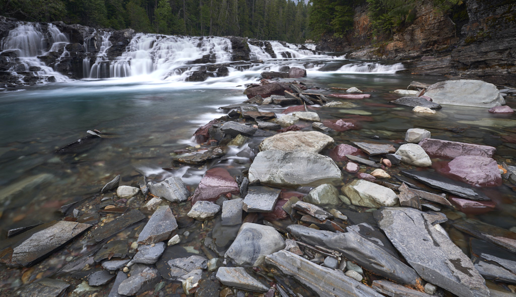
October 2019 - Avalanche Creek
Original
About the Image(s)
This was shot in August during a quick trip to Glacier National Park. Primary editing was done in Capture One Pro with basic raw edits. Open in CC for a bit of burning on bright rocks, removal of a bright rock, clone on a rock and content aware fill on the lower right. Lastly a vignette.
This round’s discussion is now closed!
6 comments posted
I love the cotton candy effect of the waterfall. The leading lines caused by the rocks is also great. I may have cropped it so there are not as many rocks and it would have brought the waterfall in a bit making it the center of attention. Right now my eye doesn't know whether to look at the rocks or the waterfall. Posted: 10/13/2019 12:04:20
Now this landscape I like. The leading line of the rocks is fun. If I could edit, I might have edited out the large rock on the right upper third horizontal line. It seems to pull my eye away from the waterfall.
Great waterfall.
Posted: 10/16/2019 11:12:18
Great waterfall.
Posted: 10/16/2019 11:12:18
I like your tight cop of the scene, and the rocks create a good lead in the waterfall. To me you have the shutter speed just right, so as to create a blurred effect without removing all texture from the water. I find the large rock on the right top to be a major distraction because of its lightness, I would tone it down or possibly crop it off. Posted: 10/16/2019 12:24:53
Good leading lines, foreground, midground and background. Patterns and colours in the rocks are interesting.
Perhaps the little bit of sky does not add to the image.
I think that in catching the flow of waterfall you may have allowed the centre to be rather over exposed. Perhaps some added contrast to water and rocks would a little punch and mood.
Posted: 10/23/2019 07:26:27
Perhaps the little bit of sky does not add to the image.
I think that in catching the flow of waterfall you may have allowed the centre to be rather over exposed. Perhaps some added contrast to water and rocks would a little punch and mood.
Posted: 10/23/2019 07:26:27
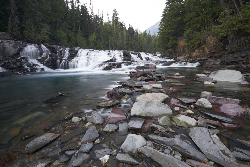
I agree on the contrast and the hot spot on the falls. I did some further editing a little later because I also made a print of it for a circuit. I tried to change the main image but the website wouldn't allow me. Posted: 10/23/2019 07:55:26
I like the leading lines to the waterfall. Strong composition. In an image like this I often use a gradient at the bottom to slightly darken the foreground, thus drawing even more attention to the waterfall. Posted: 10/31/2019 14:25:49