Bob Laster
April 2021 - Tulip
About the Image(s)
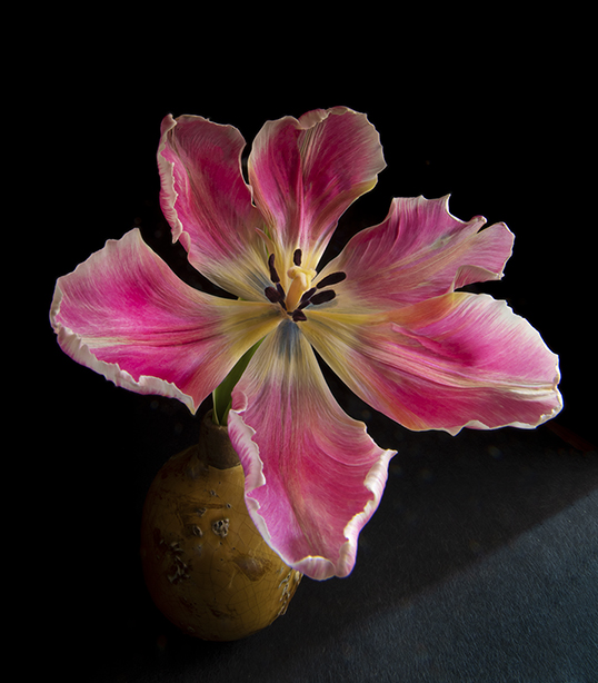
This tulip was shot indoors with natural light. I liked the colors and beautiful presentation of the tulip.
14mm lens with attached extension tube.
f22, 25 seconds, ISO 80
This round’s discussion is now closed!
9 comments posted
Beautiful vivid colors. Depth of field is good. You might try using a frame so that the eye has a place to stop. Posted: 04/16/2021 10:05:48
Thanks Posted: 04/16/2021 10:09:57
Ruth Thanks Posted: 04/16/2021 10:09:30
(Groups 24 & 48 & 58)
The tulip is beautiful; however, I don't find that brown thing under the lower left of the bottom leaf or the blue thing on the lower right positive additions to the image. Posted: 04/17/2021 20:02:44
A beautiful tulip with great colors. It really reminds me of spring. I agree with Bev that the light gray triangle in the lower right corner is a distraction and should be made the same darkness as the rest of the black background. I think the vase needs to be brightened a little to provide a solid base for the flower. Also, the edges on the bottom and right petals seem to be blown out and could be darkened a bit. Posted: 04/20/2021 10:17:30
Very lovely portrait of the tulip. It's a fantastic image in terms of composition, colors, sharpness and lighting. To my eye, the picture seems off-balance(tilting toward the right).If you rotate it a bit anti-clock wise that would have taken care of it. Posted: 04/20/2021 12:21:31
I think the flower is beautifully presented. I agree the vase needs more definition to make it more obvious that is what it is, so I took it into Photoshop and used the dodge tool to brig the vase out of the shadows. I also tried Abe's suggestion of rotating the image -- less than 1 degree anti-clockwise did seem to make a difference. I was pretty sure I wanted to keep the bottom right corner, thinking the base was on the edge of a table, but then I tried removing it. I also added a very fine stroke to separate the whole from our black background and define the image. See what you think (you will have to click on my image to see it against the black background). Posted: 04/21/2021 11:00:22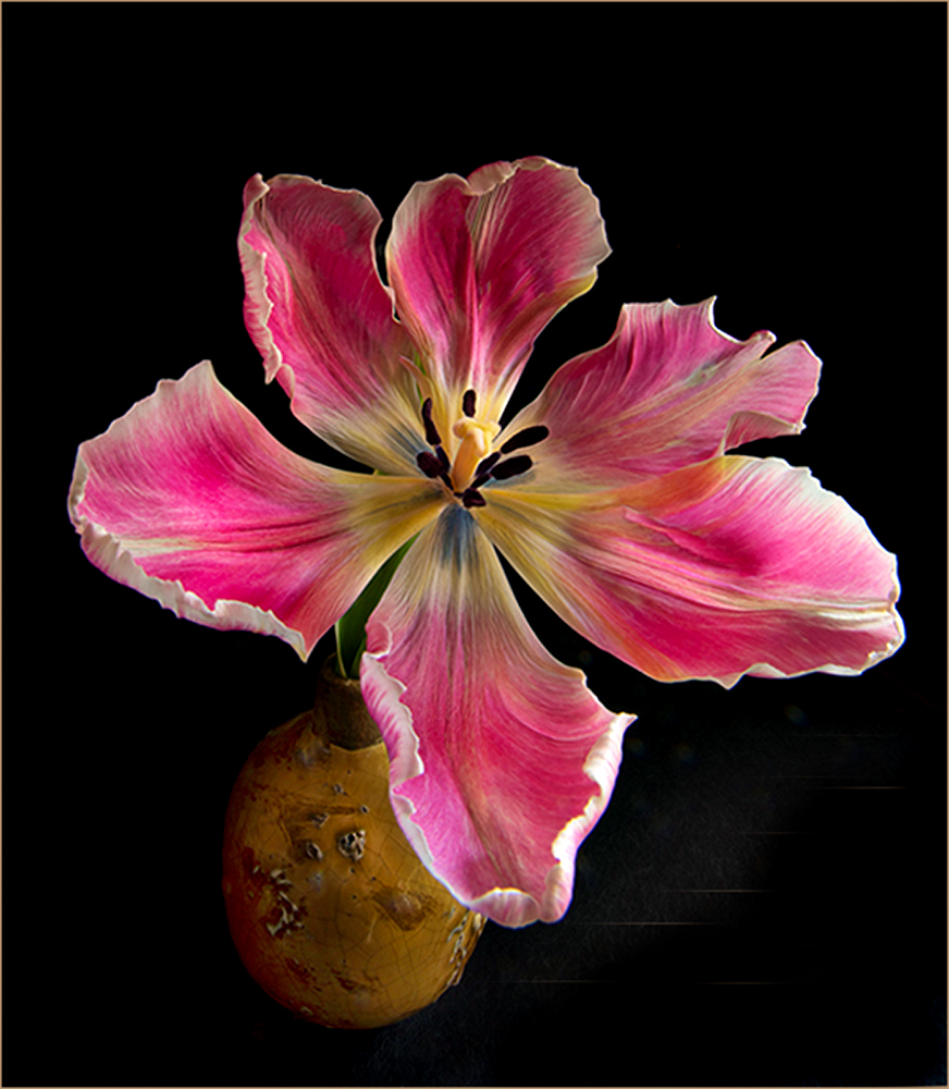
Audrey Thanks for the time and helpful advice...esp for the stroke line. All advisors have mentioned getting rid of the triangle (thing). I first played with geometric light after seeing a book of Mapplethorpe Flora which had great praise for his geometric lighting and geometric patterns presented with flowers. Although I did not flip over many of his images I thought I would play with dramatic lighting and geometric patterns. I guess I did not present in a successful manner or the style is out for the 21st century. Thanks again. Posted: 04/21/2021 15:10:25
As I said, I first thought of the triangle as indicting the vase was sitting near the edge of a table. I don't think there is a right or wrong, just two different interpretations, with just about equal merit. I can see the influence of Mapplethorpe's idea in your original. Posted: 04/21/2021 15:30:25