Lynette Colgin
October 2018 - Frog Capital Boxer
Original
About the Image(s)
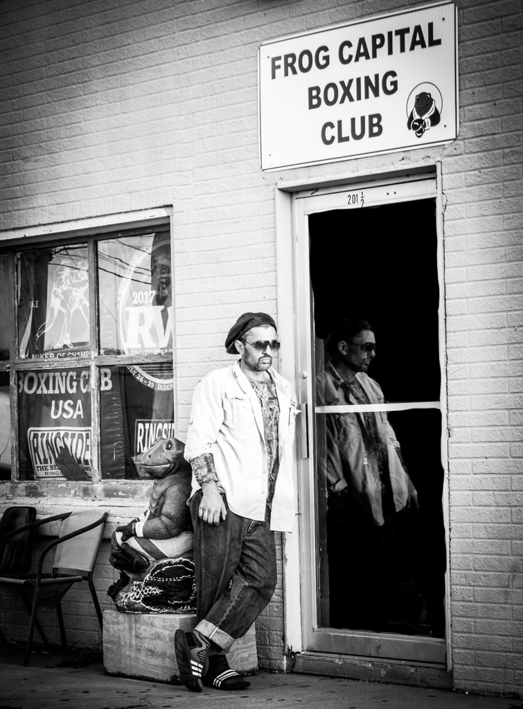
1/25 on tripod, F4.0, focal length 47mm, ISO 100, Canon lens 28-135, on my Canon 80D. There's a small town near where we live, Rayne, LA. Believe it or not, it's the "Frog Capital of the World" (bet you didn't know there was such a place -- hence the frog statue behind the model). I had passed this old building many times and wanted to photograph it. I woke my good friend, Oakley, at 6:00 AM one morning to go catch the golden hour. I cropped it, used the burn tool to darken the glass on the door and to cover up a stack of something that was just inside the door. I decided to go with black and white, using a vignette. I loved the reflection and the pensive, almost sad body language depicted by the model.
This round’s discussion is now closed!
7 comments posted
(Groups 5 & 15)
Lynette, I like your decision to do B&W and vignette. It lends so much more character to your boxer and suggests a much earlier time. I like how you chose the window to be vertical rather than doing a key-stoning adjustment to make the right side vertical - like they did decades ago before Photoshop. Nicely done. Posted: 10/02/2018 16:30:00
Thank you, Jim! Posted: 10/02/2018 17:09:47
I love the image. I am impressed that you saw and caught just a moment in time. I agree with the black and white, good choice. I love the idea of a vignette, but I'm not sure it is the best shape. You might want to play around with that. You can make a free form vignette in PhotoShop by creating a blank layer and painting on it with a soft black brush of low opacity.
Also, to my eye, all the verticals feel tilted to the left. You might want to use the Transform tool in PhotoShop to straighten them. Posted: 10/04/2018 18:49:46
Also, to my eye, all the verticals feel tilted to the left. You might want to use the Transform tool in PhotoShop to straighten them. Posted: 10/04/2018 18:49:46
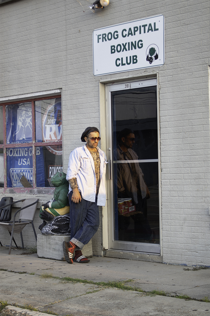
Laura Lee,
I straightened the image and redid the vignette. Do you think it was enough? I decided not to try removing the chairs since they were part of the character of the old. building. Posted: 10/07/2018 22:25:04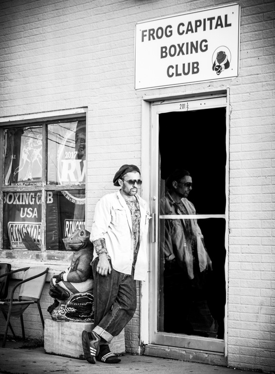
I straightened the image and redid the vignette. Do you think it was enough? I decided not to try removing the chairs since they were part of the character of the old. building. Posted: 10/07/2018 22:25:04
I think your choice for darkening the door was a great one. It gives the image some personality. I find the furniture to the left a bit distracting, but I am not sure you could do anything about it. Nice picture. Posted: 10/04/2018 21:05:07
Thanks to Laura Lee and Kayvon for your comments. I love the constructive criticism as it helps me become a better photographer. Posted: 10/07/2018 20:27:36
As others said, the B and W transform was perfect for this. I really like the shot and would have nothing to offer to fix. I think a totally different picture from this shot could just be the man and the door refection, but it is the background that makes it a story. Posted: 10/09/2018 14:35:04