Sherry Icardi
June 2018 - Nantucket Sunrise
About the Image(s)
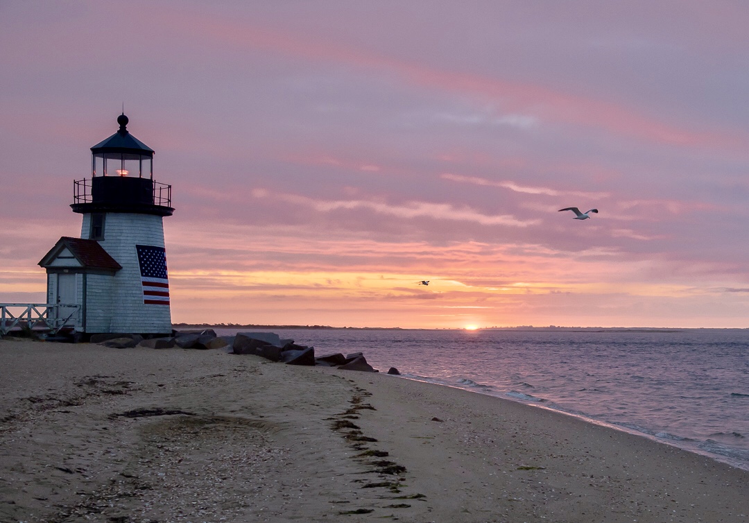
Om tripod, 1/25 F6.3 iso2500 at 5am. Post processing included cropping, wb adjustment. And bright and dark sliders.
This round’s discussion is now closed!
13 comments posted
I wonder how it would look if darkened down to bring out the beautiful colors. It would probably look more of a night scene.
I like the way the shoreline debris makes a lead in to the picture. Posted: 06/08/2018 09:02:28
I like the way the shoreline debris makes a lead in to the picture. Posted: 06/08/2018 09:02:28
(Groups 73 & 94)
It started out as darker but I was trying to get the setting to allow the birds in flight to be at least be recognizable (thus the higher ISO and F stop - knew I could not get it in the the thousand range but these were seagulls that were floating on the currents) Luckily the sun just peaked through as I took the shot.
Lowering the exposure also makes the "Lighthouse" and sand very dull and not well defined at all. That sun peaking up really did brighten the scene a great deal. It actually starts to get light there at 430AM. Posted: 06/08/2018 12:42:50
Lowering the exposure also makes the "Lighthouse" and sand very dull and not well defined at all. That sun peaking up really did brighten the scene a great deal. It actually starts to get light there at 430AM. Posted: 06/08/2018 12:42:50
(Groups 24 & 48 & 58)
I am the administrator of group 48 and enjoy visiting all the groups. After reading the comments, I figured I'd try a trick that I learned from my friend Marie Altenburg in group 21....namely, a non-destructive layer mask, where I selectively darkened (I think enhanced) the sky colors not affecting the birds. What do you think? Posted: 06/08/2018 20:25:28
(Groups 73 & 94)
Like it, will give it a try! I assume this is photoshop adjustments ? Posted: 06/10/2018 11:00:17
Yes! I think that has improved it. The topmost red band of clouds is better. You are the clever one. How did you manage to catch the furthest bird in that bright sector? Posted: 06/09/2018 08:10:41
(Groups 24 & 48 & 58)
Duplicate the layer. Fill the top layer with 50% Gray then in the layers panel, change normal to overlay. Once you change that to overlay, use the paintbrush tool at about 15% opacity (change it to your liking) paint black for darker and white for brighter or lighter. If you have a problem, don't hesitate to email me at bevandstu@gmail.com.
Good Luck Posted: 06/10/2018 11:24:37
Good Luck Posted: 06/10/2018 11:24:37
(Group 51)
Thanks for visiting Beverly, and your comments. Posted: 06/11/2018 08:46:35
(Groups 24 & 48 & 58)
I find every visit a learning experience and am happy to do so. I wish more people would visit 48. It might be an inspiration to my members to do the same. Thanks for your note Posted: 06/11/2018 09:25:04
(Groups 73 & 94)
Thanks everyone! Great discussion! And I learned something new. Posted: 06/13/2018 13:18:45
Thank you Beverly for your comments. I certainly can use your suggestion. Posted: 06/15/2018 17:42:00
(Group 51)
This is a great image for a Composition 101 discussion. Placement of a straight horizon, exposure, sharpness, placement of the lighthouse, leading lines, all good! Posted: 06/11/2018 08:48:52
Well seen, great cropping. All leading lines lead up to the lighthouse. The image is very sharp - great detail in the sand. And the birds add an extra touch. Well done. Posted: 06/15/2018 17:46:40
great lesson and definitely helpful. thanks very nice image of lighthouse with setting sun. Posted: 06/16/2018 09:24:21