Peter Newman

November 2020 - The Continents
Original 1
Original 2
About the Image(s)
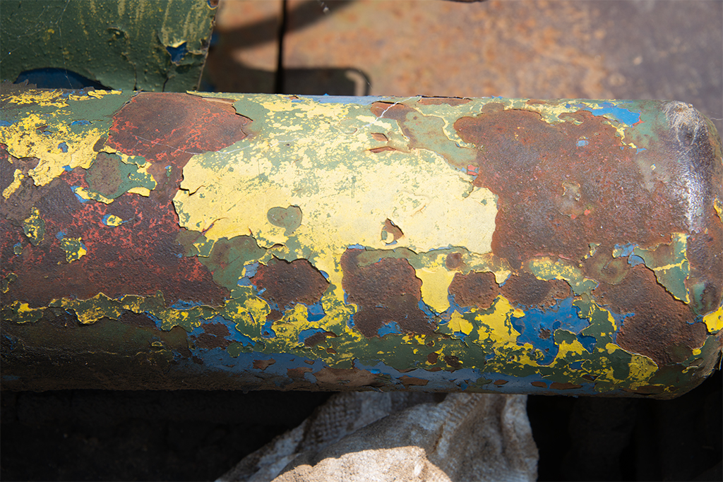
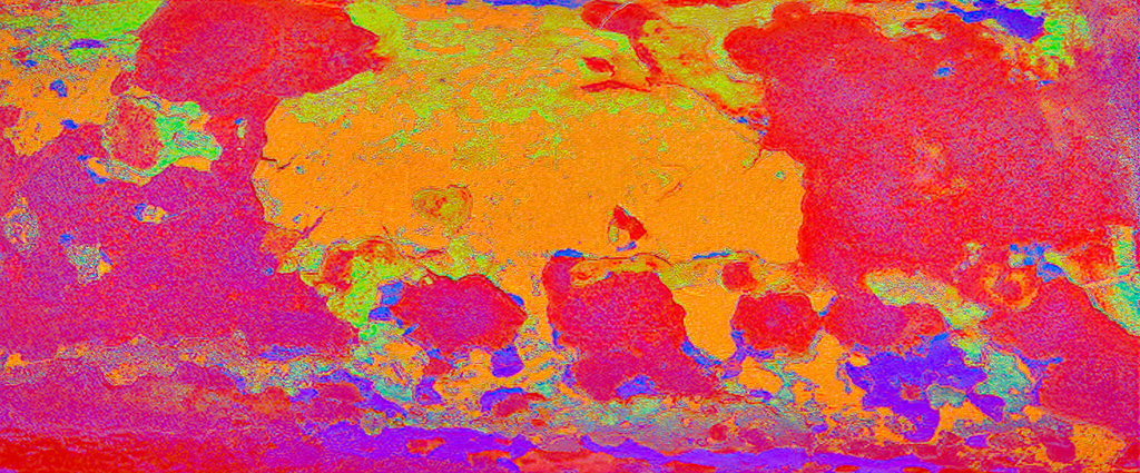
I went to an old machinery museum. The original is an image of an old rusty pipe. I only did some exposure and white balance adjustments. In the first iteration I increased the pixel count in Gigapixel, played around with the color in PS LAB mode, then in Topaz Studio2, used an adjusted “abstract Flux” look and made some further tweaks with Topaz filters. I was not happy with the result, so I painted it using Corel Painter, mostly auto paint mode, and made some adjustments to the paper and lighting. I hope you like it. The judge at my CC didn’t.
This round’s discussion is now closed!
11 comments posted
(Group 41)
Peter, What do judges know? Clearly, the one at your Camera Club must have been looking at something else and/or had his/her mind elsewhere. It is amazing how we photographers are always drawn like magnets to old rusty pipes and flaking paint. I love the visual softness and flow through the three elements of the triptych. The colour palette works across the composite and the individual colours link together well. However, I am less keen on the brightness of the border which needs to be toned down and a little less dominant as it draws the eye. Posted: 11/04/2020 10:30:30
(Groups 20 & 79)
Brian I felt there was something not quite right. Thank you, I think that your comment about the border is spot on. I added a darker and textured border. While I was at it, I decided to give the image a painterly look.
Posted: 11/04/2020 15:58:41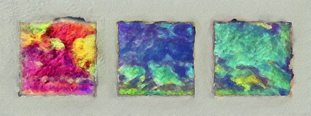
Posted: 11/04/2020 15:58:41
(Group 41)
Peter, I love this artistic iteration of your triptych which I prefer to your earlier version. The painterly effect to the images and the textured border add a sense of mystery and romance which is most appealing. The ragged edges to each image is perfect. Interesting that you made the first image maroon/orange/yellow and the other two blue/aquamarine. Presume that was deliberate on your part to introduce a colour tension but I wondered how it would look if there was a common hue across all three images, perhaps the blues to make it more visually relaxing. Either way, I love it. Well done. Posted: 11/05/2020 03:40:43
(Groups 20 & 79)
Thank you. Yes it was deliberate. With this image I felt that all blue green was too boring, and all reddish was too hot and "in your face." The color transition was simple, red was the original color, I simply inverted the red, which gave me the complimentary colors. Posted: 11/05/2020 19:46:20
A really interesting triptych! I like the way you have divided the image to add interest to the composition. I personally am not too keen on those colours together and am wondering what it would look like in blue/green? (Blue is a very saleable colour I have discovered....but that is my own bias I suppose!). Posted: 11/06/2020 00:16:57
Peter, it always amazes me how something that so many people look past, like your rusty pipe, can be made into a piece of art. You have a good eye. I do like your second rendition better than the first. The variety of colors and darker border add to its eye appeal for me. The original number two seems to be much sharper than your final product. Is that because each time you manipulate a picture it loses some clarity? Posted: 11/06/2020 13:46:12
(Group 41)
Charles, I presume the softening in the final version is a function of the effects of Topaz Studio 2/Filters when applied to Original 2. Posted: 11/07/2020 05:12:07
(Groups 20 & 79)
Charles, It was the result of painting out the internal edges with a watercolor brush, and applying a very mild surface blur to the painted areas. I felt that the rust texture, which I originally enhanced by embossing the image, did not match a watercolor feeling.
Posted: 11/07/2020 16:56:36
Posted: 11/07/2020 16:56:36
(Groups 20 & 79)
Charles, It was the result of painting out the internal edges with a watercolor brush, and applying a very mild surface blur to the painted areas. I felt that the rust texture, which I originally enhanced by embossing the image, did not match a watercolor feeling.
Posted: 11/11/2020 13:57:37
Posted: 11/11/2020 13:57:37
(Groups 3 & 18)
Peter,
The tryptich idea works so well for this. Rather than a rusty pipe, this reminds me of a flattened concept of the world map, much distorted and colored in a wonderful way, which is what you wanted to convey. Maybe making the colors a little sharper would help with it. As is, the "continents" are kind of fuzzy, which is OK for creative. I assume this is the division you entered it in. The preponderance of warm colors makes the world appear in rose-colored glasses. Too bad it doesn't.
You did a lot of work on this in many applications with which I am not familiar. I recognize you for all of your work Posted: 11/25/2020 16:09:49
(Groups 34 & 68)
I agree with Brian, and I like your improved version but I think the background could be even darker.
...But I truly love original #2! Posted: 11/30/2020 11:22:53
...But I truly love original #2! Posted: 11/30/2020 11:22:53