Phillipa Frederiksen, EFIAP MAPS SSAPS
October 2020 - Boat Reflection
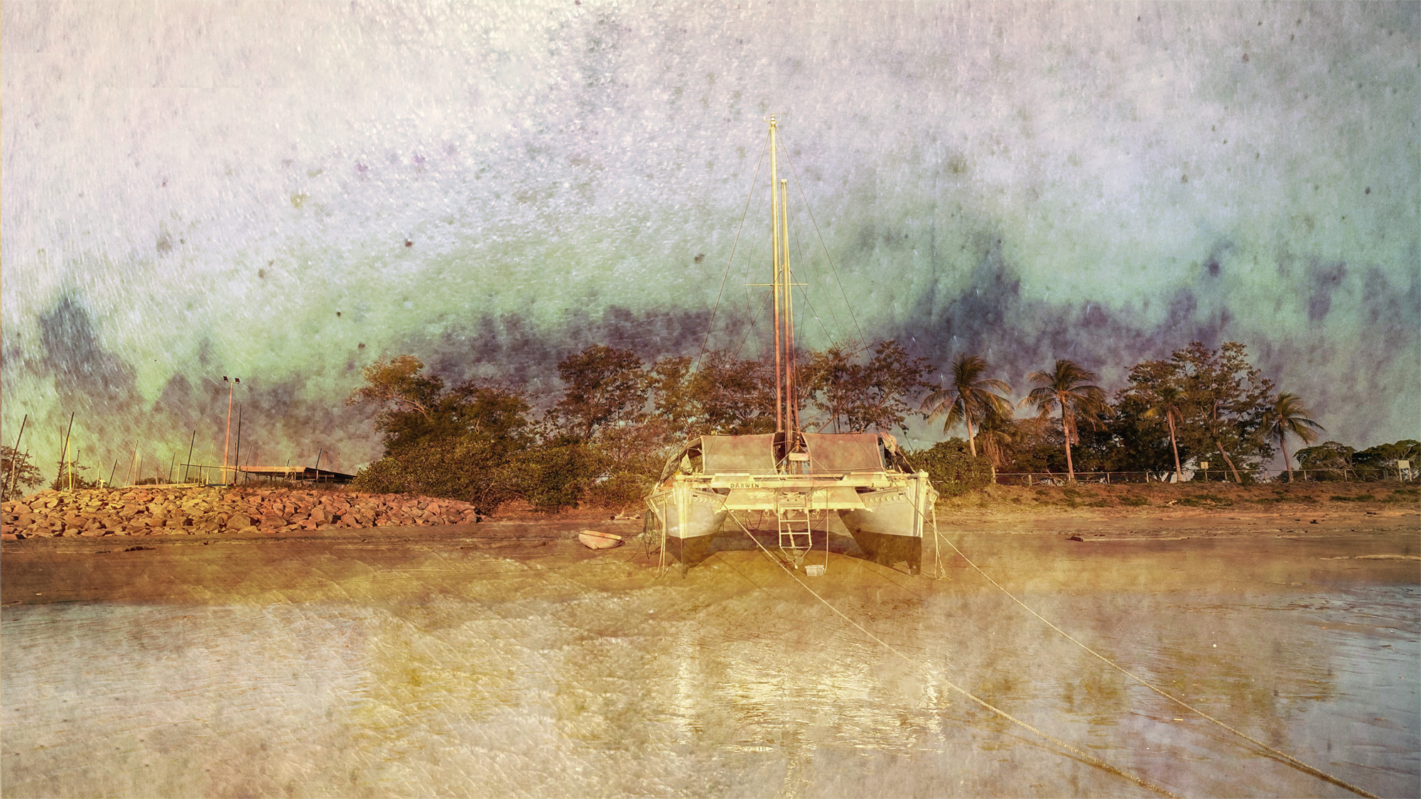
Original 1

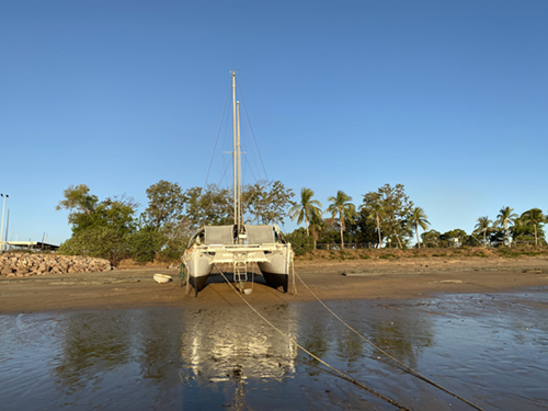
Original 2
About the Image(s)
The first is a bruise which I used for the background and the second image is the actual boat in the image.
I processed the image in the iPhone App “Superimpose” by blending the two images (as you would normally do in Photoshop).
This round’s discussion is now closed!
7 comments posted
Phillipa: Nice effect! However, think about less intensity of the fog on the water. This should increase the visibility of the boat's reflection. Posted: 10/08/2020 12:38:24
Good idea! Didn't even think about that! Thank you. Posted: 10/08/2020 23:37:20
(Groups 20 & 79)
Good seeing and nice use of the effect. I am not sure that I agree with Rick about the need to show more reflection. To my eye the subtle hint of a reflection is more consistent with the mood of your image.
As a suggestion in which I have tried to be consistent with your image expression: I would like to see the catamaran less centered, and your image a tad more accentuated. In my interpretation, in addition to the obvious, I made a curve adjustment of about 3-4 to lightness and shadows, with a subtle vignette, to illustrate what I mean.
Posted: 10/10/2020 12:14:04
(Group 41)
Phillipa, I like the 'Old Masters' feeling you have achieved with your composite. They do say that if you can get something of yourself into your pictures then you have done well. In this case, we have the bruise which I assume belongs to your good self. Interesting that Rick wants less fog whereas I want more fog, mist and intrigue to make it more Turneresque. I agree with Peter that the catamaran needs to be more off-centre to increase the overall visual dynamic and his flipping horizontally has made better use of the mooring lines as a left-to-right lead-in to the picture. Posted: 10/22/2020 09:07:29
(Groups 3 & 18)
Phill,
I'm glad Brian referred to Turner as the painter who might have put this together.
He is one of my favorites, having beaten the impressionists by many years. Anyway, you di an excellent job putting the two layers together to produce something much more interesting than the original. I fo think the water reflections are perfect, not too sharp, but still able to draw our attention to them. The placement of the boat doesn't bother me as it is off-center enough for my sensibilities. The flip so the lines come in from left to right is possible, but, again, it doesn't bother me.
Nice work for the iPhone. Did you take both photos on the phone? Posted: 10/24/2020 14:45:06
Thanks for your comments Joan. Yes, Both on the iPhone Posted: 10/24/2020 15:52:53
(Groups 34 & 68)
The ropes, mast, and horizon create an excellent visual flow. I agree that less opacity over the water might be an improvement. Posted: 10/25/2020 11:22:30