RH Samarakone
March 2023 - Pensive
Original
About the Image(s)
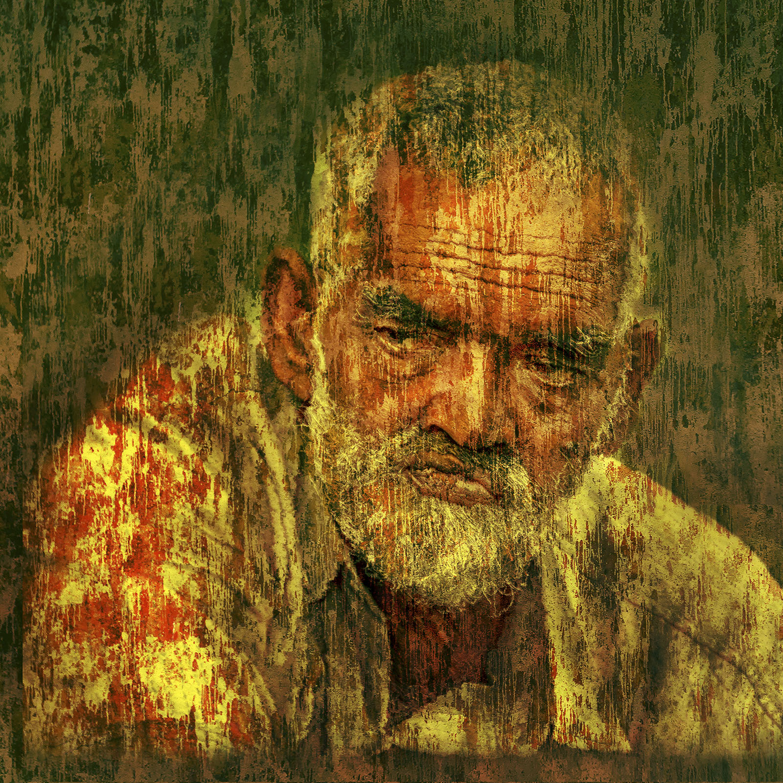
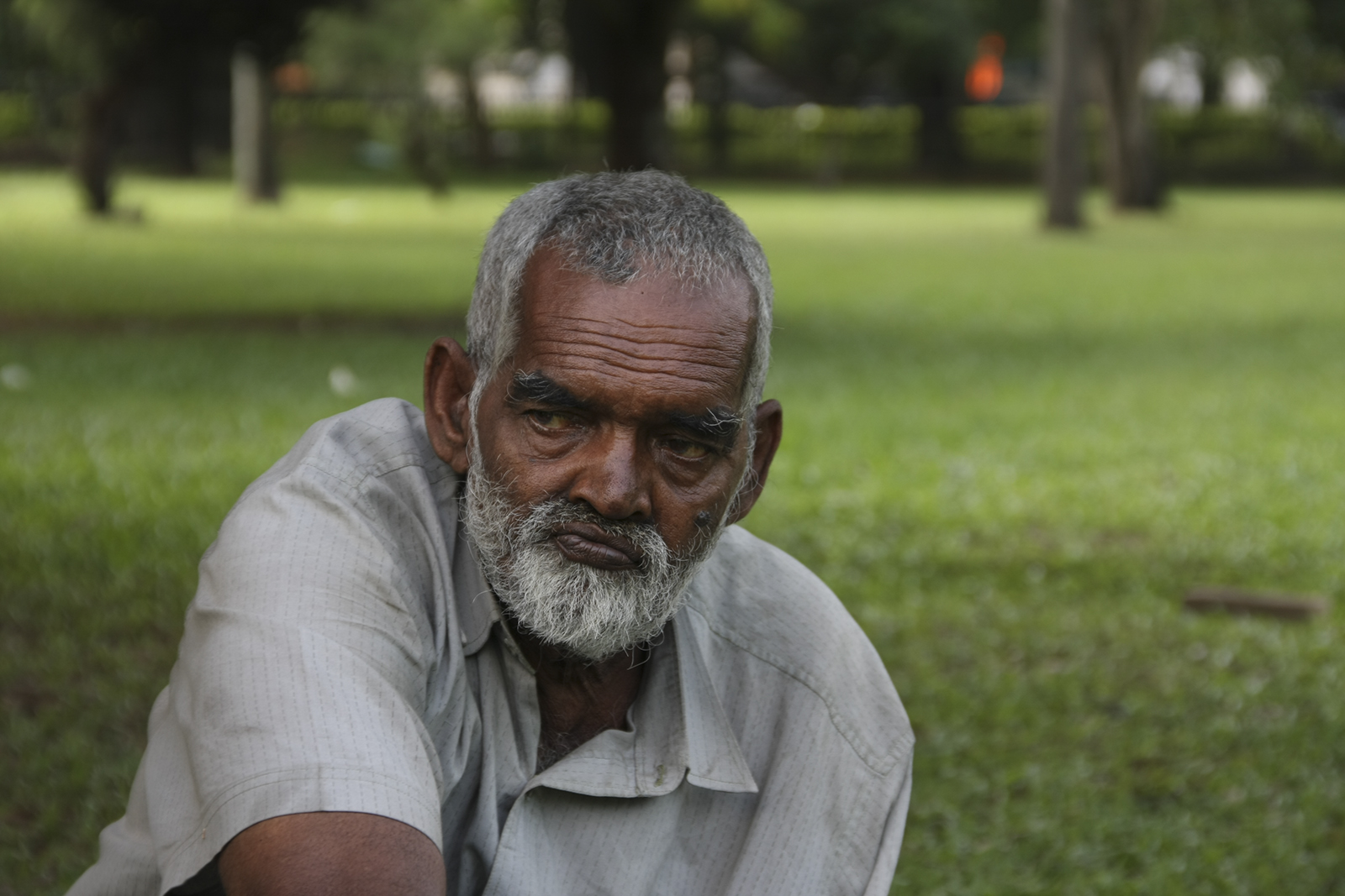
This image is made with one of a series of images I captured of a homeless person sometime ago. I wanted to give more emphasis to his expression, and to achieve that I have extracted details and added a lot of light and color to the face. Thereafter, I have added a texture as an overlay using an image I took of a wall. To add drama I have changed the color of the overlay. The image was cropped tight to make it a head and shoulder portrait.
This round’s discussion is now closed!
9 comments posted
I really like what you have done in post processing. It really brings out the sadness in his face and makes the whole image more interesting.
Other than taking off that sliver at the base that is a different colour I wouldn't change anything. Posted: 03/01/2023 07:38:20
Other than taking off that sliver at the base that is a different colour I wouldn't change anything. Posted: 03/01/2023 07:38:20
Thanks Angela... Posted: 03/01/2023 20:06:22
Sam I love what you have done to this image. It really does evoke an emotion. I wouldn't change anything. Posted: 03/01/2023 08:26:41
Thanks Fred... Posted: 03/01/2023 20:06:39
I think your post processing is excellent. The texture helps emphasize the emotion/expression. Wonderful portrait. Posted: 03/01/2023 11:56:30
Thanks Deborah... Posted: 03/01/2023 20:07:03
Great image Sam. Your use of an analogous color palette works quite well. I cannot figure out what the wall is unless it's wallpaper. I see the sliver at the bottom of the image that Angela pointed out. I'm not sure how to correct it but it should be fixable on a PSD layer.
Our homeless encampments seem to me to be more violent than at any time since the Great Depression. Posted: 03/08/2023 09:56:42
Our homeless encampments seem to me to be more violent than at any time since the Great Depression. Posted: 03/08/2023 09:56:42
Thanks.
The sliver of the colour difference was intentionally done to give some sort of three dimensionality. In hind sight, as already pointed out by Angela, it may not be working as well as I intended it to...it is possible to remove it from my psd file, as I usually apply these using brushes and masks...
I am attaching the wall texture I used in its original colours...
Thanks again for the feedback. Posted: 03/08/2023 21:49:49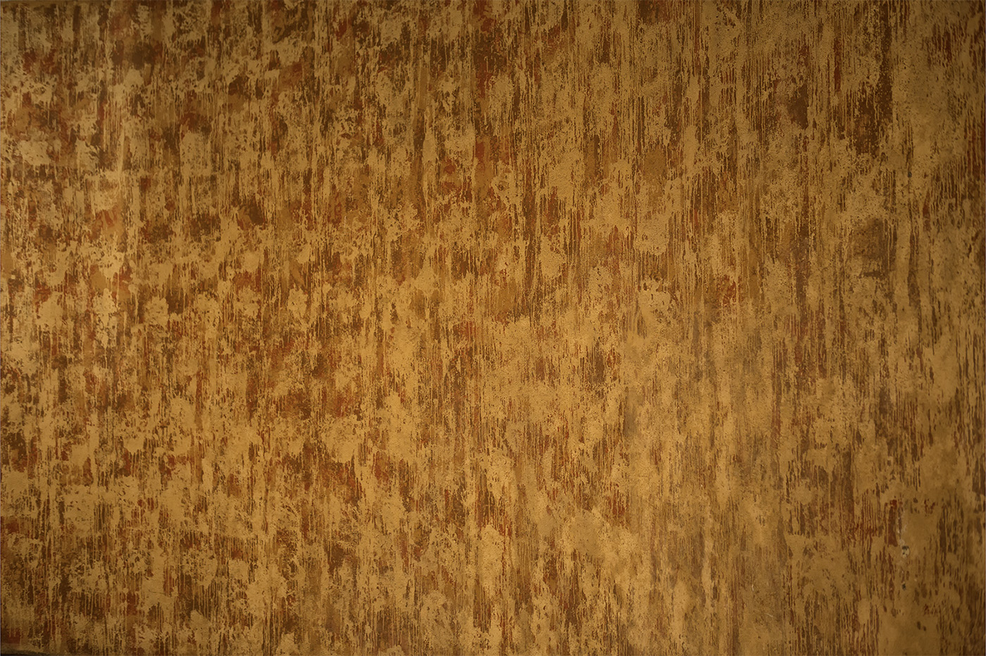
You're welcome. Consider blending the sliver from the collar a little rather than a hard line. I do see your intent to add depth. Maybe try adding some canvas to the right and duplicate that sliver near that left arm too. I'm really complicating an excellent work. Nice background selection. Posted: 03/09/2023 09:47:40