Ann McDermott
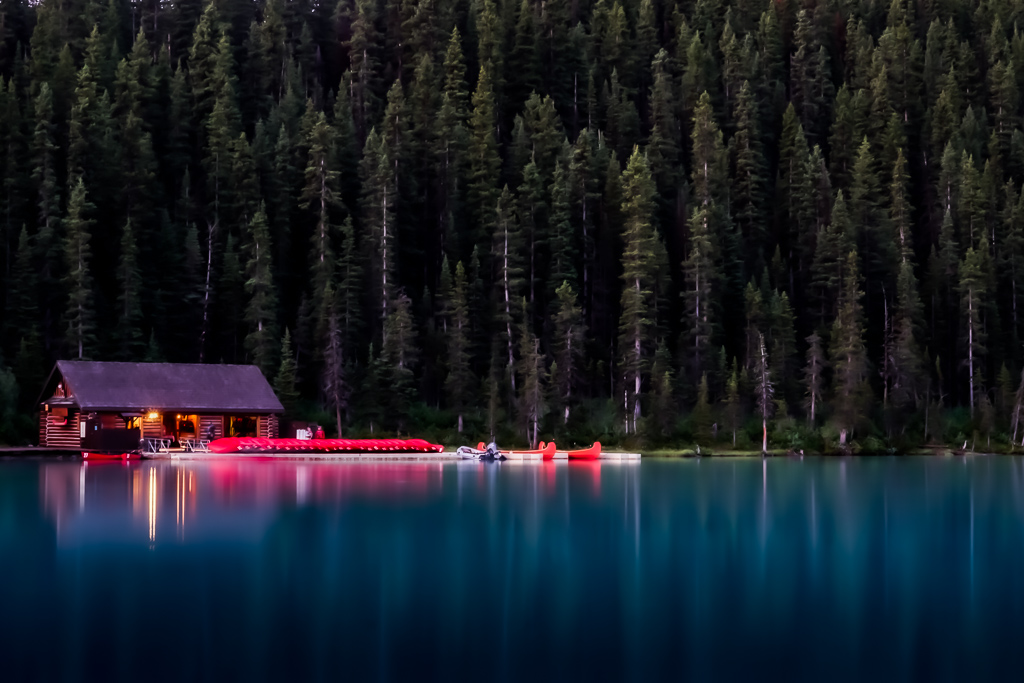
December 2019 - Morning at the Boathouse
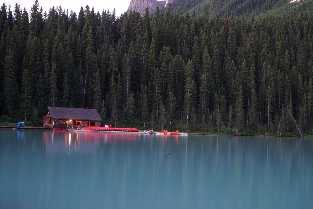
Original
About the Image(s)
I was trying to convey the peace and quiet of the morning. This photo was taken before the sun rose as the boathouse was preparing to open for the day.
I applied a lot of edits, including: straightening, cropping, healing, sharpening, noise reduction, clarity and dehaze. I also applied a gradient filter to the water to darken the bottom.
Settings:
ISO 200 34mm f/22 10 seconds
This round’s discussion is now closed!
9 comments posted
(Group 32)
I like the subject and concept of this. I think the gradient filter is a great success.
I prefer your original framing, showing the sky and mountain--entirely a personal preference.
I suggest that the color and brightness post-processing are a bit too much, because your finished image sort of announces, "I am post-processed." Posted: 12/04/2019 17:29:01
I prefer your original framing, showing the sky and mountain--entirely a personal preference.
I suggest that the color and brightness post-processing are a bit too much, because your finished image sort of announces, "I am post-processed." Posted: 12/04/2019 17:29:01
Thanks for your comment, Stephen. I appreciate your feedback. Posted: 12/04/2019 19:28:14
Hi Ann,
A lovely image that conveys the peacefulness of early morning.
I agree with Stephen that aside from the gradient filter the post processing can probably be toned down--while keeping those beautiful colors...Another suggestion might be to perhaps (?) crop a bit of the bottom portion of the image so that the boathouse doesn't appear so centered in the image. Posted: 12/05/2019 10:23:04
Wow ........a most striking image but do agree with the other comments about the colors being toned down a bit. Posted: 12/14/2019 16:02:31
Interesting use of negative space on the right. The colors really pops out at me. Nice image. Intensity of the red in the original image is pretty good but the enhancement of the building is great so perhaps a balance between the two. Posted: 12/14/2019 18:39:39
I like your crop, it makes for a much better composition. The colours have for me become a little intense in processing, making the reds a little too much in the face. But overall a nicely seen picture. Posted: 12/15/2019 08:21:30
(Group 77)
Beautiful image. Love it. I was there this year. Posted: 12/22/2019 09:43:55
I think I like the image the way it is presented. Yes, the colors are perhaps a bit over the top, but this doesn't need to duplicate reality to be an excellent image. I believe this is on Lake Louise and you caught it while there was still enough light but no tourists, a remarkable combination and well done. Posted: 12/26/2019 15:25:54
Harriet Ciccone
I like your crop and the gradient filter applied to the water is very effective. The colors might be a little too much, but work for the reflections.
Posted: 12/31/2019 14:51:28
Posted: 12/31/2019 14:51:28