Jen Fawkes, PPSA, SPSA
December 2020 - Hurting
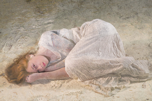
Original
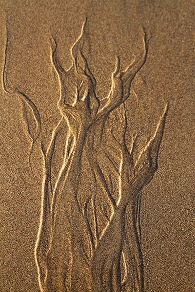
Original 2
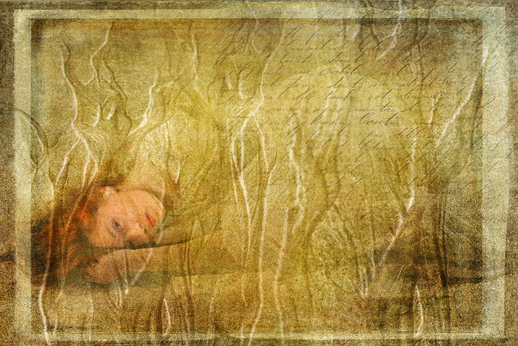
About the Image(s)
I'm still playing with texture layers and blending modes in Photoshop.
This is a composite of 2 different images, the original taken at a portrait shoot, the sand pattern taken down the beach.
I have duplicated the sand patterns several times and blended them over the original image in different ways (backwards, partial).
I've added a texture later made from an image of sand that has been blurred and colorised.
I've added some faint text made from a rubber stamp on some white paper and photographed it.
This round’s discussion is now closed!
6 comments posted
I like every element of this well-conceived creative image. Super ****.
When I looked at the sand I saw arms and hands. Perhaps you have another image to make a variation of the woman sleeping in a person's hand? Posted: 12/01/2020 11:56:16
When I looked at the sand I saw arms and hands. Perhaps you have another image to make a variation of the woman sleeping in a person's hand? Posted: 12/01/2020 11:56:16
A wonderful image with your blending of the various layers exhibiting great skill, so those lessons you have been taking are certainly paying off. I would choose to just reveal a little more detail in the face by removing some of the texture.
I notice you had a good crop od acceptances in the Lake Mcquarie Circuit - well done. Posted: 12/11/2020 10:13:06
I notice you had a good crop od acceptances in the Lake Mcquarie Circuit - well done. Posted: 12/11/2020 10:13:06
Wow .......this is one terrific image. Extremely 'artistic' and most beautiful. Might want to try one with the 'texture ' going horizontal like the subject. Posted: 12/11/2020 13:53:47
(Groups 21 & 34)
The original is beautiful, and the feint text is a subtle addition that works very well. I like the frame, but for me the sand patterns are a distraction, and it's gold colouring should be toned down a tad. It would then be a stunning image. A case of less is more I feel. Posted: 12/13/2020 02:38:20
I think this photo is outstanding. I like the dream like quality but am bothered by the text as I don't see how it complements the rest of the image. I would also consider lightening the effect of the overlays. Posted: 12/13/2020 19:22:56
(Group 40)
Super stuff. I am not sure about the writing either, perhaps would work better if more blurred i.e. recognisable as writing but not so readable. My only other thought is that it might work even better if her eyes were not open. Just an idea. But I am being picky. Posted: 12/18/2020 10:48:26