Dr V G Mohanan Nair, APSA, QPSA
November 2020 - At the Sandia hill top
Original
About the Image(s)
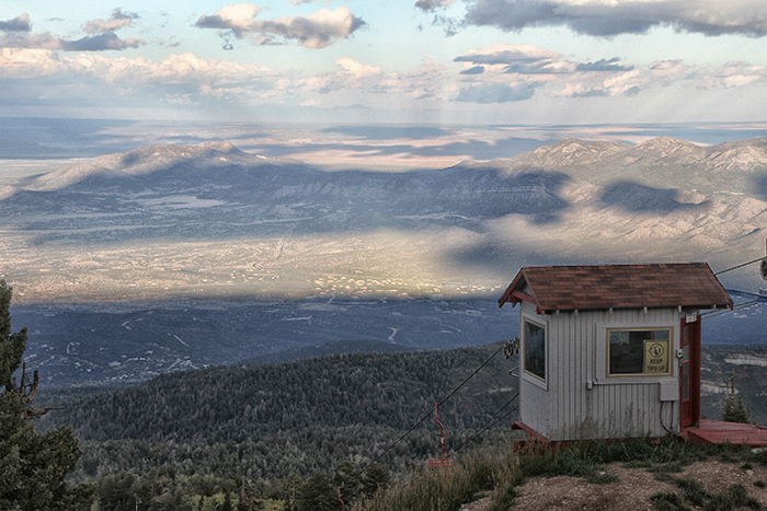
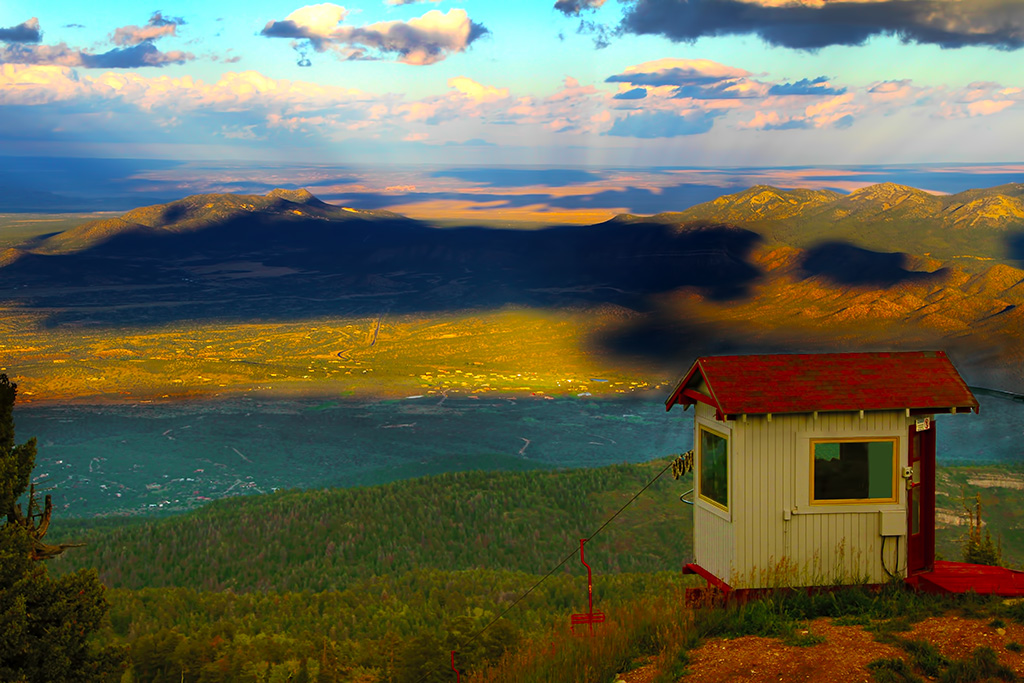
This image was taken during the 2014 PSA conference tour to Sandia Peak. Duplicated the layer. On the top layer adjusted the exposure and Gamma correction. About lower 50% of this layer was erased. The background layer was adjusted for color and saturation. Sepia filter was used in the background layer to remove the blue tone. The layers were flattened. The second rope was cloned out and further adjustments on levels, color and vibrance were done.Camera - Canon EOS 7D, f/8, 1/160 sec, ISO 200, 55mm
This round’s discussion is now closed!
6 comments posted
I like the original shot and believe it just needed a little adjustment with the saturation. Your adjustments in the foreground is pretty good, however, the background is extremely over processed. The yellow and orange areas in the middle of the photo are now black. Several clouds have areas that are too dark and unrealistic. The little shack adds a point of interest to the shot. Posted: 11/19/2020 15:16:37
Your original image is a really good one to work with, but the processing left a big dark blot on the upper half. I suggest you start over. With your skills you can make this a beautiful picture. Posted: 11/19/2020 17:09:23
An amazing amount of post processing. Well done. I think it is overdone and unrealistic. But then, perhaps you did not intend for it to be realistic. The building is an good center of interest. Posted: 11/19/2020 18:13:24
I agree: an interesting scene. The middle Landscape part is oversaturated, while the shadow of cloud is much too dark. I can't find explanation for a blurred mist around the roof. Posted: 11/20/2020 15:34:55
(Group 43)
The shed in the front is interesting. To my eye, the scene is processed so much that it looks unreal. Perhaps that is your intention? The cloud shadow is so dark and so central that my eye is pulled to it. Posted: 11/20/2020 16:37:25
The image contains many interesting elements however they all seem to be competing for our attraction. Please consider this is a suggested re-starting point. I used Nic - Landscape Detail Extractor and played a little with the sliders. Posted: 11/21/2020 15:20:27