Syed Shakhawat Kamal, QPSA
February 2021 - Monolithic Freedom
About the Image(s)
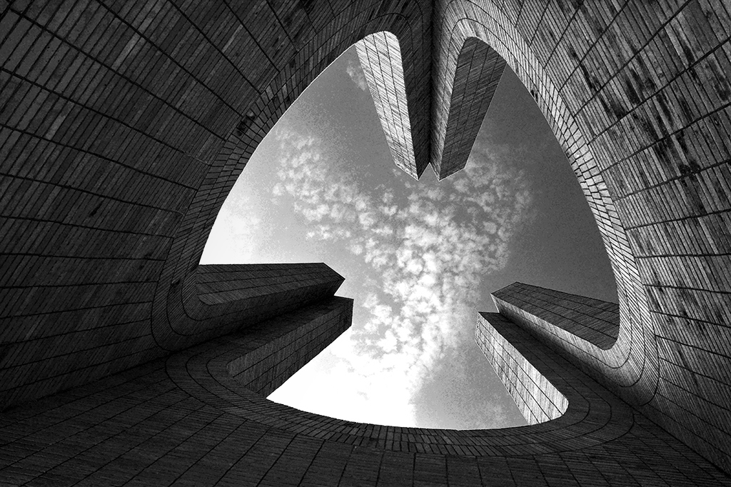
This is one of my abstract images. I captured it a few years back on the way to a photo walk morning for a subject called pottery.
This is an iconic location in a popular university in Bangladesh called "Jahangir Nagar University". The Nikon D7100 was used - f/10, 1/250 sec, 18 mm & ISO 200 with Flash in auto.
I tried to capture the view in a different perception. I am happy about the outcome. I hope all of you enjoy the image. Any suggestions would be more than welcome.
This round’s discussion is now closed!
12 comments posted
Syed,
A very creative image. I really like the tonal range of your B&W conversion and the symmetry between the left and right sides. I can almost see the shape of a bird in the sky. One question that I have is did you intentionally make the left side higher than the right? I think the image still works with the offset.
Best regards,
Greg Posted: 02/10/2021 00:01:35
Hi Greg,
Greetings. You are right I intentionally kept that non-symmetry. As nothing in our life is perfect but our very imperfection makes us interesting and keeps us hungry for more. Thank you for your input.
Just my opinion.
Cheers. Posted: 02/28/2021 14:17:58
Greetings. You are right I intentionally kept that non-symmetry. As nothing in our life is perfect but our very imperfection makes us interesting and keeps us hungry for more. Thank you for your input.
Just my opinion.
Cheers. Posted: 02/28/2021 14:17:58
(Group 88)
Hi Syed, I like your creative work. The brightness of this picture is moderate and correct in my eyes. I agree with Greg about symetrics when taking picture upward. I would like to see all three curved lines even, looks like the top was cut. Thanks for sharing, I did some research from this place. It is a nice choice to take this image, I don't see many people share picture like this. Nice job! Posted: 02/13/2021 22:04:43
Hi Quang,
greetings my friend.
Thank you for your kind words and input. Yes not many people takes image of this particular structure from this perception. Actually nothing was cut from the top, it was kept as it is; except for light and color corrections. Increased the light inside the structure without burning as far as possible.
thanks for your suggestions.
Cheers.
Kamal.
Posted: 02/28/2021 14:22:04
Hi Syed well-composed image, I like the leading lines focusing you toward the sky and the clouds, tonal balance is good in the brickwork. I agree with Quang and Greg on achieving the same height on the lines. On my screen, there are a few issues with the areas of the cloud appear blown out on the left adjacent to the columns and a few strange artifacts around the edge of the clouds. overall a great idea well excuted Posted: 02/14/2021 17:33:30
Hi Tom,
Greetings.
Thank you for your input. Yes the idea was to bring the cloud much more contrast so it displays & complementing the brick works in side the structure.
Appreciate your suggestions.
Cheers.
Kamal. Posted: 02/28/2021 14:26:53
Greetings.
Thank you for your input. Yes the idea was to bring the cloud much more contrast so it displays & complementing the brick works in side the structure.
Appreciate your suggestions.
Cheers.
Kamal. Posted: 02/28/2021 14:26:53
Hi Syed - I agree with Greg, Quang and Tom on their comments - pros and cons - except for the idea that this abstract image needs to be symmetrical. I believe the composition works as is. Nice capture. Posted: 02/17/2021 19:04:44
Hi Darcy,
Greetings my friend.
Thank you for your kind words. I like the idea of you and rest of the critics as oppose to the symmetry of the columns. But like I said, intentionally I kept the column non- symmetric just to portray that, nothing in this world is perfect. We all are imperfect yet very special in our own way.
Just my idea behind this abstract.
Cheers.
Kamal. Posted: 02/28/2021 14:30:29
(Group 46)
Fascinating image! I like it!
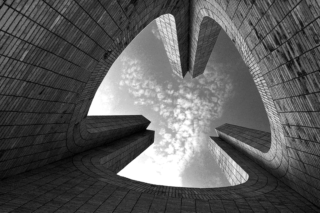
Probably I would like to burn shadow sides a little more, make it looks more contrast. Posted: 02/18/2021 09:53:29
Probably I would like to burn shadow sides a little more, make it looks more contrast. Posted: 02/18/2021 09:53:29
Hi Xiao
Greetings.
Thank you for liking my abstract. According to your suggestion, I did some experimenting here with this. See and please give an opinion. Thanks and appreciate your input.
Cheers.
Kamal.
Posted: 02/28/2021 14:44:03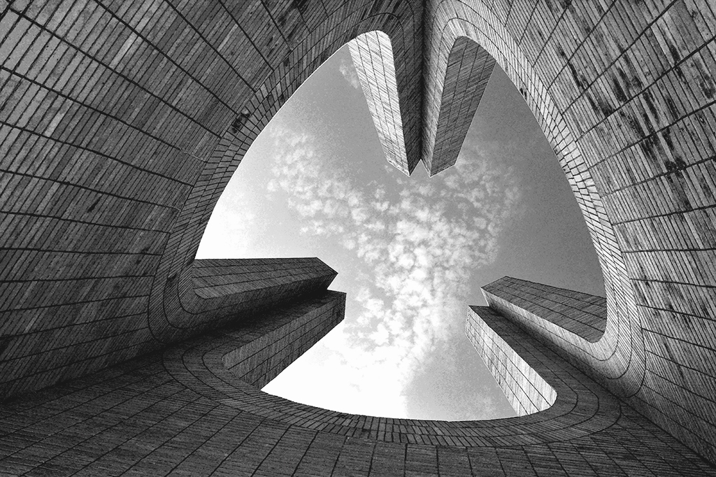
Greetings.
Thank you for liking my abstract. According to your suggestion, I did some experimenting here with this. See and please give an opinion. Thanks and appreciate your input.
Cheers.
Kamal.
Posted: 02/28/2021 14:44:03
(Group 46)
It looks not so good as the original, especially the top right corner looks brighter. Probably trying to use "gradient tool" to make the top right corner to be dark? I like the edge around the image is a "darker" feel, such as the "vignetting" feel to make the structure top(with sky) stand out. Posted: 02/28/2021 15:54:37
(Group 46)
I made a little adjustment. I like contrast images. So it is just personal preference. Posted: 02/28/2021 16:28:05