Wes Smith
February 2021 - End of the Storm
Original
About the Image(s)
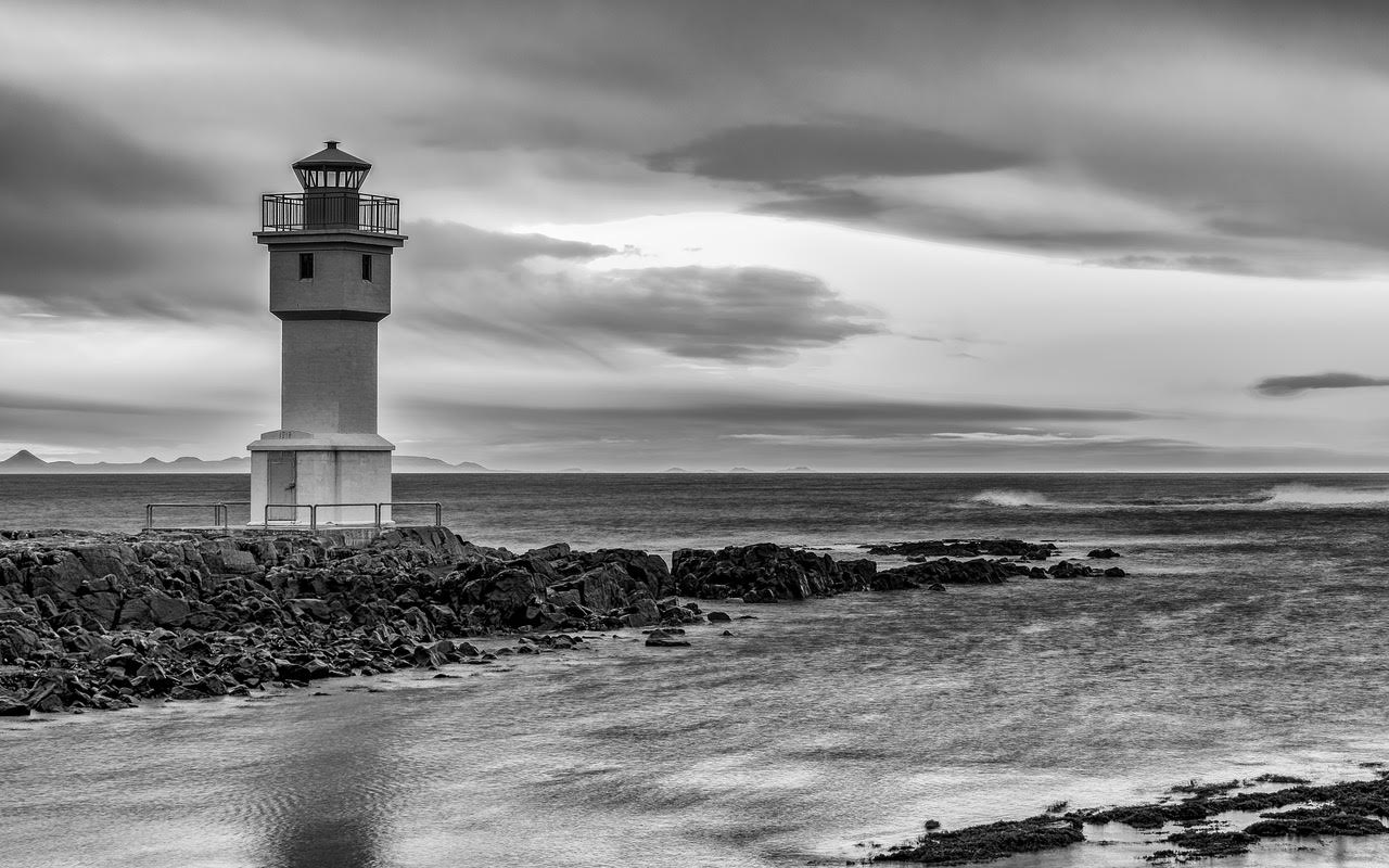
This is one the lighthouses in Akranes, Iceland
1/15, F13, ISO64
35mm(Olympus EM1.2 M.Zuiko 12-40)
Didn’t have a tripod. I braced myself well and the Olympus stabilisation really works well
I believe I converted to BW in PS but most of the processing was done in LR.
Literally 1000 iterations of various develop settings. I’m learning Lumenzia now, and would use that if I was to redo it.
This round’s discussion is now closed!
7 comments posted
I like the image and your conversion to mono. You might want to consider a tighter crop so as to focus more attention on the lighthouse. Posted: 02/08/2021 08:15:42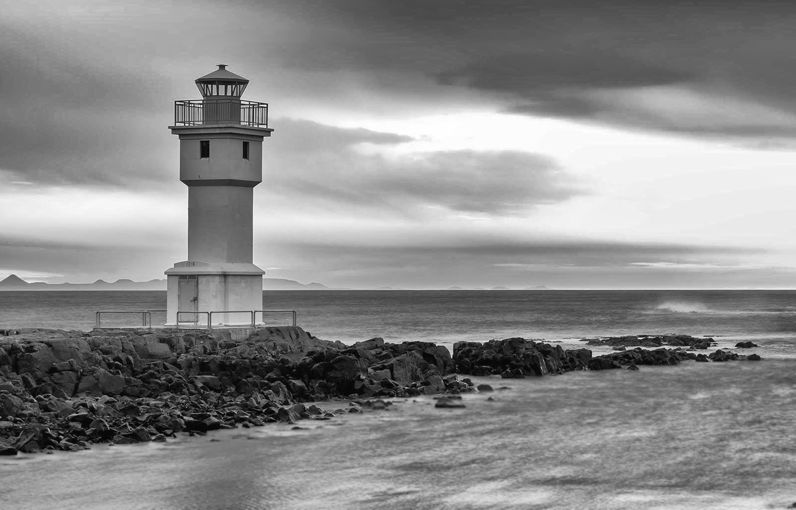
Excellent composition. Every element contributes to the sense of place and mood, and they flow smoothly together. Strong diagonal, horizontal, and vertical lines guide our eyes through the scene. Posted: 02/08/2021 11:54:19
(Groups 36 & 67)
I really enjoy your composition and the strength of the lines that guide the eye through the frame.
The conversion for me lack impact. I feel the abundance of greys makes the image feel "muddy" and would prefer to see some truer blacks to produce shadow and add depth. Perhaps more of an Ansel Adams zone approach to the conversion. Posted: 02/09/2021 13:14:56
The conversion for me lack impact. I feel the abundance of greys makes the image feel "muddy" and would prefer to see some truer blacks to produce shadow and add depth. Perhaps more of an Ansel Adams zone approach to the conversion. Posted: 02/09/2021 13:14:56
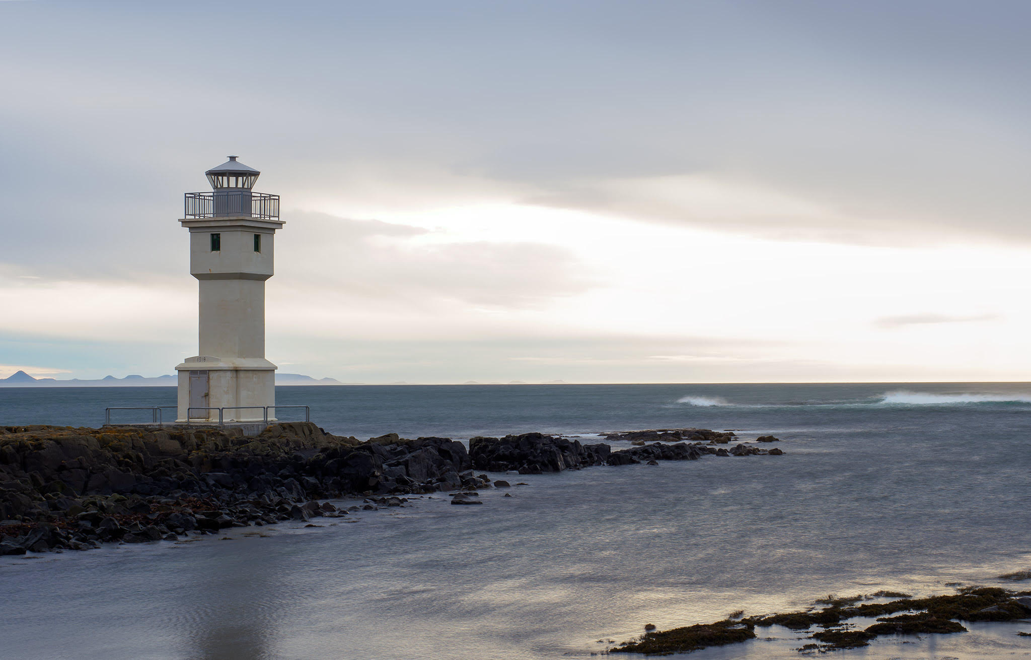
Hi Wes, I liked that you emphasized the sky/clouds more to add drama and utilized leading lines to direct the viewer through the image.
I think Jim Hagan's tighter crop improves the image as it increases focus on the important elements. You might also benefit by an off center vignette that would direct the viewers eye to the main interest of the image, rather than the brighter sky on the right. By using Lumenzia and selecting the correct mask, you may be able to add a curves adjustment layer to brighten the lighthouse slightly to make it more prominent in the image.
Iceland is an impressive location, so I hope to see more of your images in the future.
Posted: 02/10/2021 16:26:24
Thank you for the very constructive comments.
Let me play with it a bit and I'll try to post an update back here. Posted: 02/10/2021 17:54:40
Let me play with it a bit and I'll try to post an update back here. Posted: 02/10/2021 17:54:40
I like the image a great deal, but I concur with the others about the processing. I also prefer Jim's crop. There's also a bit of fringing around the lighthouse. I'm also looking forward to seeing more from Iceland. It's a wonderland for photographers. Posted: 02/20/2021 16:13:18
Here it is with Jim's crop suggestion and a bit darker/dramatic.
The lighthouse 'wanted' to have a halo with almost any adjustment at this point
I've fixed it a bit but it could still be better. Posted: 02/20/2021 17:20:16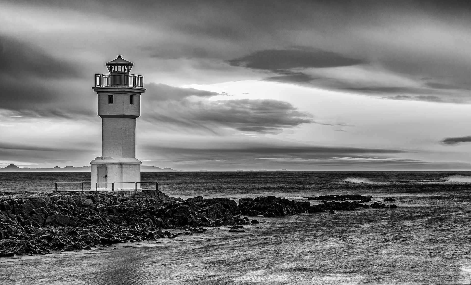
The lighthouse 'wanted' to have a halo with almost any adjustment at this point
I've fixed it a bit but it could still be better. Posted: 02/20/2021 17:20:16