Allen Tucker
September 2020 - Dhalia
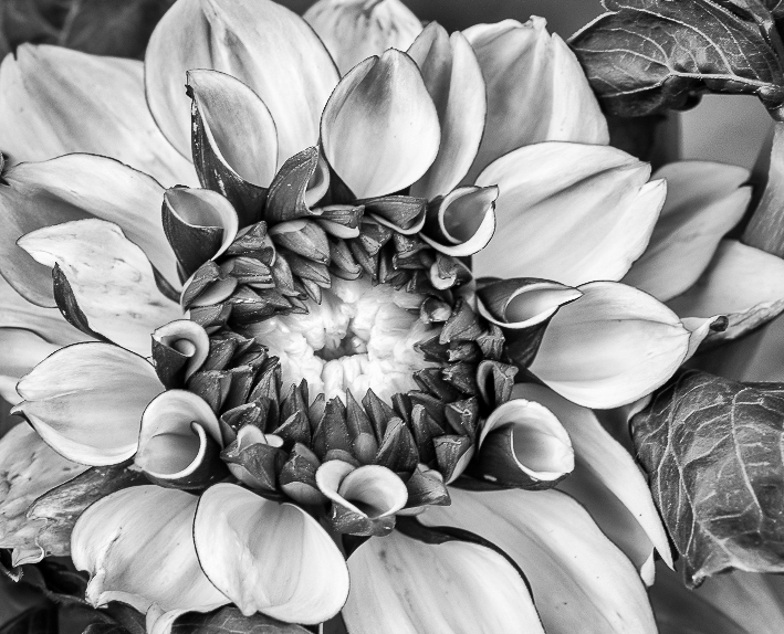
Original 1
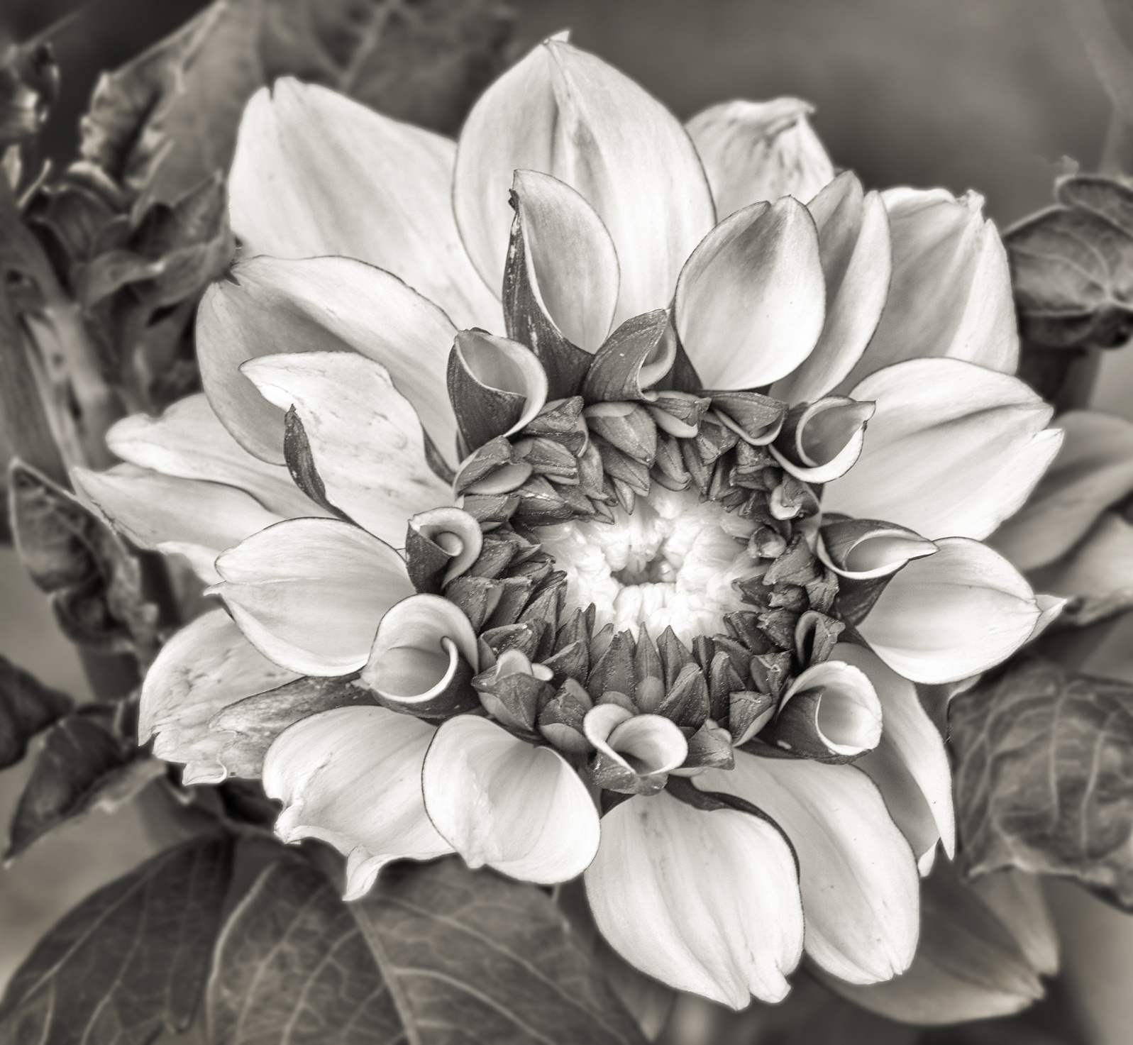
Original 2
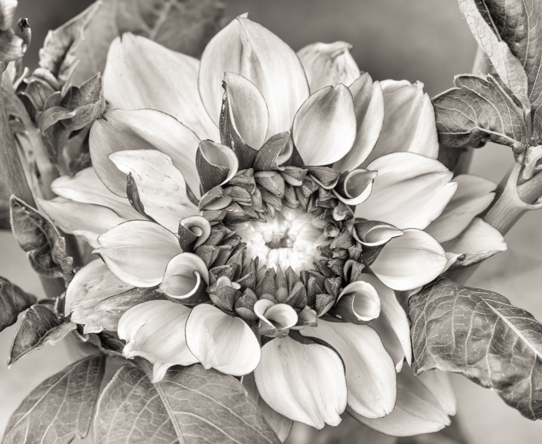
Original 3
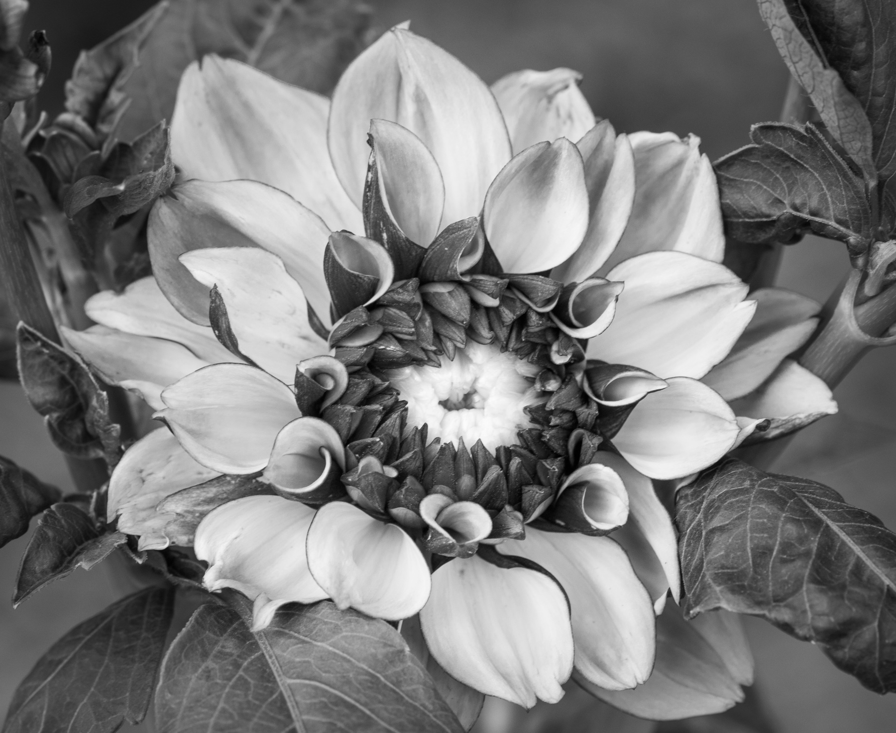
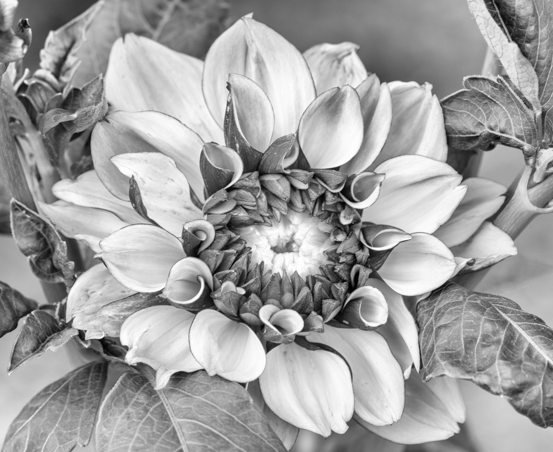
About the Image(s)
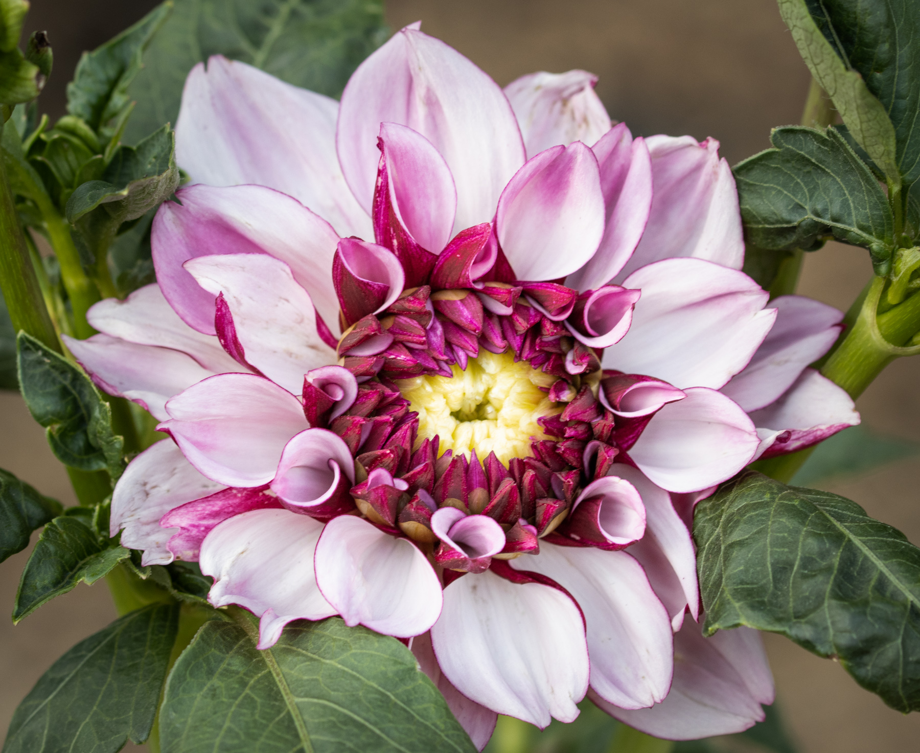
Despite my neglect, this large dahlia in one of our flower beds has put on a good performance this summer. Got this shot early on a windless morning with thin clouds softening the sunlight: Canon 90D, Tamron 90mm macro lens, 1/100, f/4.5, iso 500.
Dark, saturated colors for Original 1, with a crop and minor tone adjustments in Lightroom. The strong tonal contrasts and unfurling petal structure motivated exploring monochrome treatments. Original 2 is from applying LR's set of B&W profiles to a copy of the color file, choosing #6 as giving the closest contrast match to the color version. Next I tried all the NIK Silver Efex presets on the color original, selecting as Original 3 Fine Art High Key for its bright, sunlit feel. Back to LR to finish the Main Image with a little warm tone applied to Original 3. Suggestions?
This round’s discussion is now closed!
9 comments posted
I kept thinking that I would have liked to view the myriad of petals from closer from above than from the side. Such a beautiful tactile image with so much depth to it. Posted: 09/07/2020 22:58:35